

Next project


Highlights & Outcomes
140% spendper user vs target
£32.67 vs £23.33
£2.5mraised after the v0
From top VCs
4 monthsahead of launch plan
August vs December
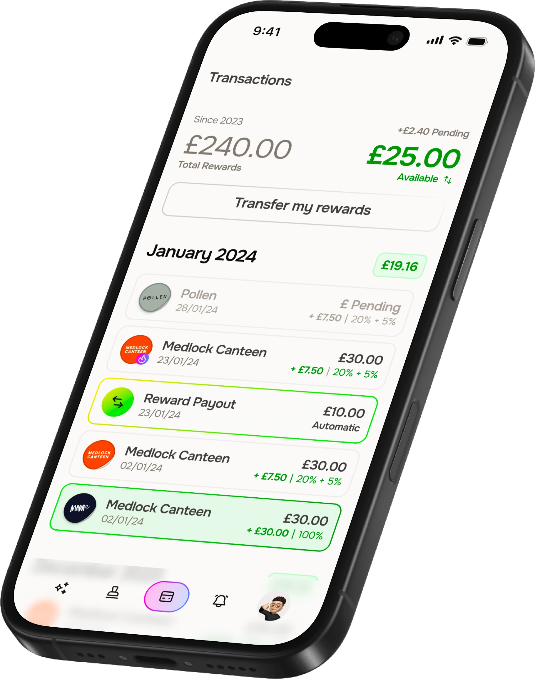
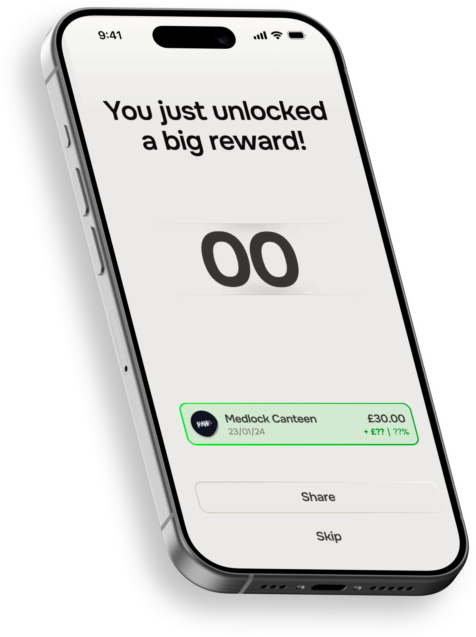
The idea was to make rewards feel like a game: a card that paid back a random amount, up to 100%, on anything you bought.
As it was a card, we had around 12 months to test, build and get all of our approvals in order (FCA, Mastercard and Apple/Google to name but a few).
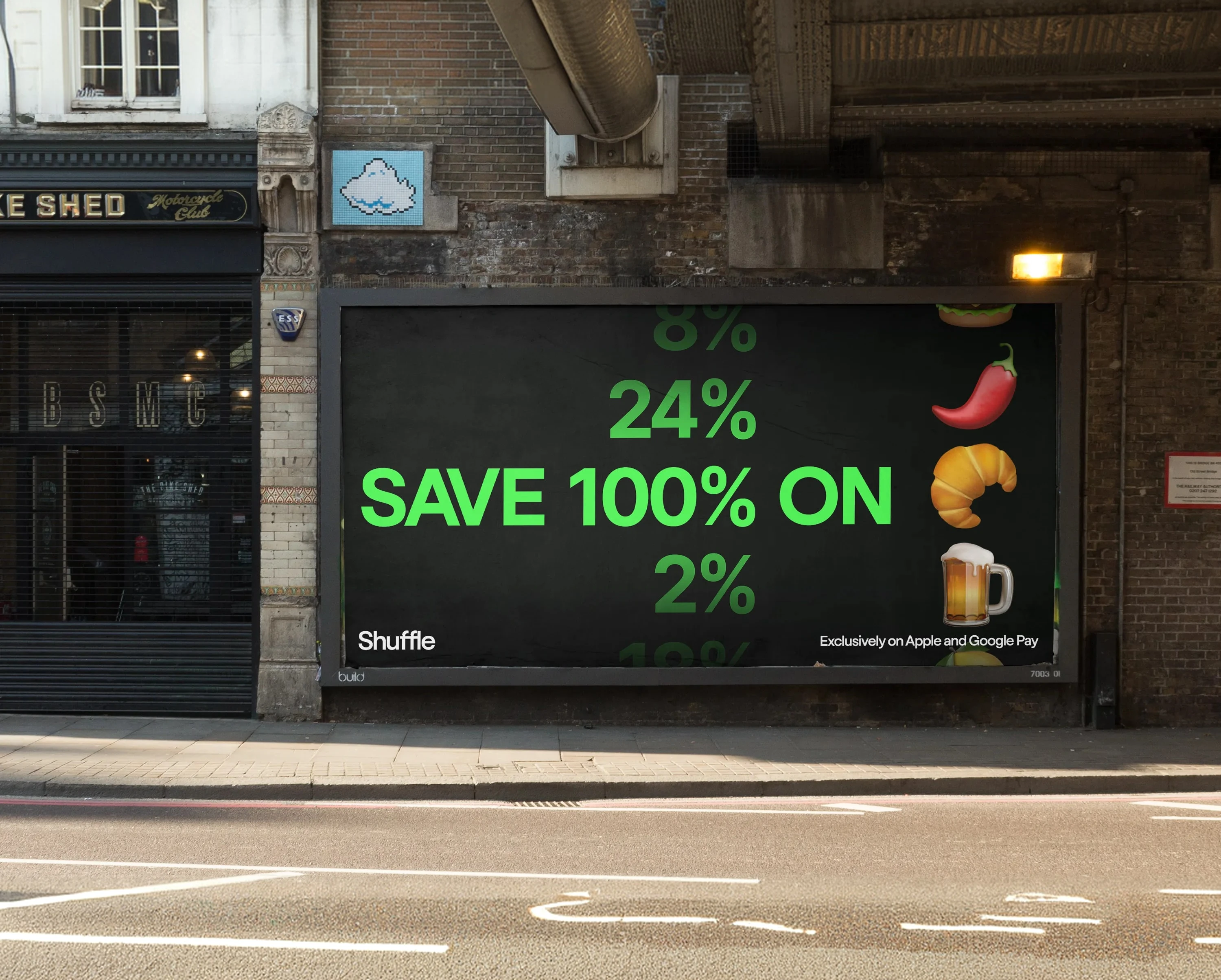
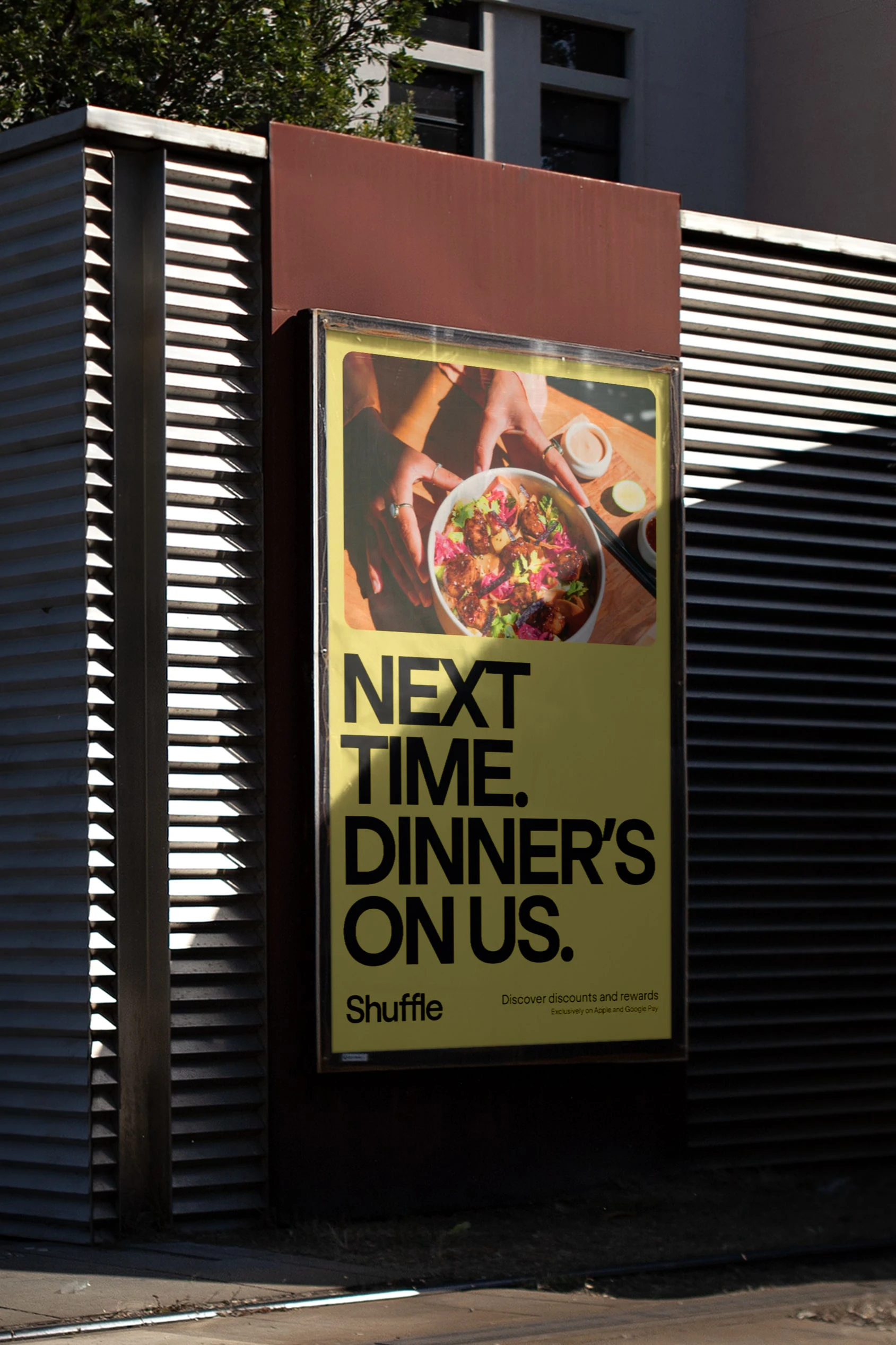
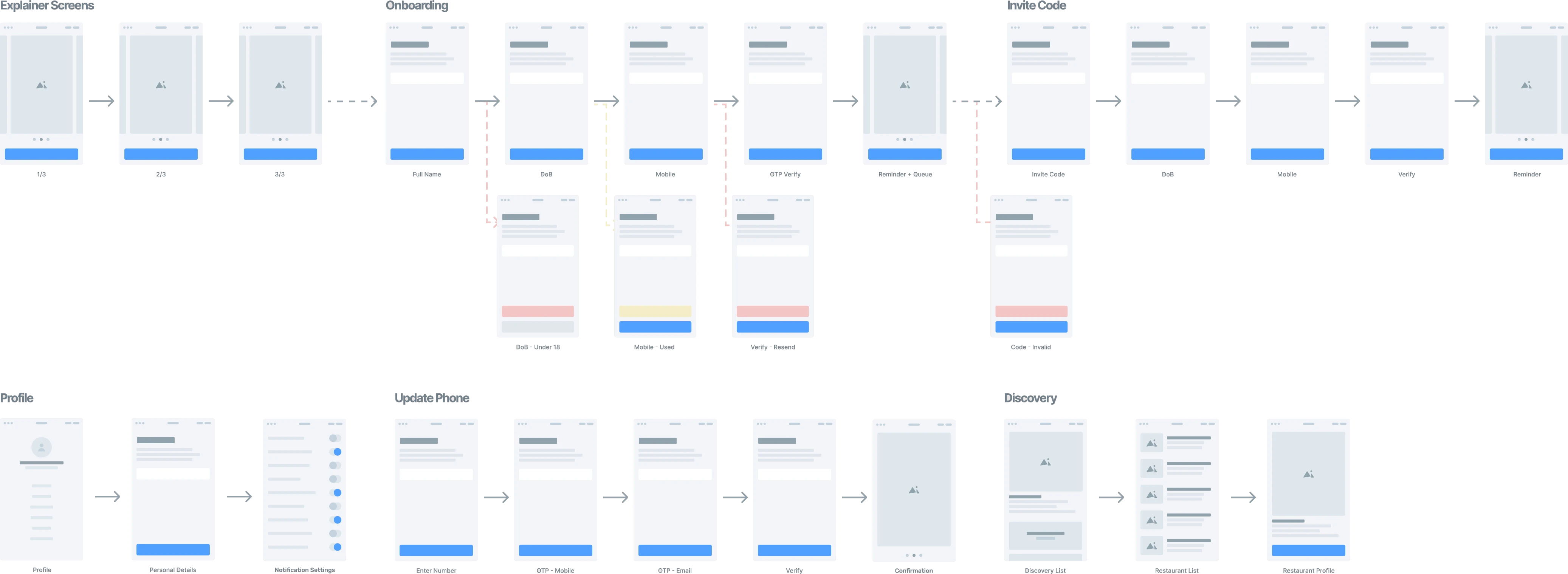
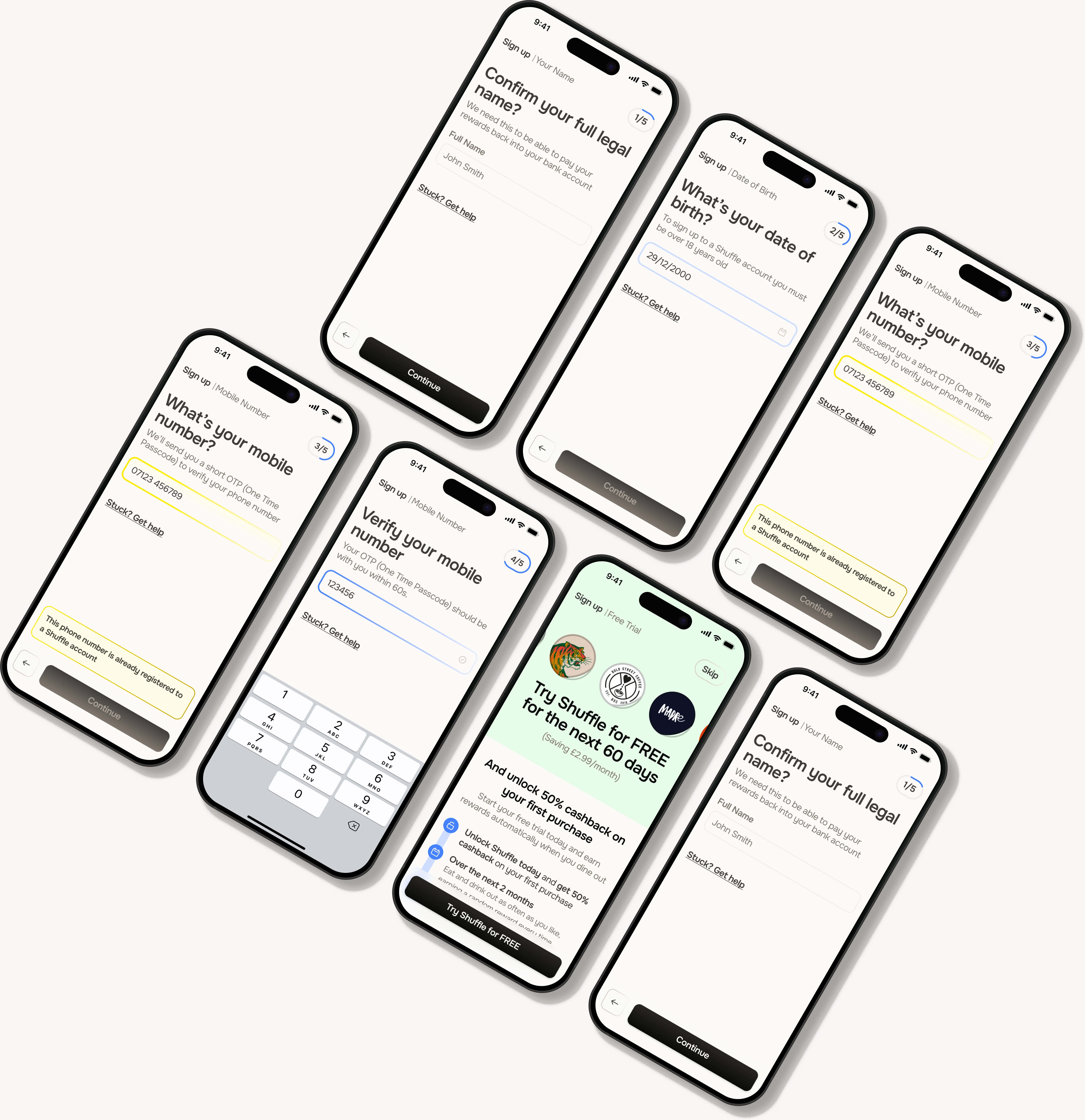
First up, I made a quick brand and a clickable v0 (happy and unhappy paths included) to show investors what the team had in mind. It did a few other jobs too. It gave venues something tangible to react to, the engineers somewhere to start, and the approvals paperwork something to point at.
Outcome:
A clickable prototype and an initial brand later, we were ready for our first investment round, raising £2.5m.
We already had our target audience “Couples with two incomes and no kids, eating out at least twice a week”; now all we needed was a launch city.
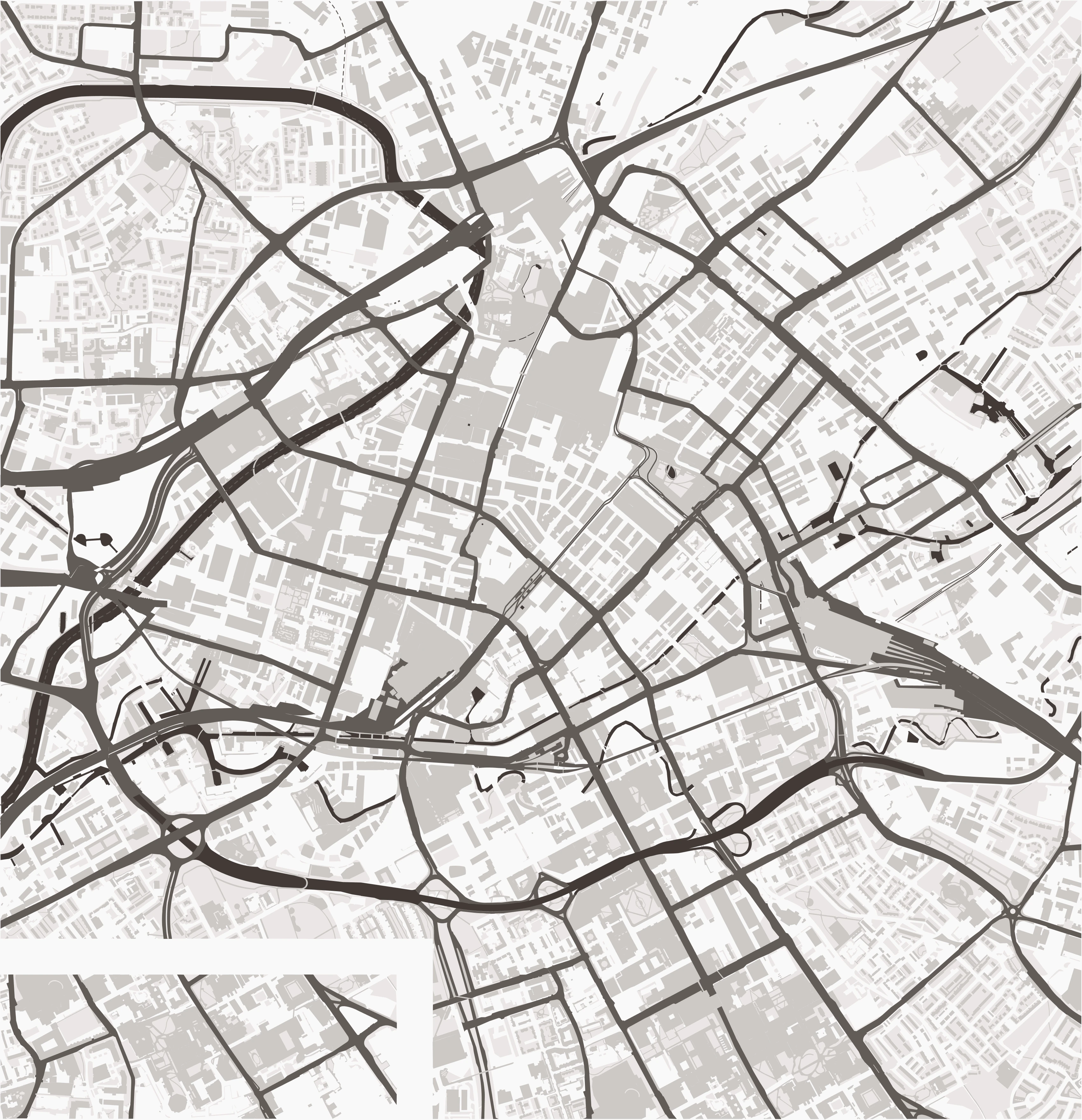
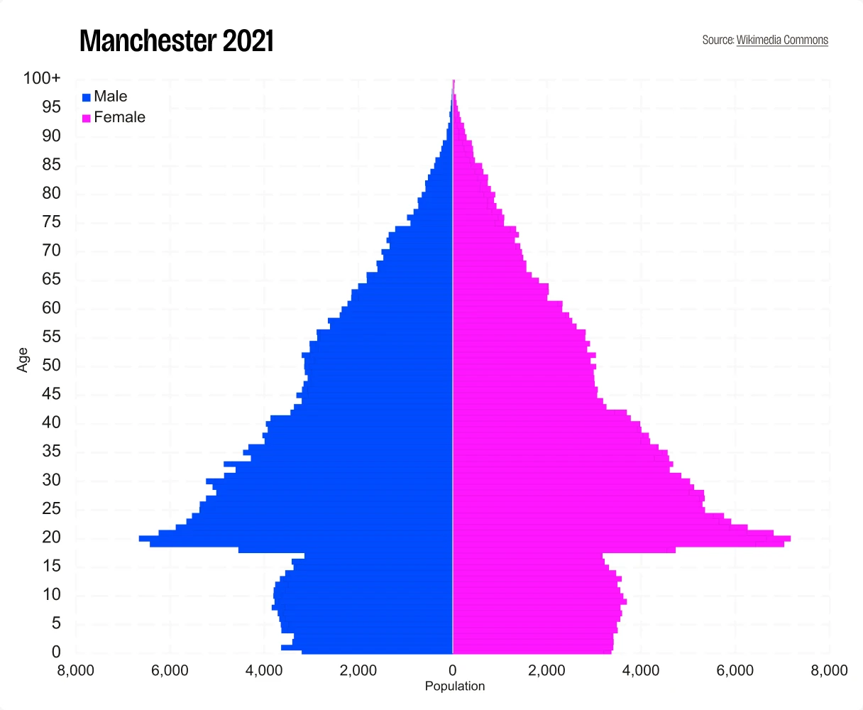
To find the ideal site, we compared cities across the UK on demographics, income and layout.
Outcome:
Manchester came out on top - young (37% aged 20–39), walkable and packed with independent places to eat. After a quick trip up North to see for ourselves, we knew we had our launch city.
2.92mpeople in Greater Manchester
37%20–39 years old
Walkablecity centre
Then we spoke to around 50 people over two weeks. The pattern that stood out was that in most groups of friends, the same person decides where everyone goes. We called them the tastemaker, and they cared far more about curation and discovery than money off. Diners told us restaurant rewards felt small or pointless, and venues didn’t believe they worked.
Outcome:
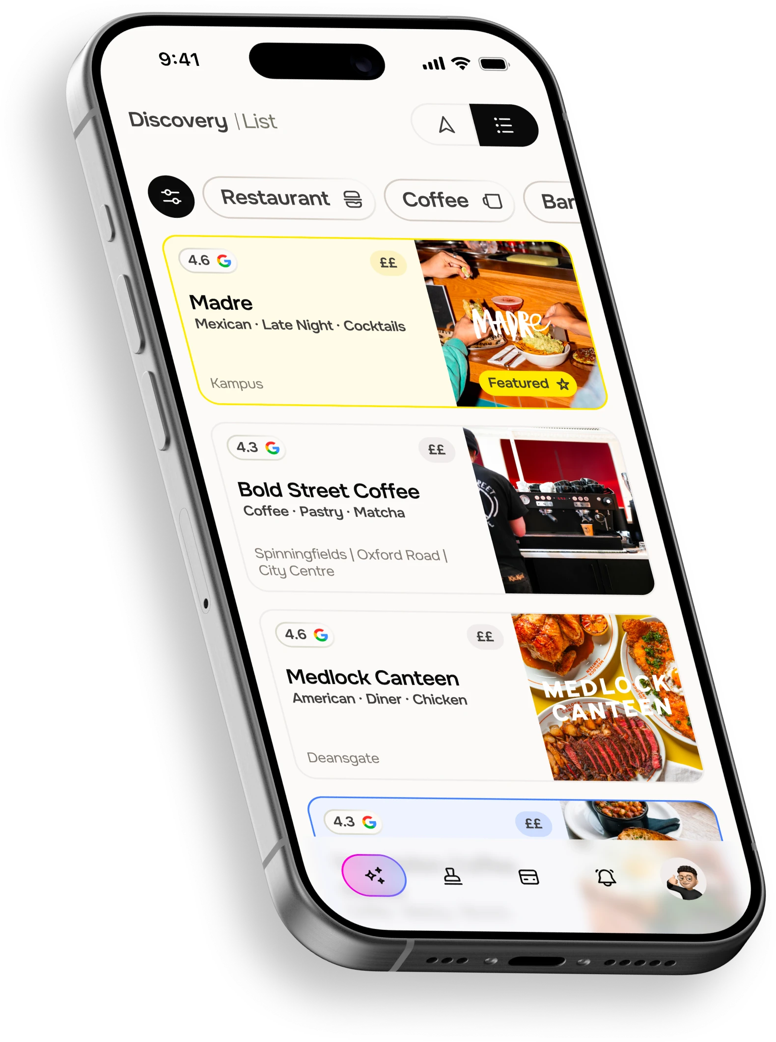
Another general rewards product would be launching into a packed market, so I proposed we focus on restaurants, bars and cafes and make it curated. The places would be the draw, and the reward a bonus.


That left the card. Approvals weren’t expected until November and we were aiming to launch in December.
This was where I had an idea.
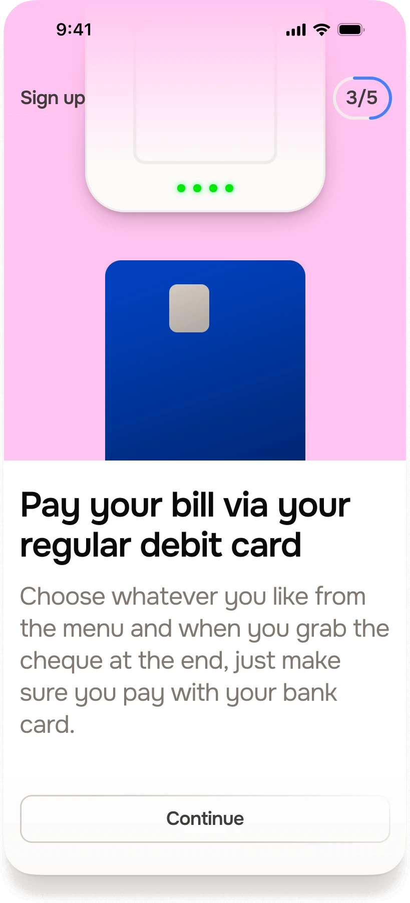
What if we offered customers a rewards product with the same app experience, random rewards and a curated list of spots, but instead of issuing our own card, linked to their existing bank account?
Original Timeline
Initial ResearchJan ’24
Legal PaperworkApr ’24
App DesignJun ’24
v1 BuildOct ’24
v1 LaunchDec ’24
Updated Timeline
Jan ’24Research Complete
Feb ’24Re-Shuffle
Mar ’24App Design
Jul ’24v1 Build
Aug ’24v1 Launch
I ran workshops with Ollie and Enzo, Shuffle’s founders, and the engineers to weigh up our options. Between full card issuance and open banking, the choice was clear: connecting through open banking meant we could launch in August, not December. The cost would be asking people to trust us (a new startup) with their bank details and transaction history.
Outcome:
Open banking it was, with the card left for later and first users in August 2024.
I led a workshop mixing Simon Sinek’s Why framework with the Five Whys, to work out what Shuffle was for.
We settled on “Bringing joy to your everyday”: pointing people to the best spots near them, and building a better local community as a result.
So the brand stepped back. A scaled-back colour palette, Onest for type (part humanist, part geometric) and plenty of room for the venues Shuffle would play host to. They were the joy, not us.
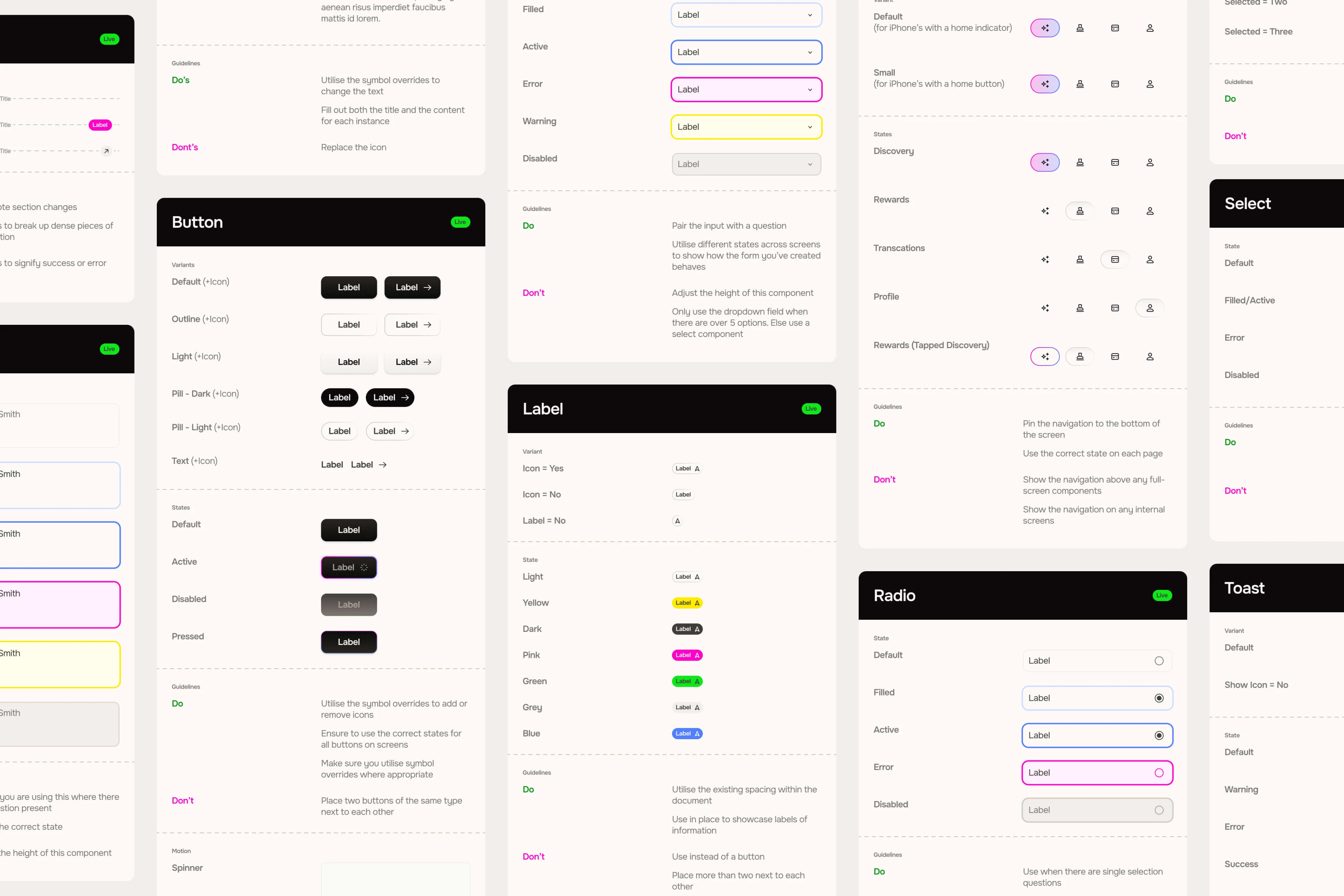
Working directly with the engineering team, I set up Shuffle to use a design system from day one. It lived in Figma with components, variables and clear documentation, and was mapped to the codebase and its states so design and development were working from the same thing.
Outcome:
The development team grew from one person to three, all working from the same system, which tidied up how design and development talked. It also gave the team after me something to build on without me.
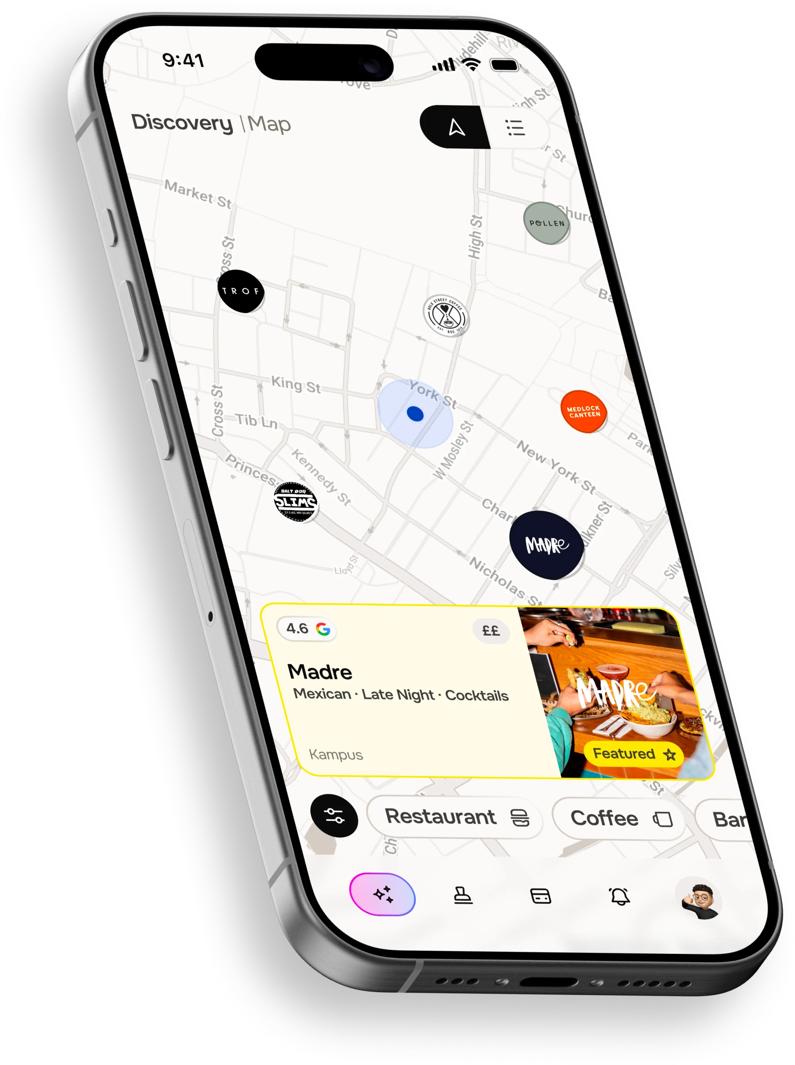
After a private beta, we opened to the public on 13 September 2024 with 14 partner venues across Manchester (Pollen, Bundobust, Medlock Canteen and Madre among them). Customers were averaging more than 1.5 visits in their first two weeks.
Outcome:
1,176 people signed up in the first week, more than twice the 500 we’d aimed for.
1,176sign-ups in the first week
vs 500 target
£32.67spend per user a month
vs £23.33 target
14 partnersavailable at launch
Across Manchester
Post Launch
Trust turned out to be the sticking point
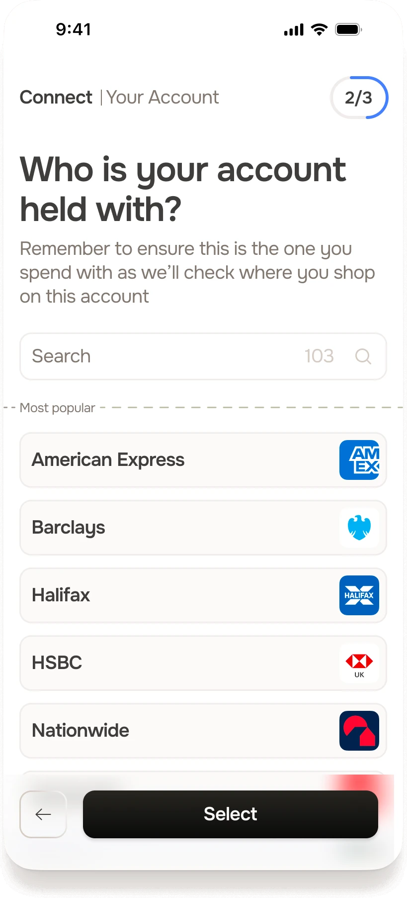
As suspected, users connecting their bank accounts became a key drop-off in our sign-up funnel.
Change:
I redesigned the step to show the value upfront, ask for consent in stages and be clearer about what data we could see.
57% of usersconnected their bank account
Previously 44% +30%
Post Launch
People liked the curated feed
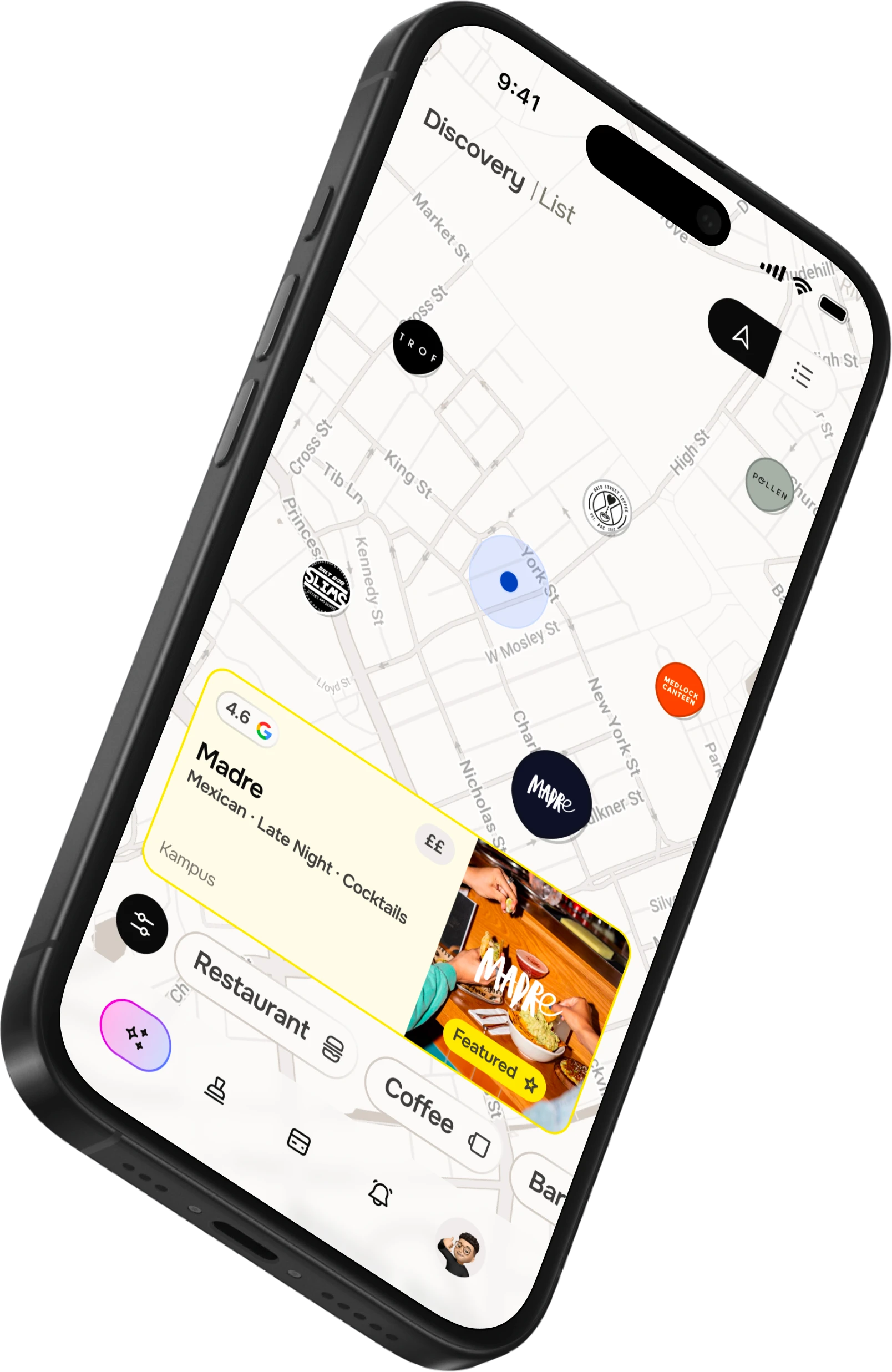
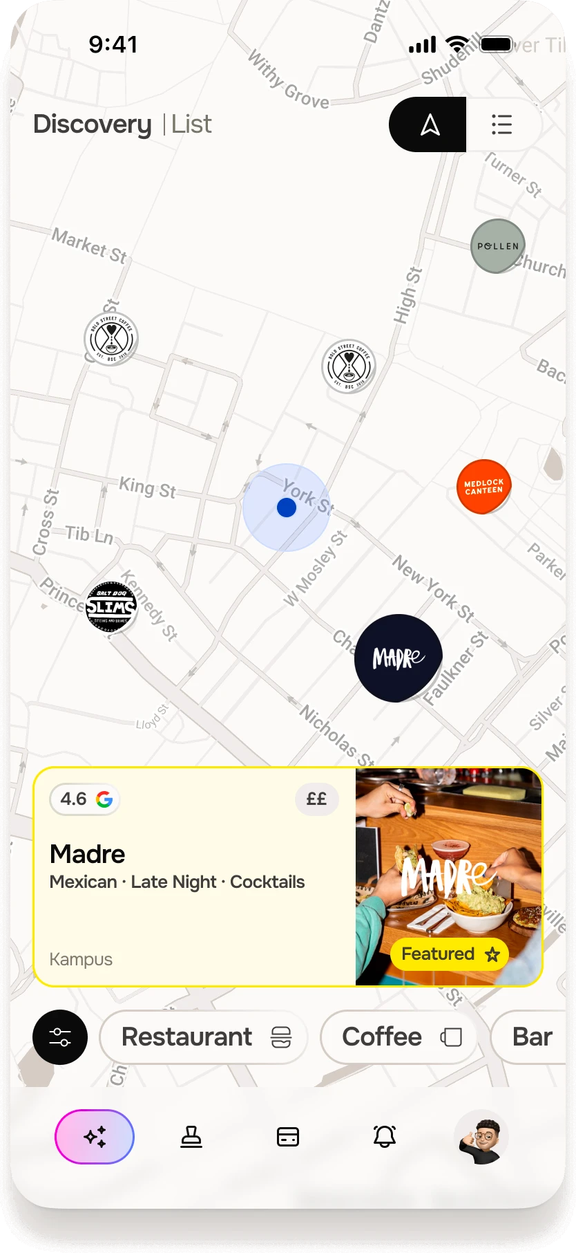
But couldn’t tell where anything was, and kept dipping out to Google Maps to find each venue.
Change:
A short design sprint later, I’d added a map, which made the app instantly more usable, even while our list was small.
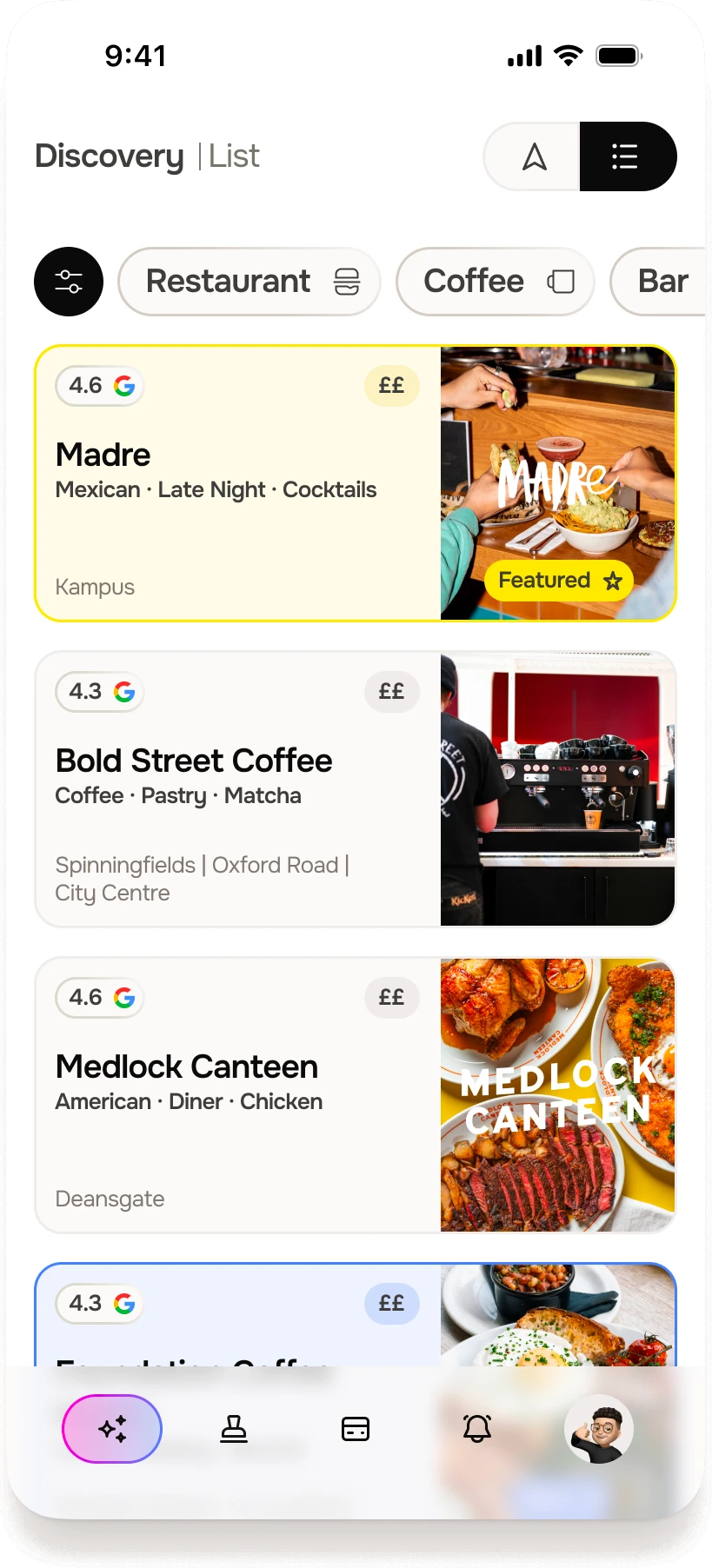
Map Discoveryhelped users find where to go next
Feature New
After launch, retention beat its target by 200% and onboarding conversion rose by around 15%. I wrapped up in November 2024, handing over the app, the design system and a development team three times the size it was when I started.
Looking back:
I’d ship a leaner MVP sooner, and set up tracking from day one. We learnt the most once real people were connecting real bank accounts, and we’d have got there faster with the data in place from the start.
+200%retention vs target
+15%onboarding conversion

“Sean really gets into what users are actually trying to do, and asks the tough questions that make you rethink things you thought you’d figured out.”

Martin DreymannCo-founder & CTO
