

Next project


Highlights & Outcomes
3+ yearson the brand, until acquisition
6 particlesin the logomark
21 pagesof brand guidelines
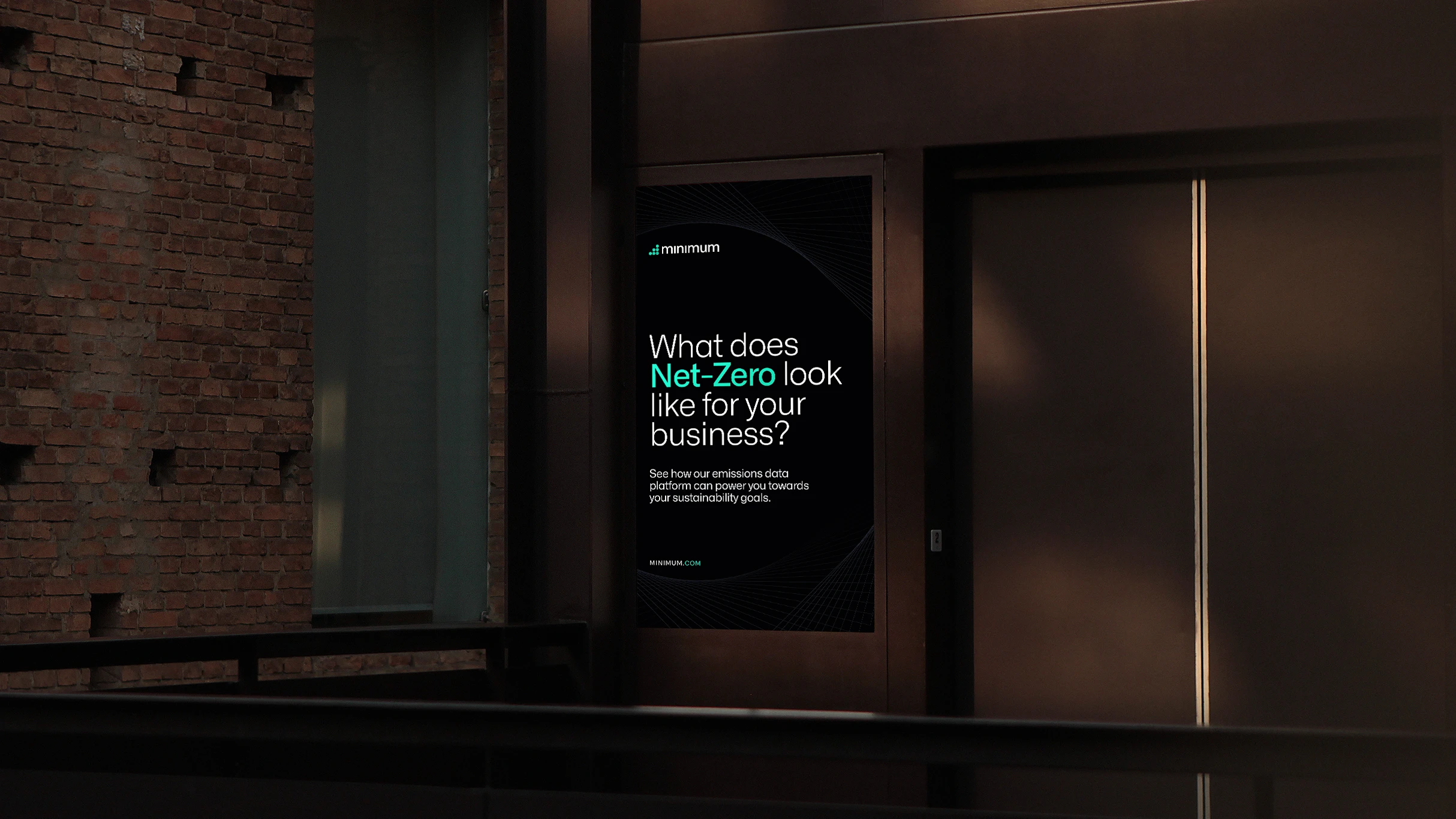
Carbon accounting is complicated. Minimum pulls emissions data from across a business, then works out what it all adds up to, auditable line by line. The people buying it were large corporations, alongside startups managing their own footprint.
The brand had to make that feel simple without making it look lightweight. Precise enough for a compliance team, clear enough for everyone else.
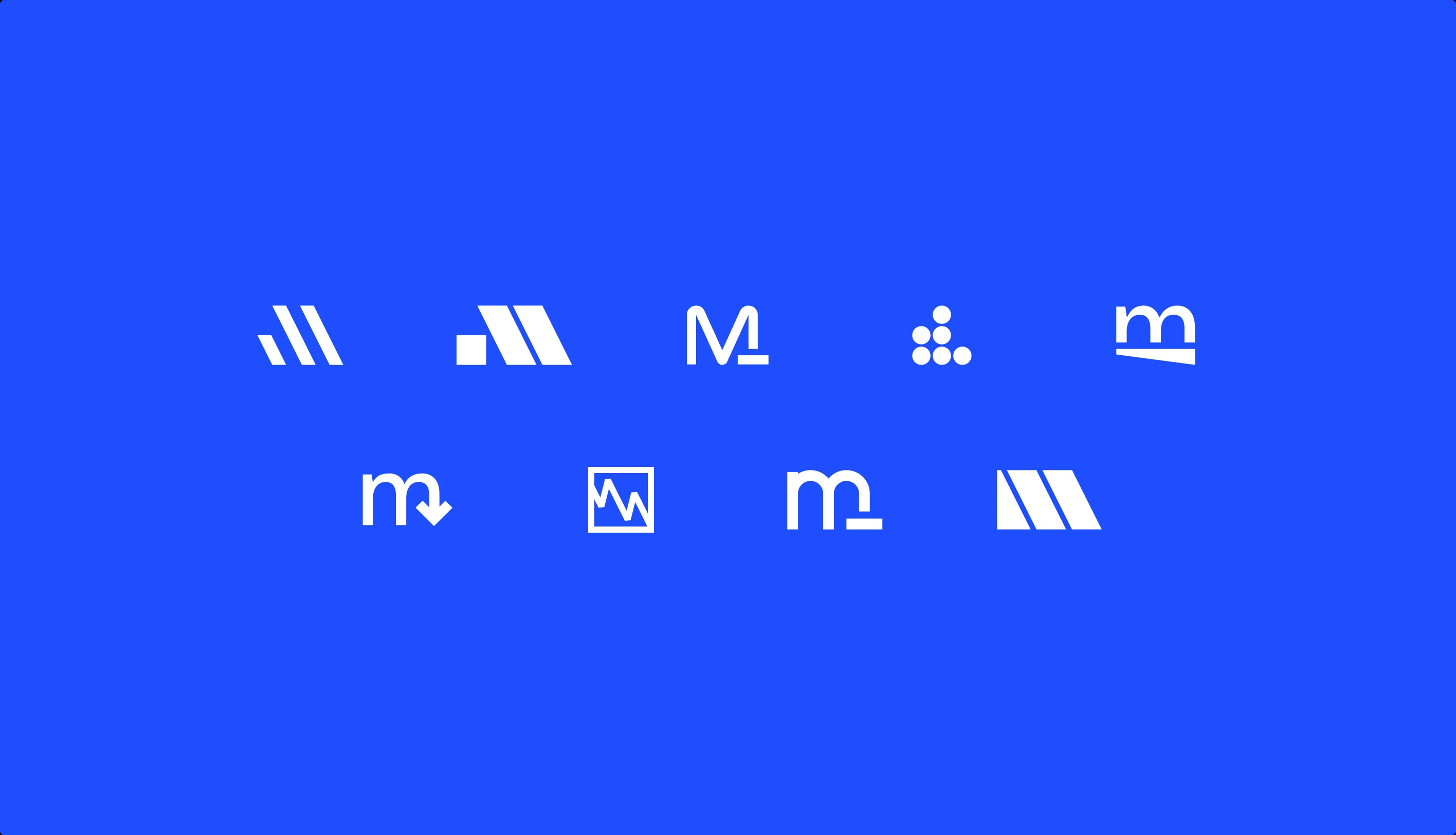
It started with a brand workshop with Freddie Evans, Minimum’s CEO, and Chris Winchurch, their CPTO. Out of it I drew nine marks, from slanted bars and a chart line to an m with a minus sign and a stack of six dots.
Two became routes. The first leaned on the science, with six dots for carbon, set in Space Grotesk with a blueberry blue and a pop of acid green. The second was the Minus M, set in Alliance No.1 with a cobalt blue we picked from Chris’s coat.
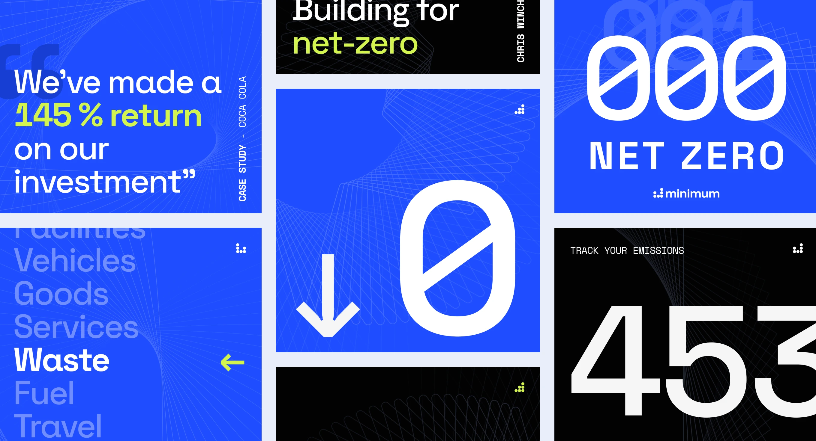
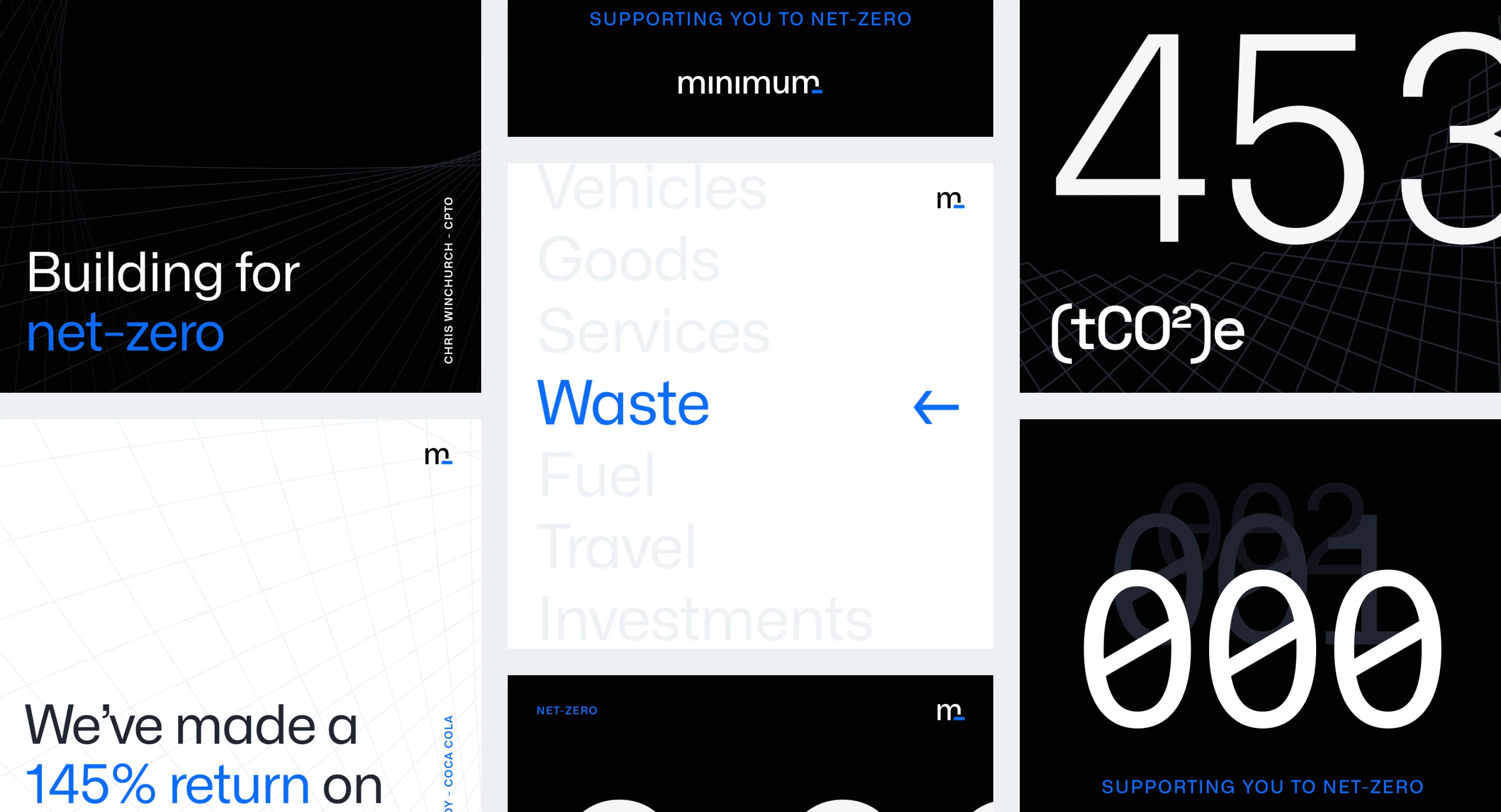
The final brand brought the two routes together: the six particles from the first, with the type and blue from the second. Carbon’s atomic number is six.
The particles sit a sixth of their size apart, and the mark sits one particle’s width from the wordmark. The same particles set the clear space: four of them around the full logo, one around the mark.
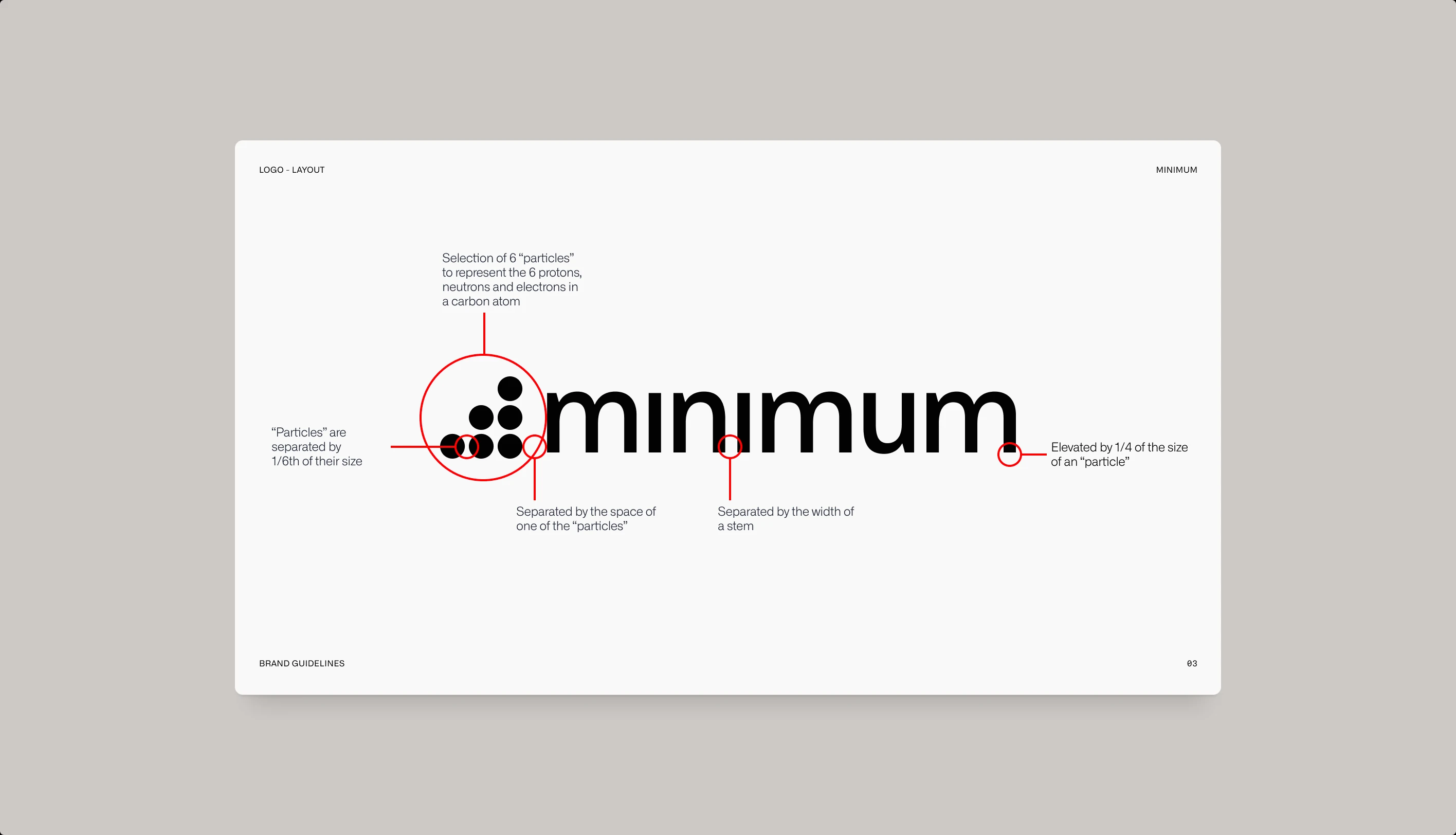
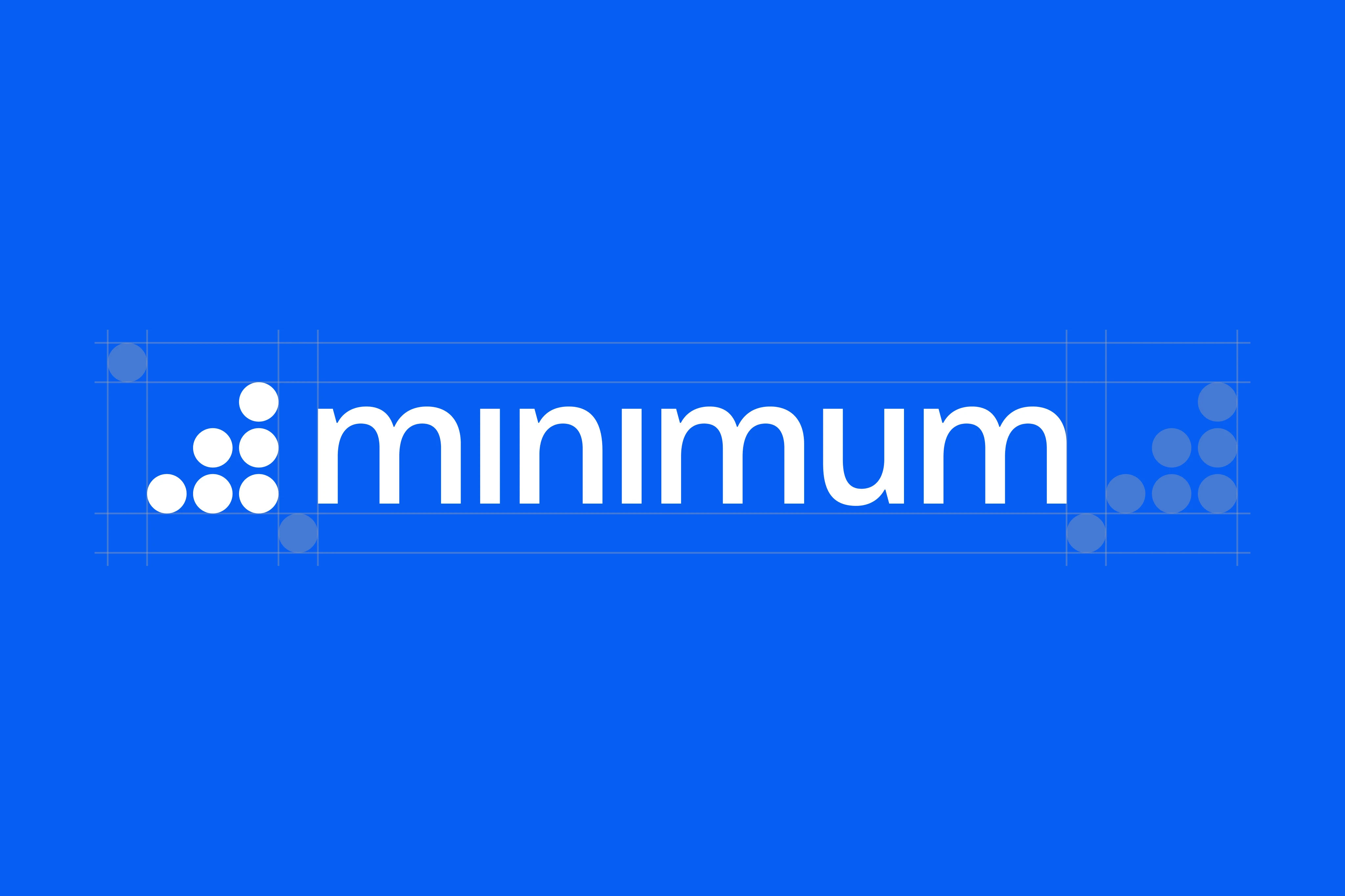
The logotype is a customised Alliance No.1 from Degarism. I chose it for its sharp angles and ink traps, which read as precise without feeling cold. For the wordmark I refined those ink traps, and a few of the letterforms with them.
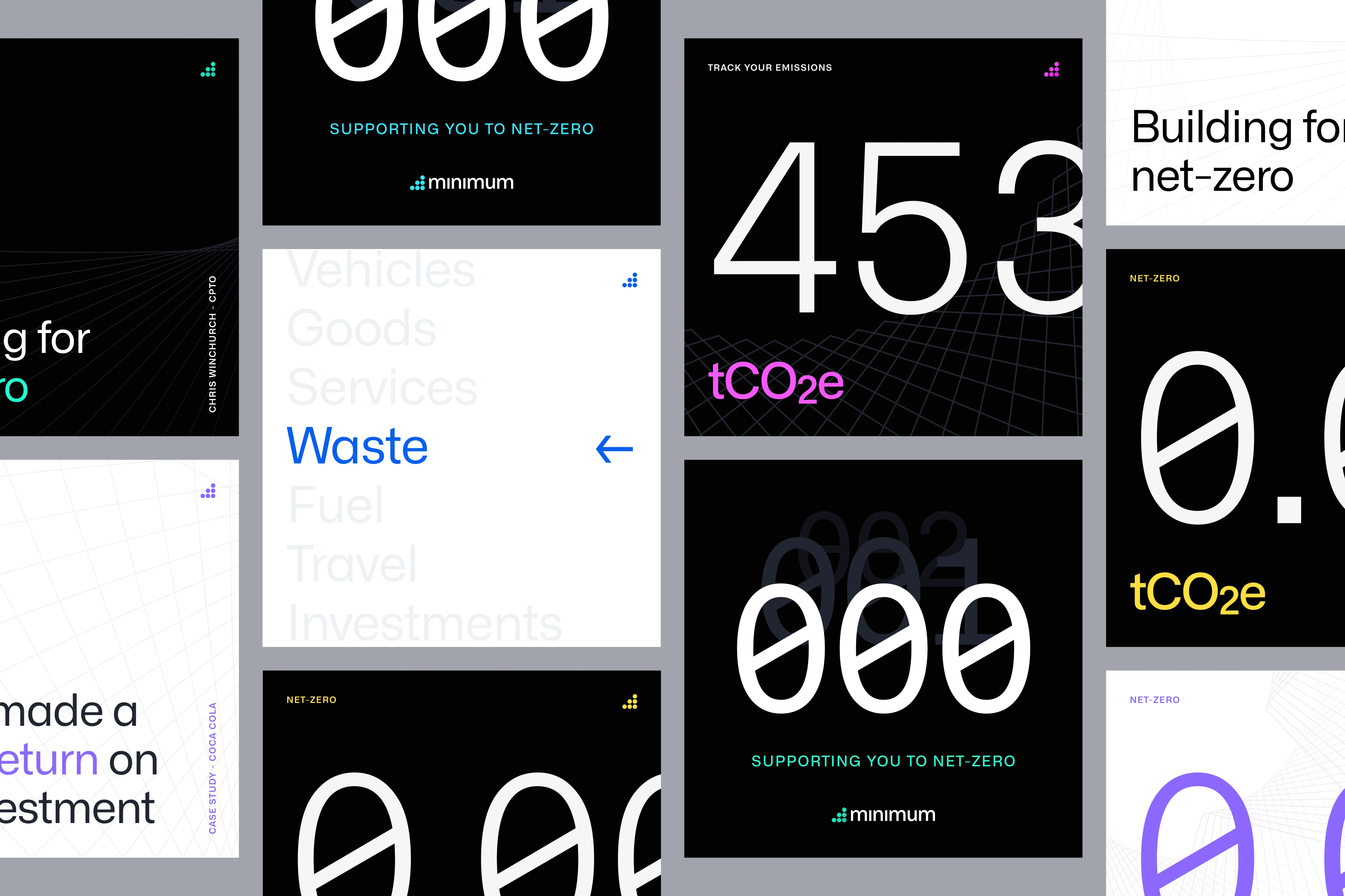
Alliance also has a monospaced cut. Every digit takes the same width, so emissions figures line up like a ledger: 453.6 tCO₂e, 0.00 net-zero.
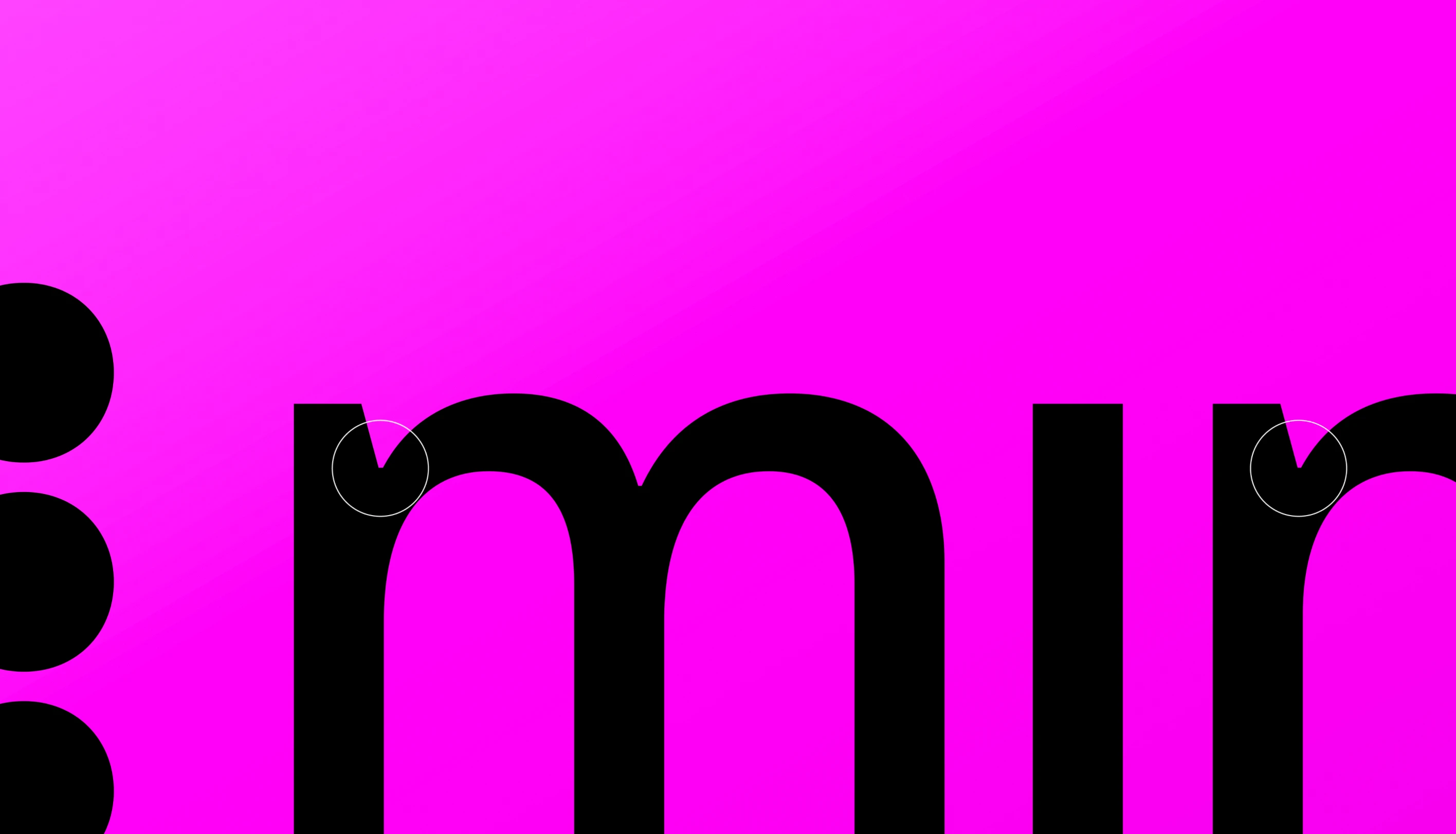
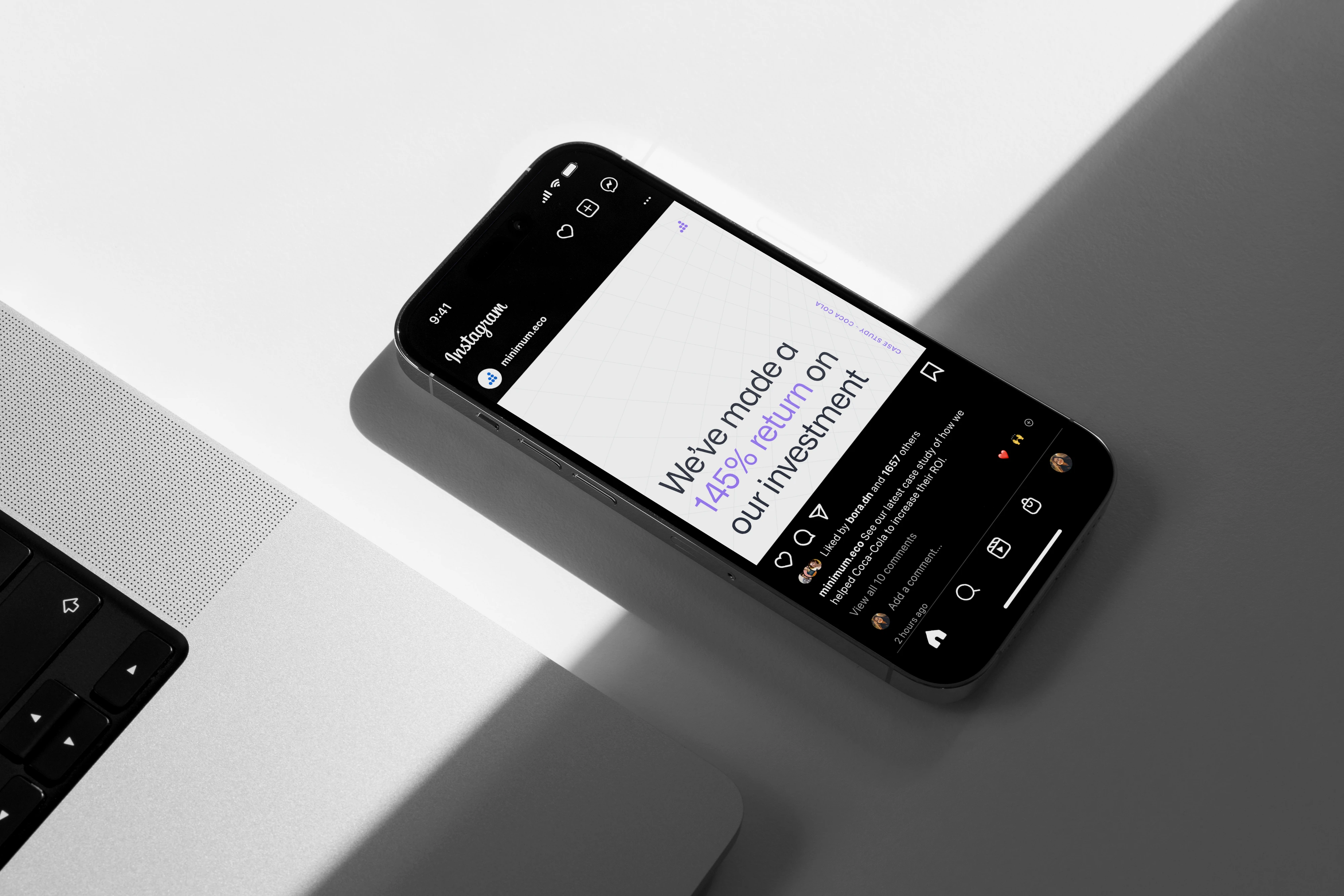
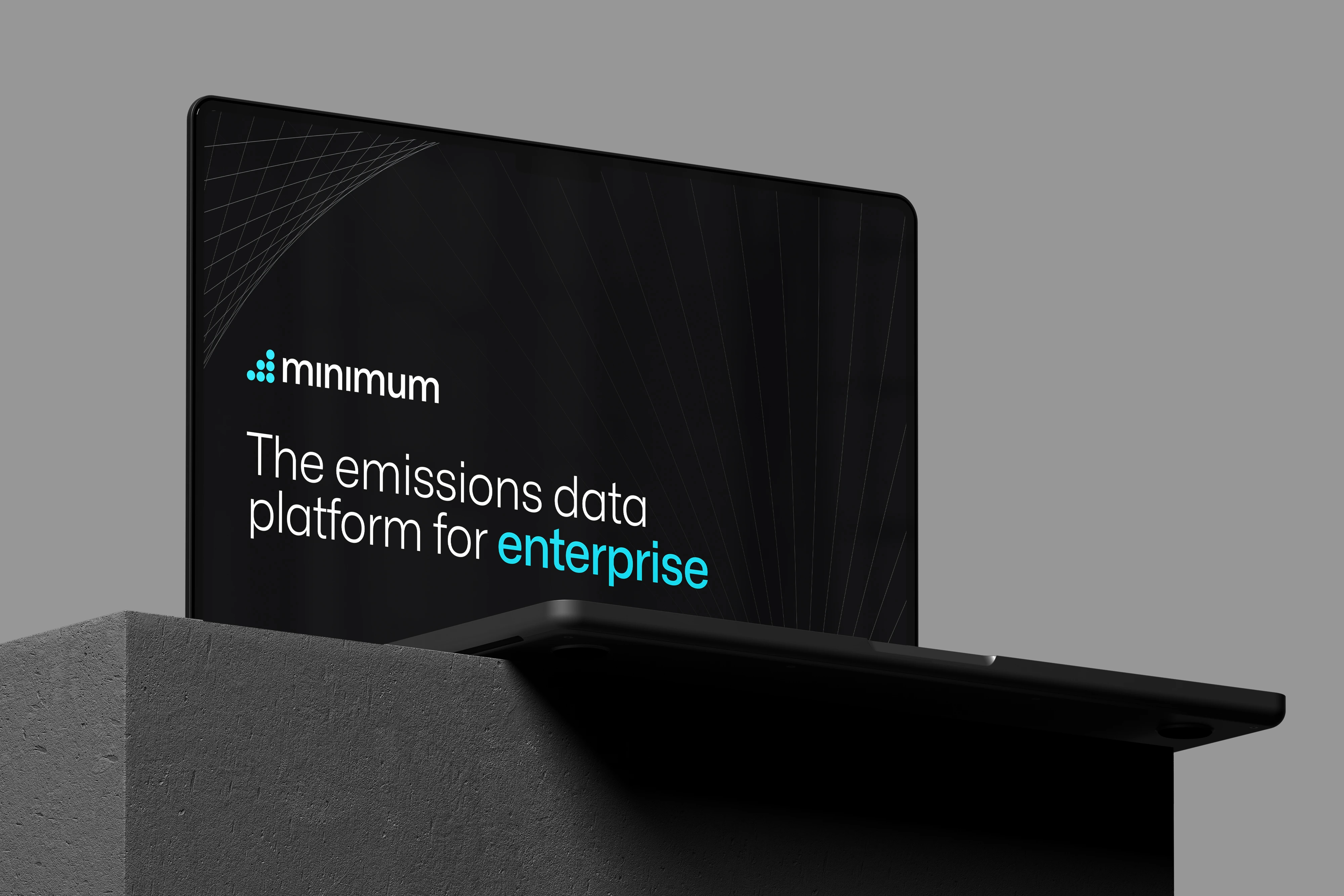
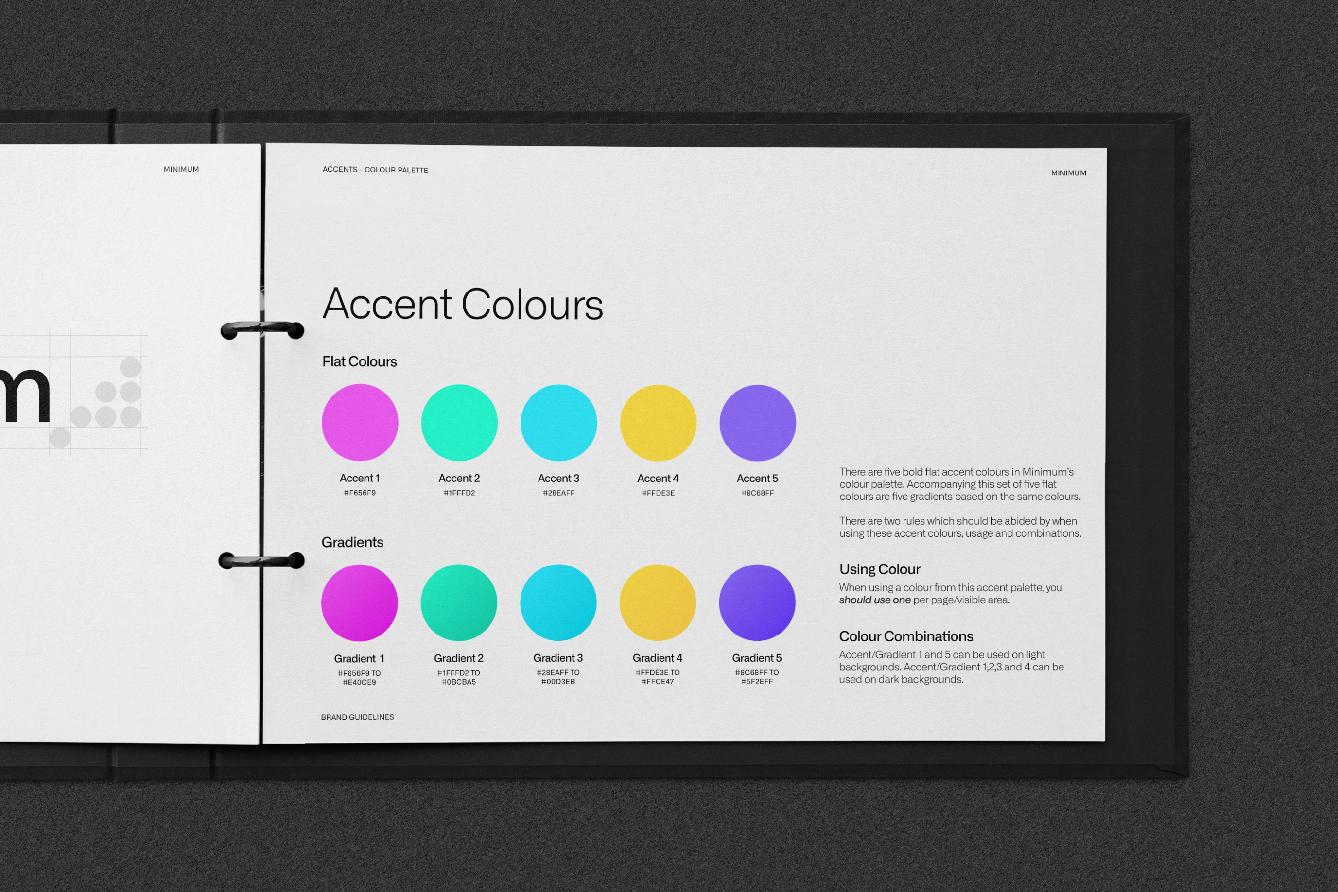
Minimum’s blue is the constant, bold enough to pick a number out on black or on white. Around it sit five bright accents, each with its own gradient.
The rule is one accent per page. Flat colour for small details, gradients for big areas, and only pink and violet on light backgrounds.
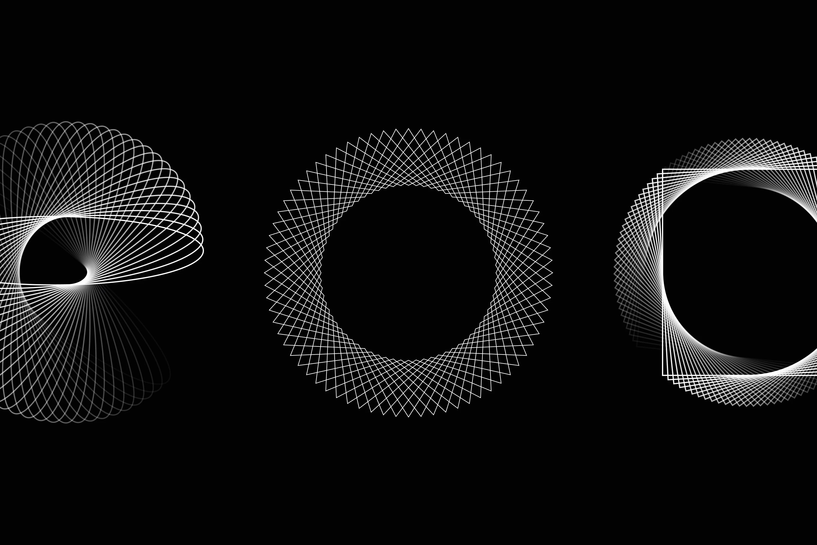
The patterns are spirals, built by rotating one shape around a centre point, step by step, until it closes. For a fading spiral, each step drops the contrast by the same amount.
In use, we only ever show a crop. It hints at the data behind every number: there’s always more there than you can see.
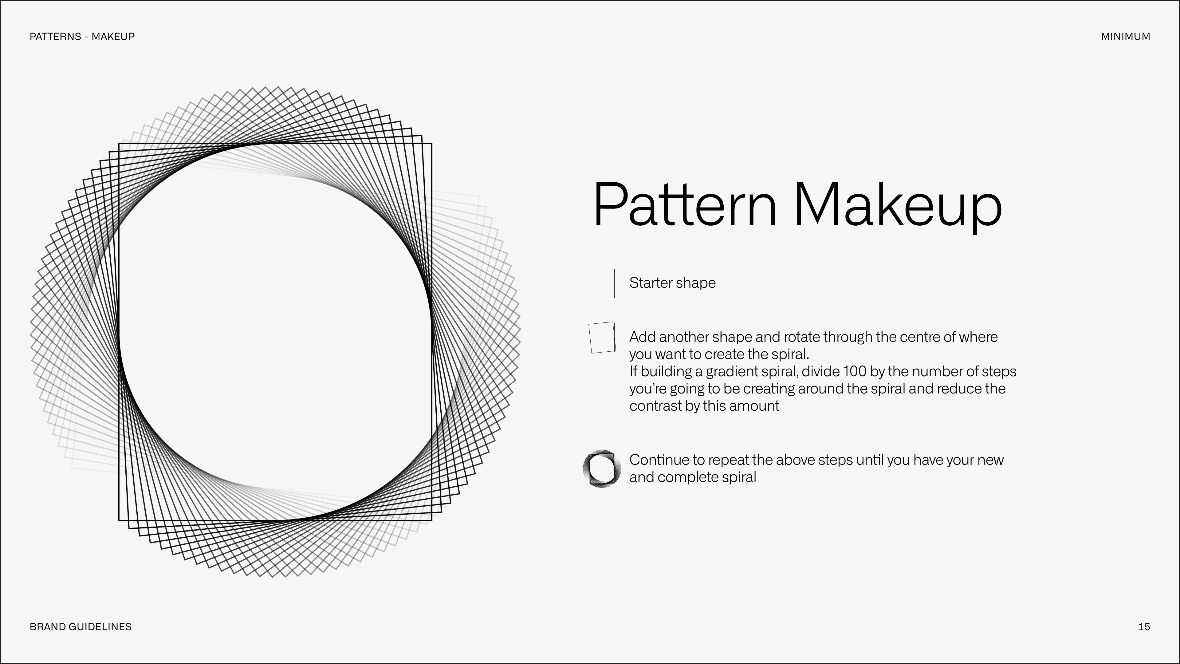
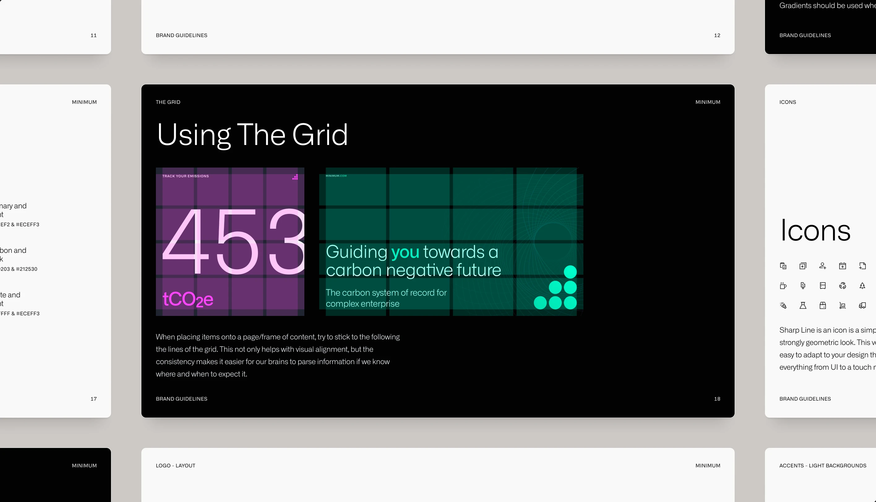
All of it went into a 21-page guide covering the logo, type, colour, patterns and icons, alongside new messaging.
The grid has four columns and stretches from a square post to a 16:9 slide, so a social post and the website’s header follow the same rules.
Minimum ran on the brand for over three years. In that time it partnered with Novisto, a sustainability platform based in Montréal, and the two came to share enterprise customers.
Outcome:
In March 2026 Novisto acquired Minimum. Its carbon accounting, the thing the brand was built to make feel simple, now runs inside Novisto’s platform.

“Sean really gets into what users are actually trying to do, and asks the tough questions that make you rethink things you thought you’d figured out.”

Martin DreymannCo-founder & CTO
