

Next project


Highlights & Outcomes
75%of users connected an AI tool
After the MCP page launched
0 → 33%of all product usage
New record & insight pages
All newdesign system
Made with my build loop
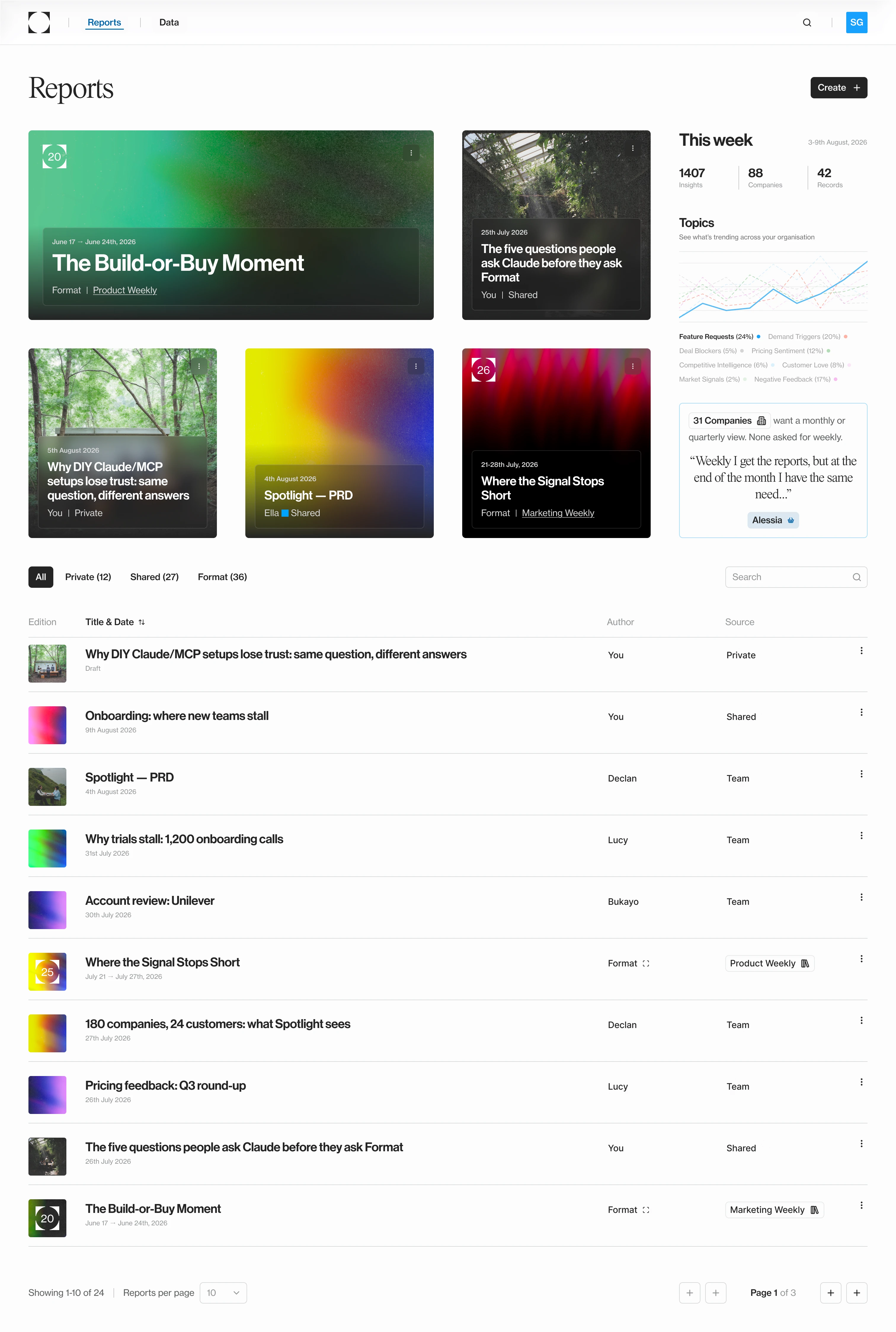
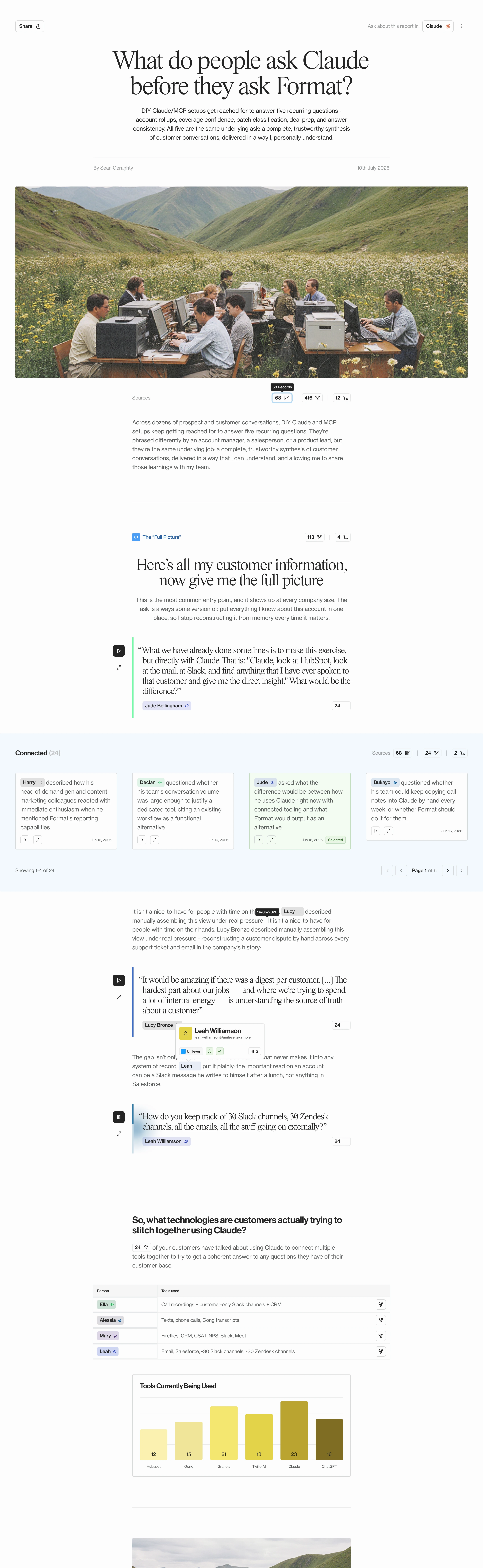

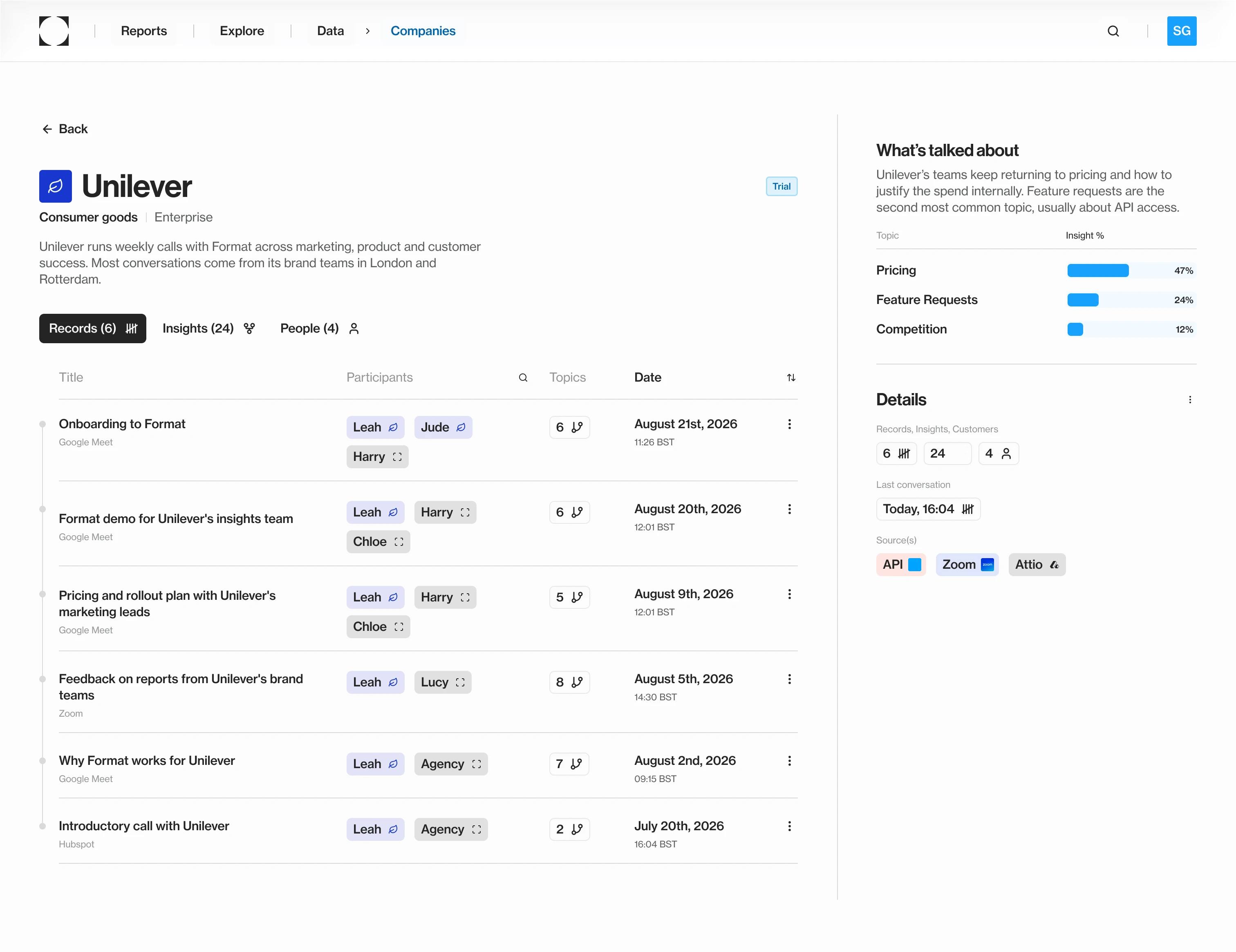
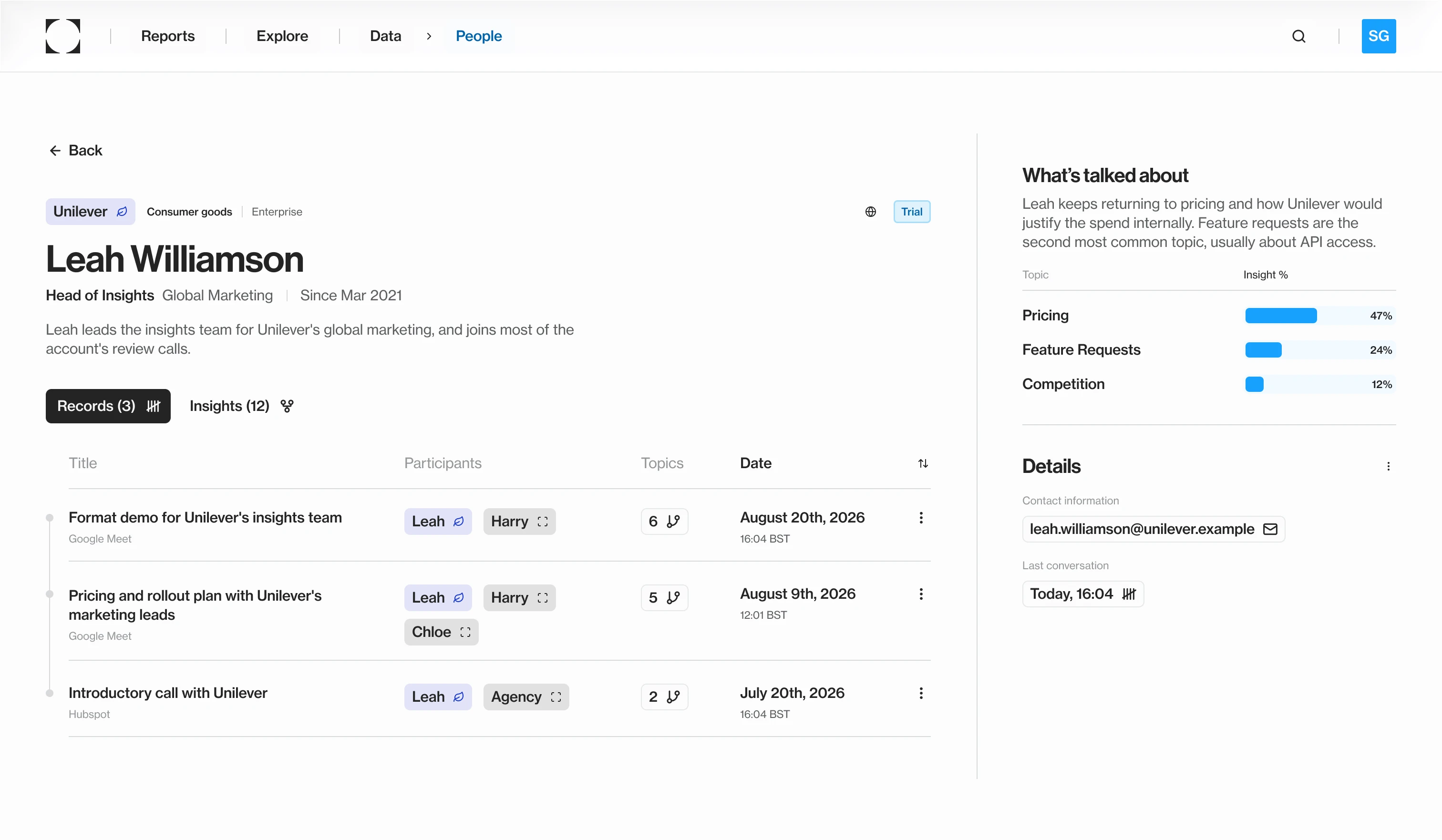
My first brief was to design the missing pages: records, insights, companies and people, so every name in a report led somewhere. Over five months, that grew to more than 15 pages, built with Martin Dreymann, Format’s co-founder and CTO.
The bigger problem was trust. Customers had started asking Format questions through Claude, and when an answer came back, there was no way yet to see whether it was right.
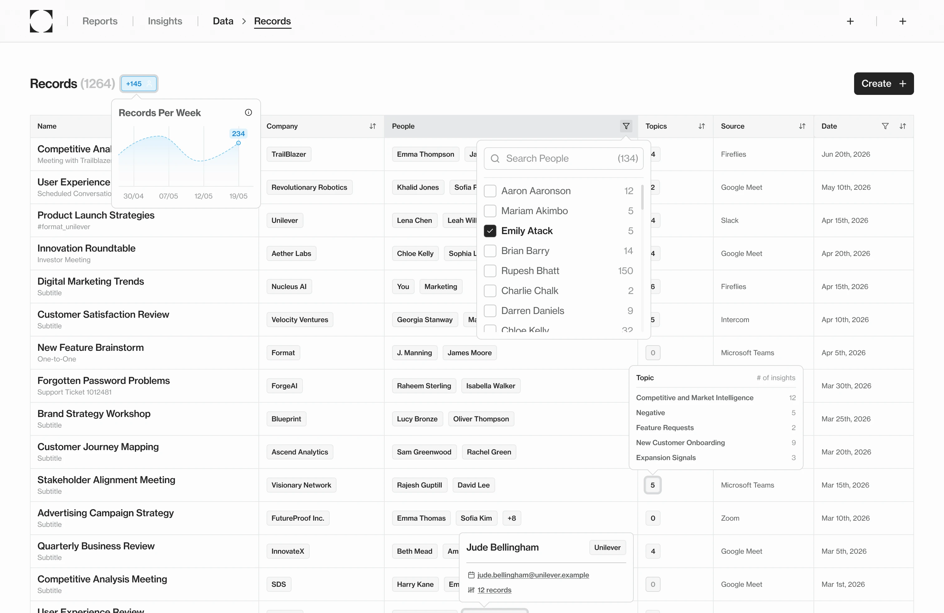
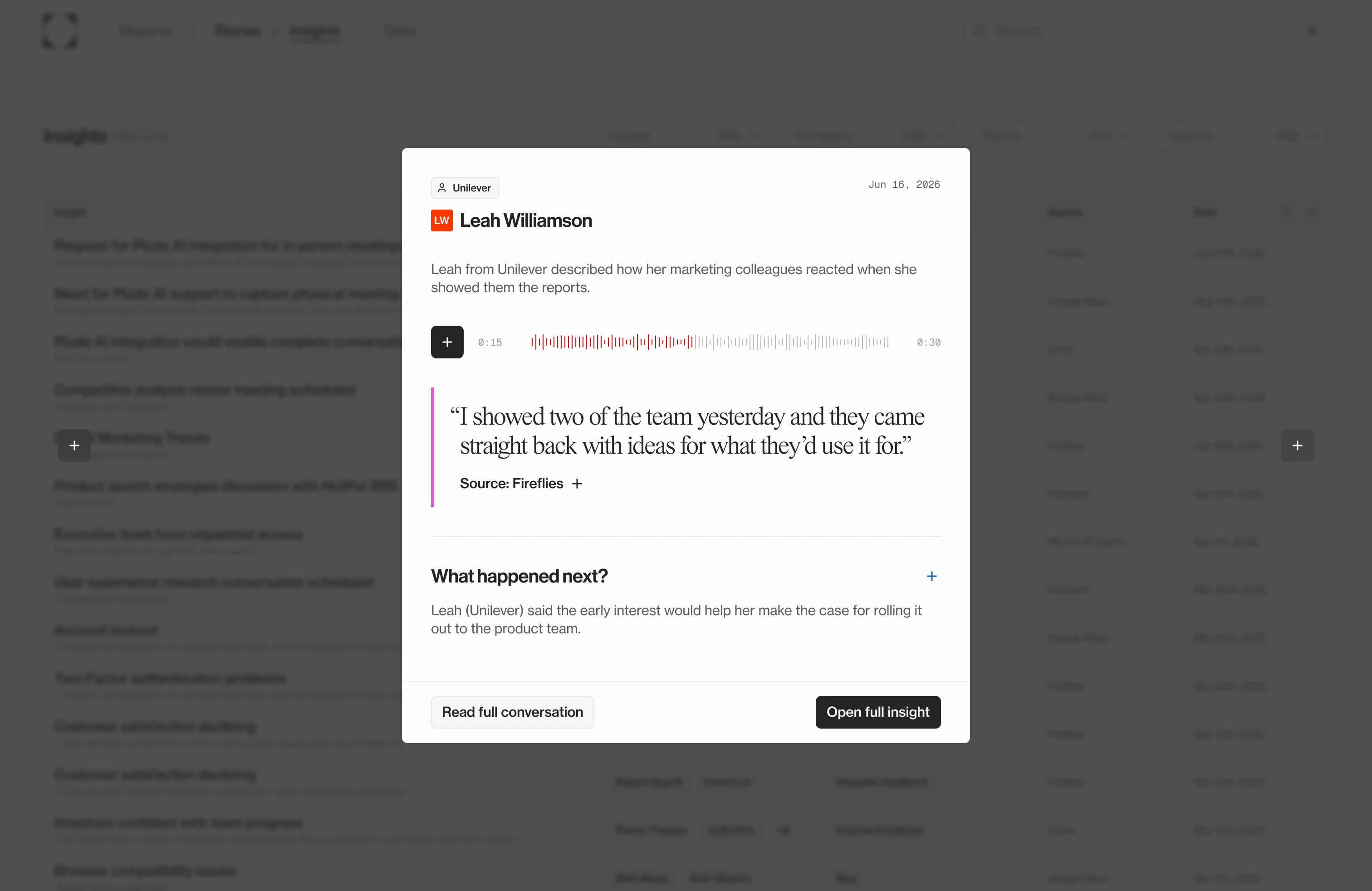
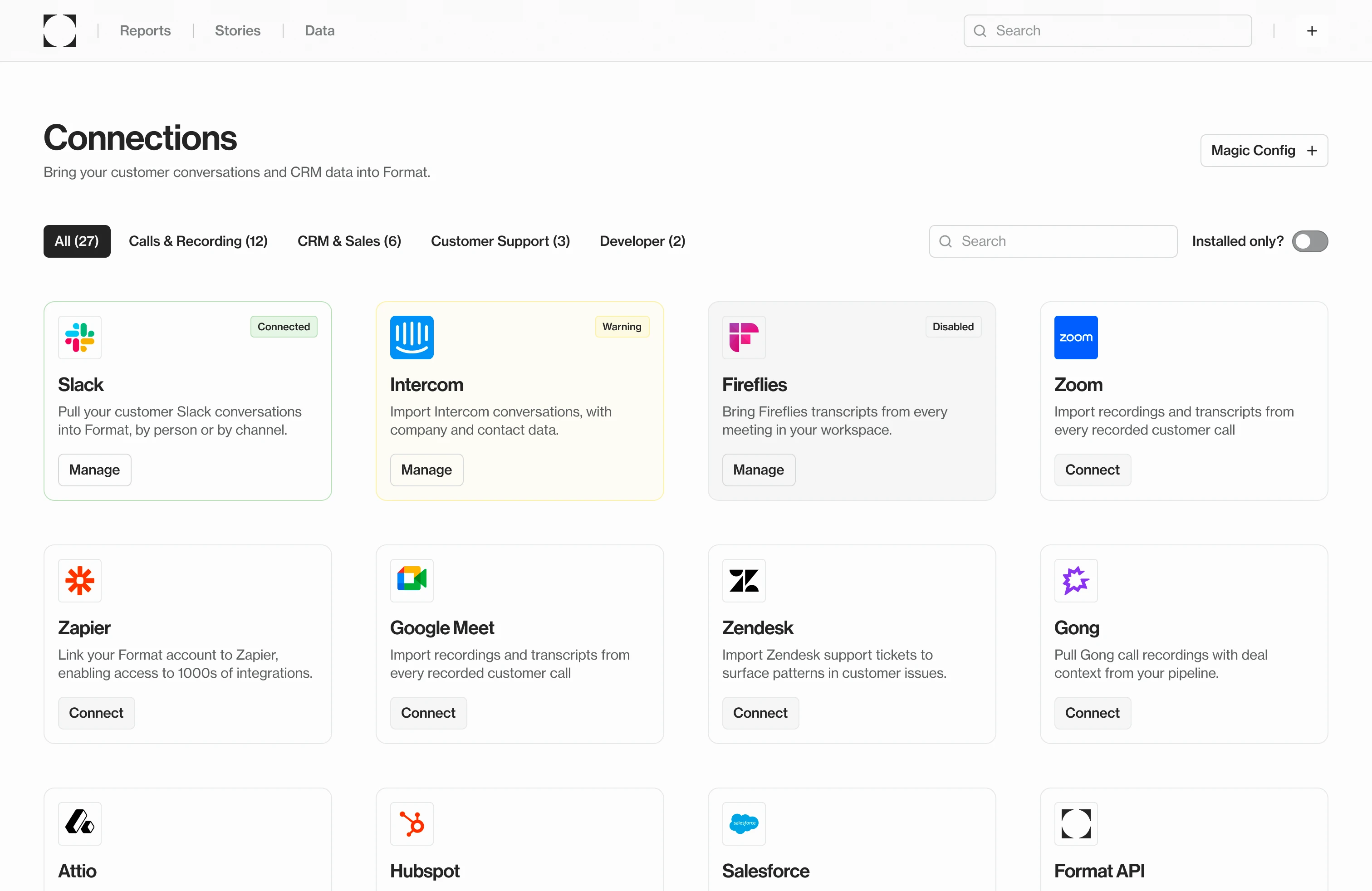
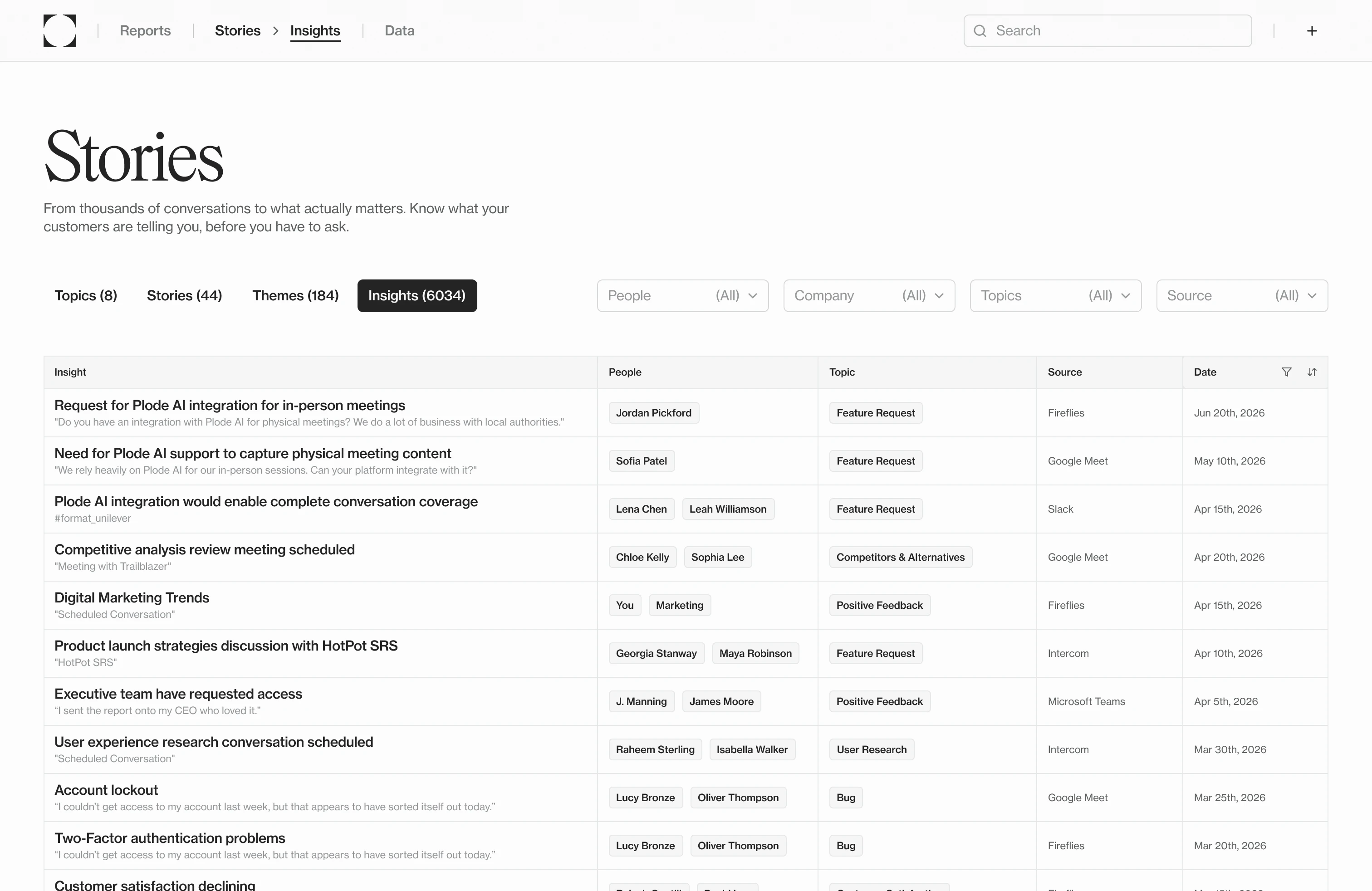
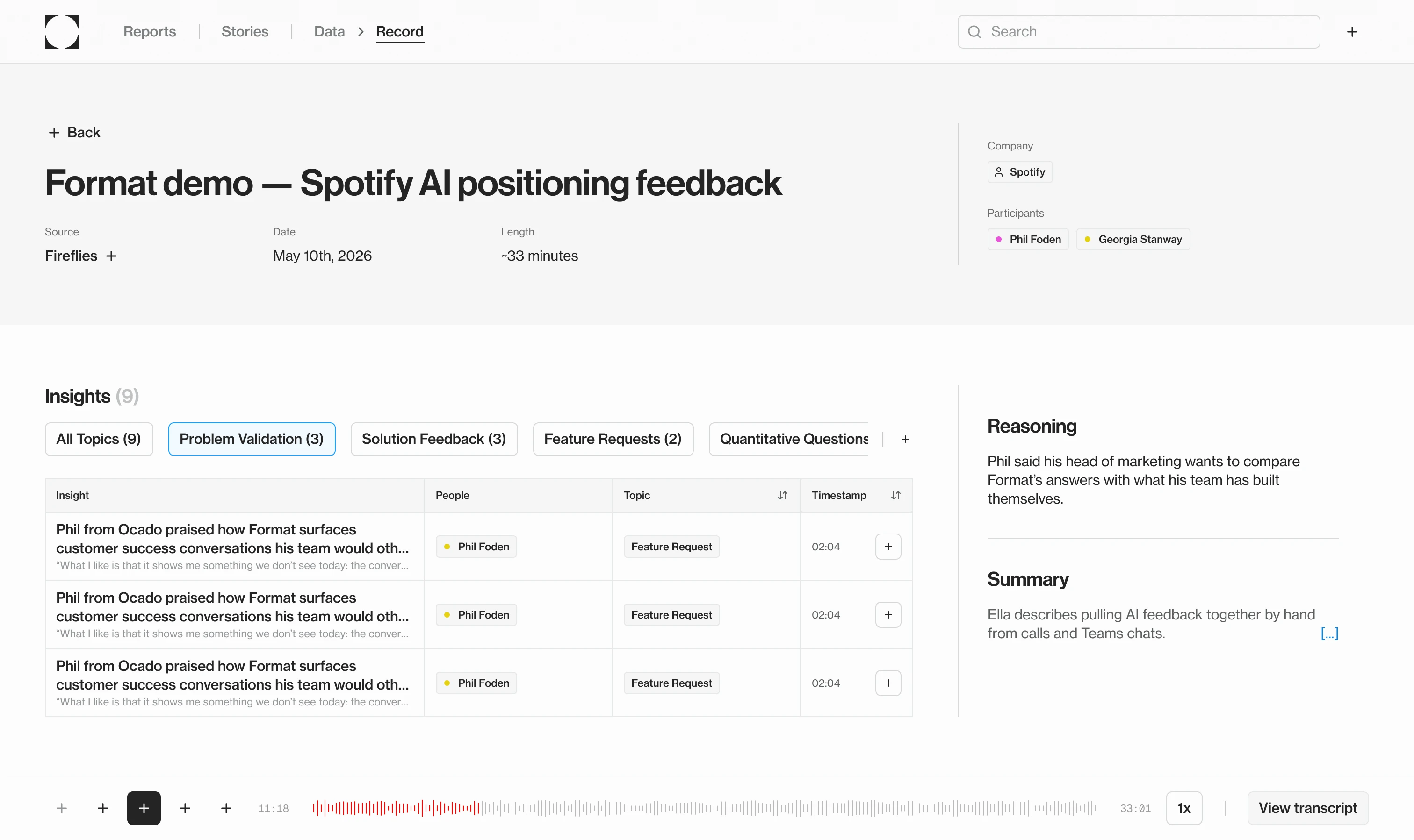
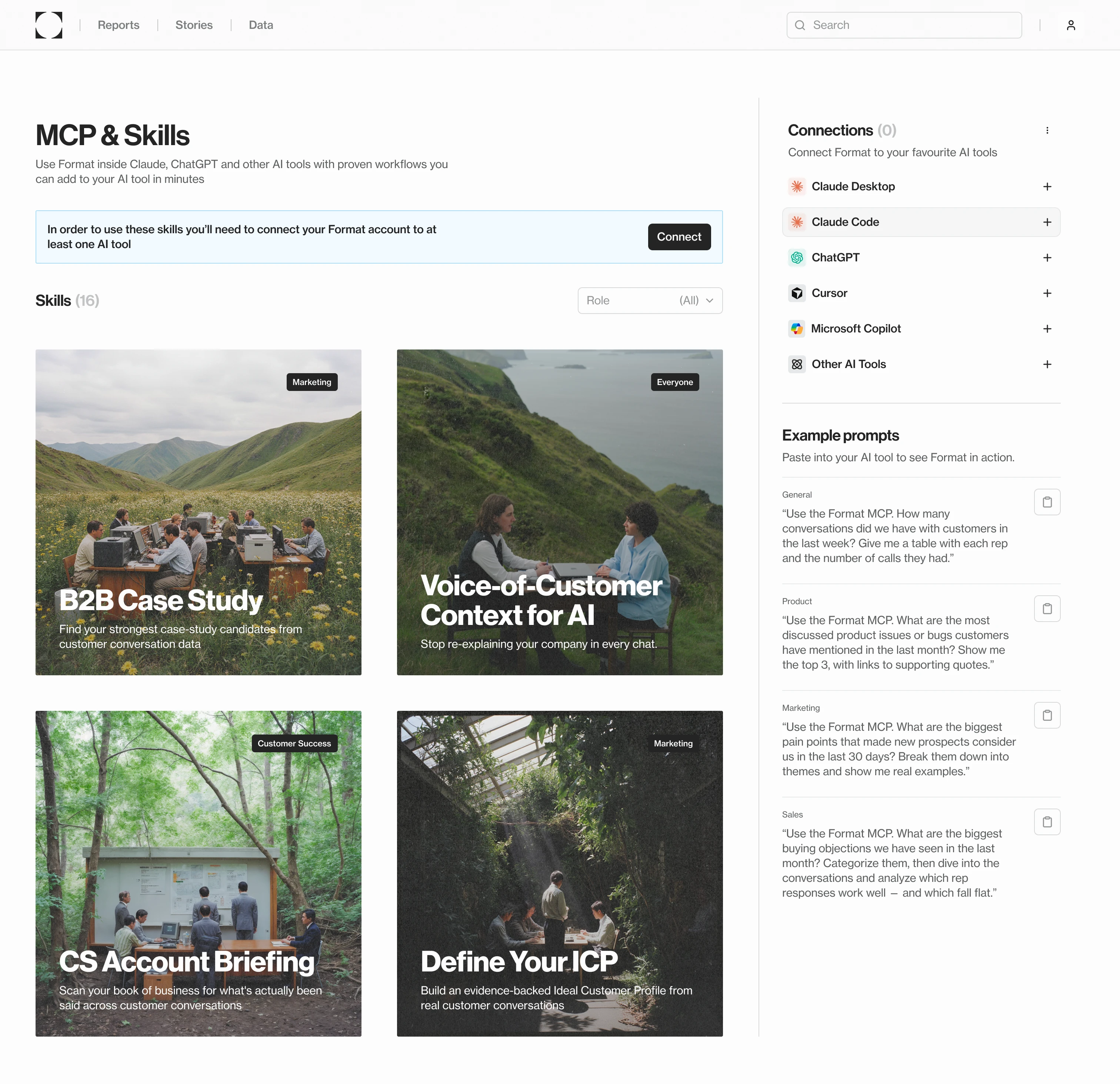
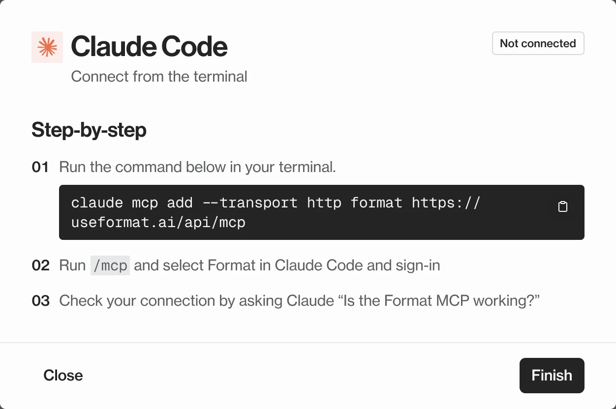
Martin soft-launched Format’s MCP page on 10 June, built around the setup steps. I redesigned it around what you’d use it for: skills, each a ready-made workflow like finding case-study candidates or briefing an account, with the setup for each tool a click away. Before it launched the week of 23 June, I QA’d the build and logged 31 issues, from a dialog with no way to close it to tabs a screen reader couldn’t reach.
Outcome:
75% of Format’s users connected Format to an AI tool.
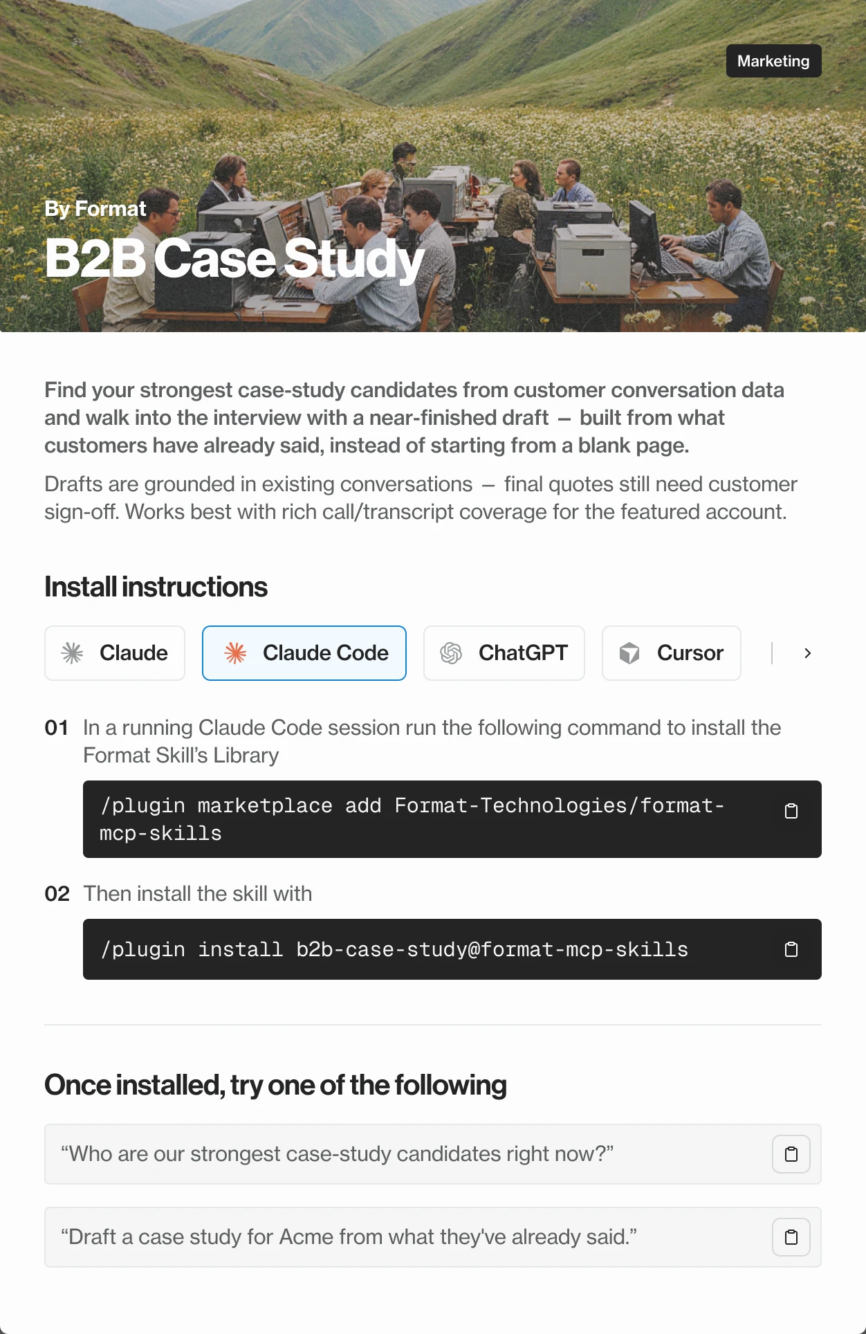
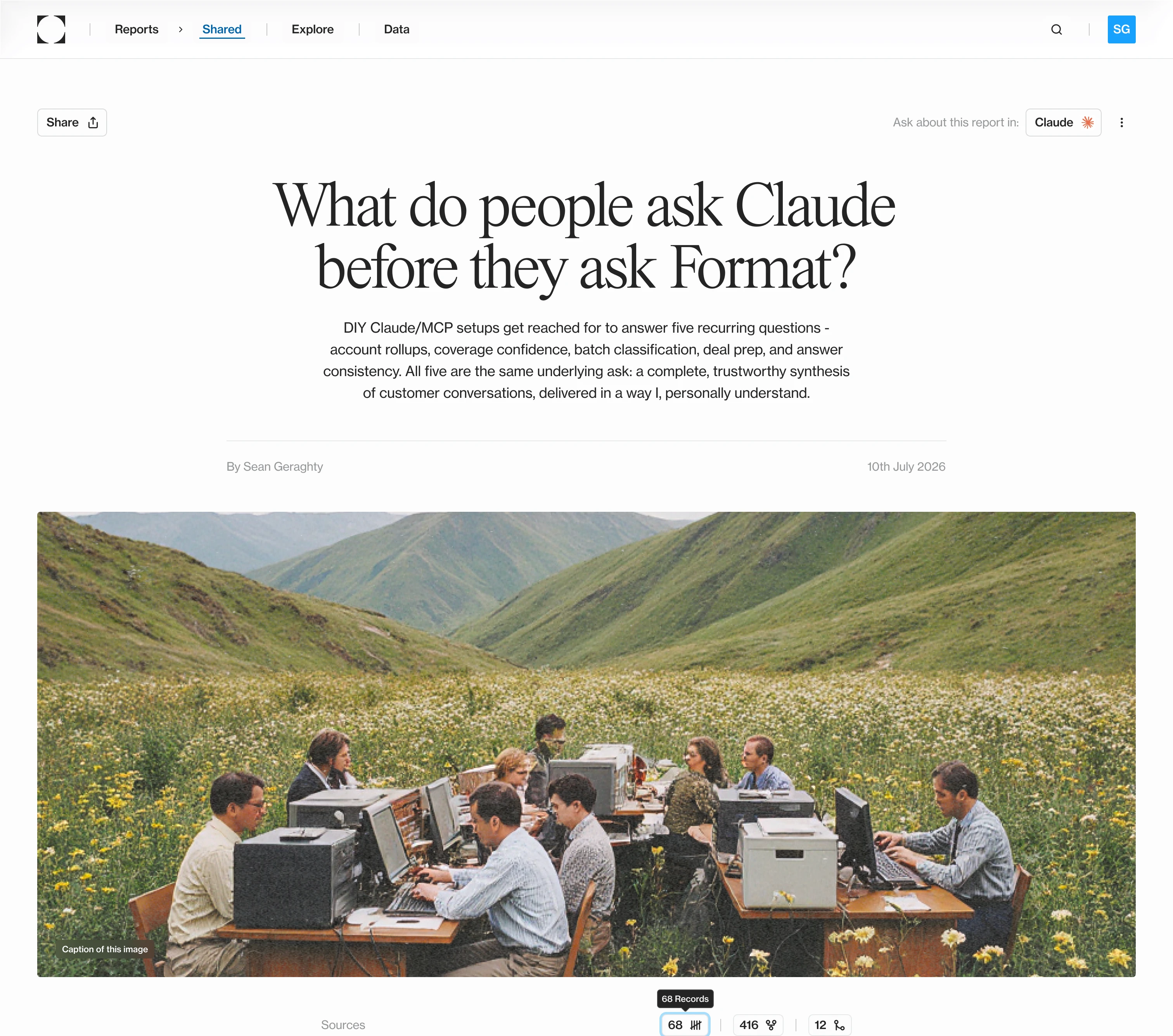
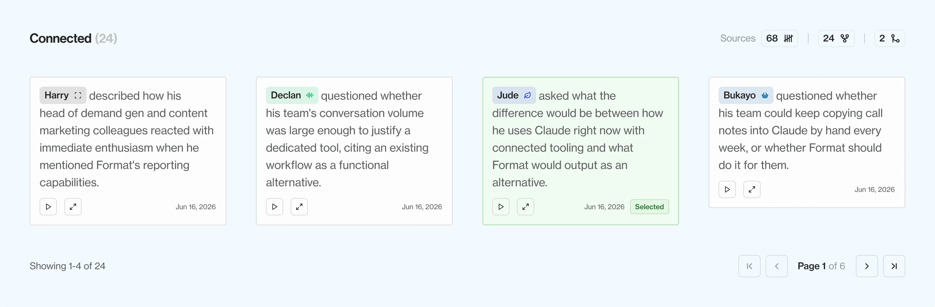
In July, before we decided what Format’s reports should say, I wanted to know what customers were already asking it. So I used the product to find out, through Claude, and asked it two ways which customers were stitching their own tools together to get answers from their data. Format’s own summary said 4, and called the theme dormant since January. Pulling the raw insights and grouping them by company found 59, and a customer had raised it that month.
The model wasn’t the problem. Those insights were filed under a topic that had since been archived, and Format’s answers only counted active topics, which held 28% of everything it had heard. The wrong number was bad. That nobody could tell it was wrong was worse.
4in Format’s own answer
Which called the theme dormant
59companies had raised it
Counted insight by insight
28%of what customers said
Under topics Format still counted
I wrote that research up as a report through Format’s MCP, in the report design I was working on: sources counted, every quote a click from its conversation, the insights it drew on underneath. Then I used it to make the case to the team for reports that show their working, and for how we could sell it. The product doing the exact job the report was arguing for.
Reports are shared as links, too. Whoever opens one can take it into Claude or ChatGPT with one button and keep asking, so the product shows what it can do before anyone has set it up.
When I arrived, the codebase had a set of colour tokens nothing used yet, colours that hadn’t been graded into ramps, and about 65 stock shadcn components. I replaced them with five OKLCH hue ramps and an eleven-step neutral with a cool tint, in two layers: primitives for the raw values, and semantic names the components use.
Figma holds the same two layers as variables, so a colour has one name in both places. The rule between them is short: code owns structure and behaviour, Figma owns visual values, so an argument is settled before it starts.
Format’s team, me included, wrote most of the code with AI agents. The agents are quick and confident, and they’ll tell you a change worked when it didn’t. So I wrote the loop every component went through: read the rules and every past mistake, take the values from Figma rather than a screenshot, build with tokens only, then check what actually renders in the browser against the design.
An agent got three tries to match the design before the component came back to me, and nothing shipped without my sign-off. The last step writes down what went wrong. When the Button came back with 8px of padding instead of 12, that became a rule every later build read first.
design-system-rules.md
learning-log.md
Icon stroke width
Set by reasoning from the code, not by looking at the rendered SVG.
Rule: check what renders before calling an SVG change done.
Read every rule
And the log of past mistakes
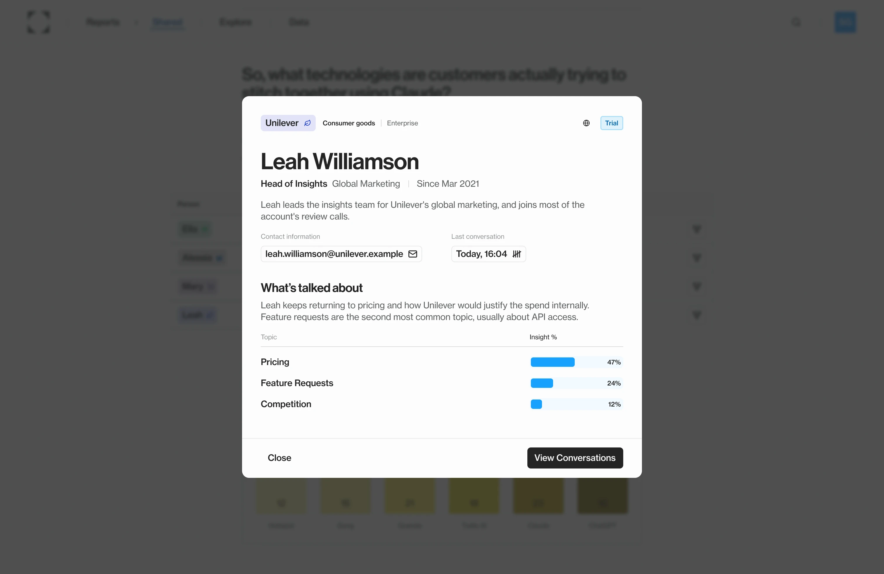
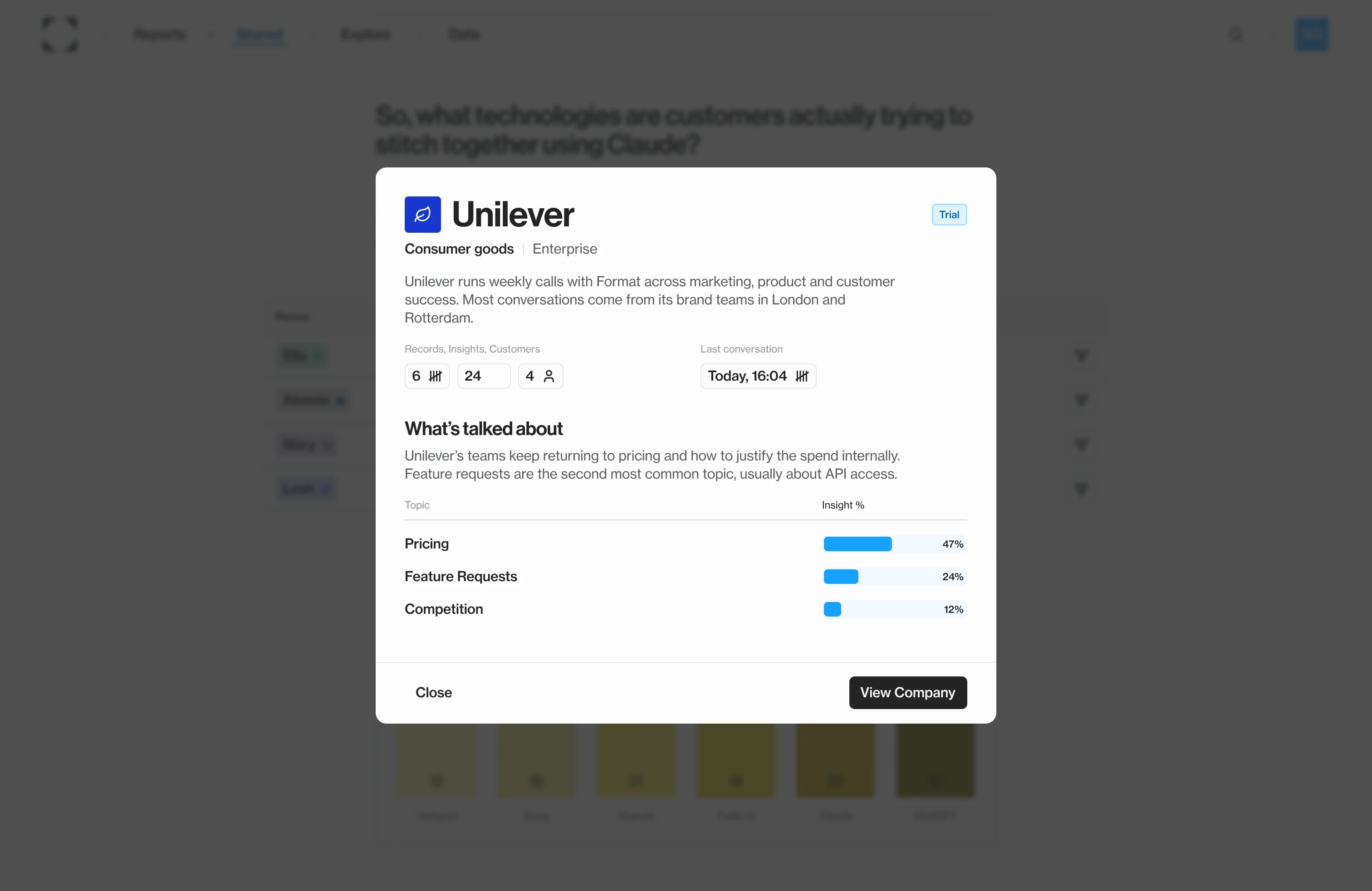
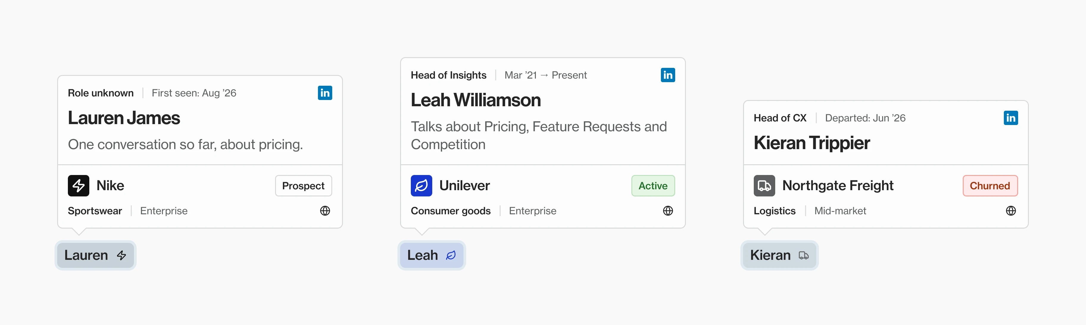
Spotlight is the card behind every name in a report. A mention carries the company’s logo after the person’s name, so one chip says who and where, and hovering it opens the card with the rest. Design was due on a Tuesday, engineering on Wednesday and launch on Thursday, the week of 10 August.
The card was the brief. But cards only appear where a report mentions someone, and mentions were only generated some of the time. A well-designed card in a report with no mentions ships to nobody. I flagged it to engineering, and spent the design time on what the card had to survive.
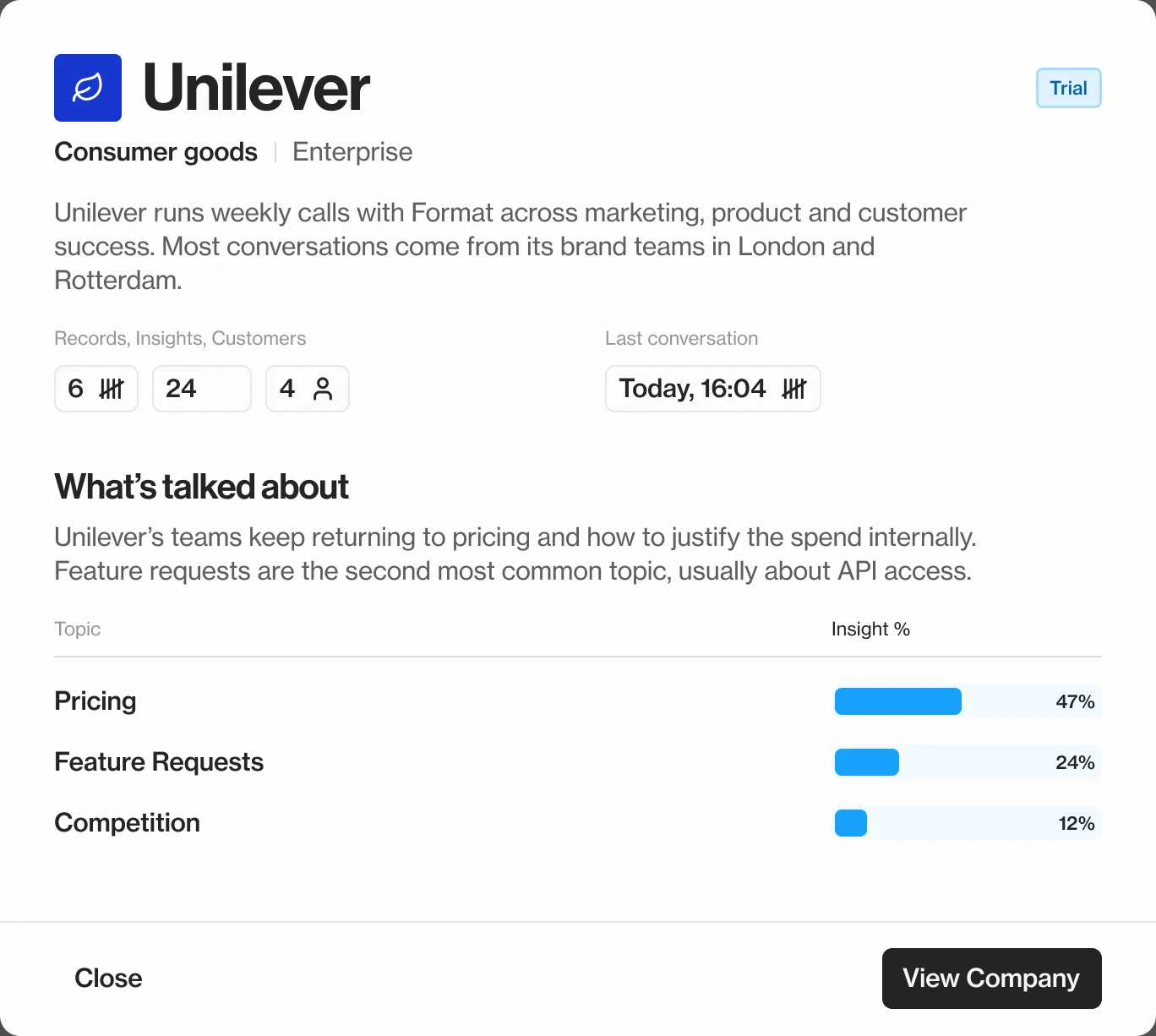
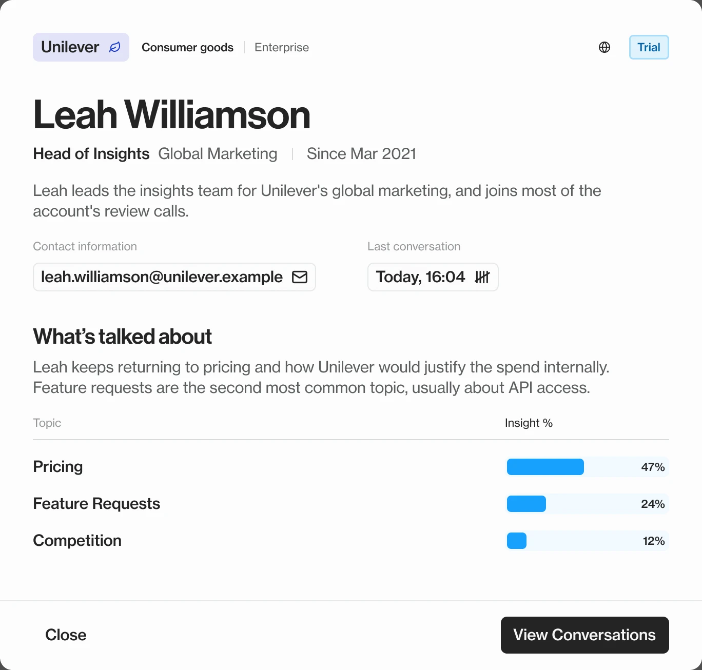
Most cards wouldn’t be complete. There might be no data yet, only some of it, data below the confidence threshold, a person we couldn’t match, someone who’d left or a fetch that failed. Partial was the most likely state, so it had to look designed, not broken. I designed those states in code, straight into the component, rather than in Figma.
I also proposed bringing mobile into scope, because people read reports on their phones. And I raised a privacy question: reports get shared outside the company, so a card showing CRM details on hover is internal data leaving the building.
“We brought Sean in to help us build the platform UI end to end, and he helped us ship 15+ pages. A big part of that was building out the design system and then pushing us to actually stick to it as we built things out. He also kept pushing for simplicity, boiling things down to what users actually needed to see and do.”

Martin DreymannCo-founder & CTO, Format
On the side, I built a 3D prototype in Claude Code to work out how you might see what an AI answer is built from. Quotes cluster into themes, themes into trends, and clicking one lights up the evidence behind it while everything else dims.
It never became a feature, and it wasn’t meant to. It was a way to start a conversation about trust, and the team used it to see how their own data connected. The data here is invented, so it’s yours to explore below.
By the time I wrapped up in August 2026, the record and insight pages had gone from no usage to a third of all usage between them, with reports still the most visited. Customers weren’t just reading reports any more. They were checking what was behind them, and that’s the direction I’d keep pushing.
What’s next:
Two things decide where it goes from here. The first is measurement: agree the two or three numbers a change should move before designing it, rather than counting afterwards as we did. The second is correction. Customers expect an edit to an AI answer to stick, while Format was built to fix the input and let the answer change. Settling that is what turns reports people can check into reports they’ll act on.


