

The Steep Club

Food & DrinkD2CBrand LeadSep → Nov ’22

Packaging that tells the time

In autumn 2022 I branded The Steep Club, a tea subscription sold direct to customers, for its founder Heather Melcer. She wanted a tea brand for Millennials and Gen Z that looked nothing like the ones already out there. There were two ranges, Rise to wake you up and Unwind to settle you down. Could they look like one brand and still be told apart at a glance?

Highlights & Outcomes

2 rangesRise and Unwind

1 gridon every pack

1 differencethe colour
Skills

  • Brand
  • Packaging
  • Art Direction
  • Typography
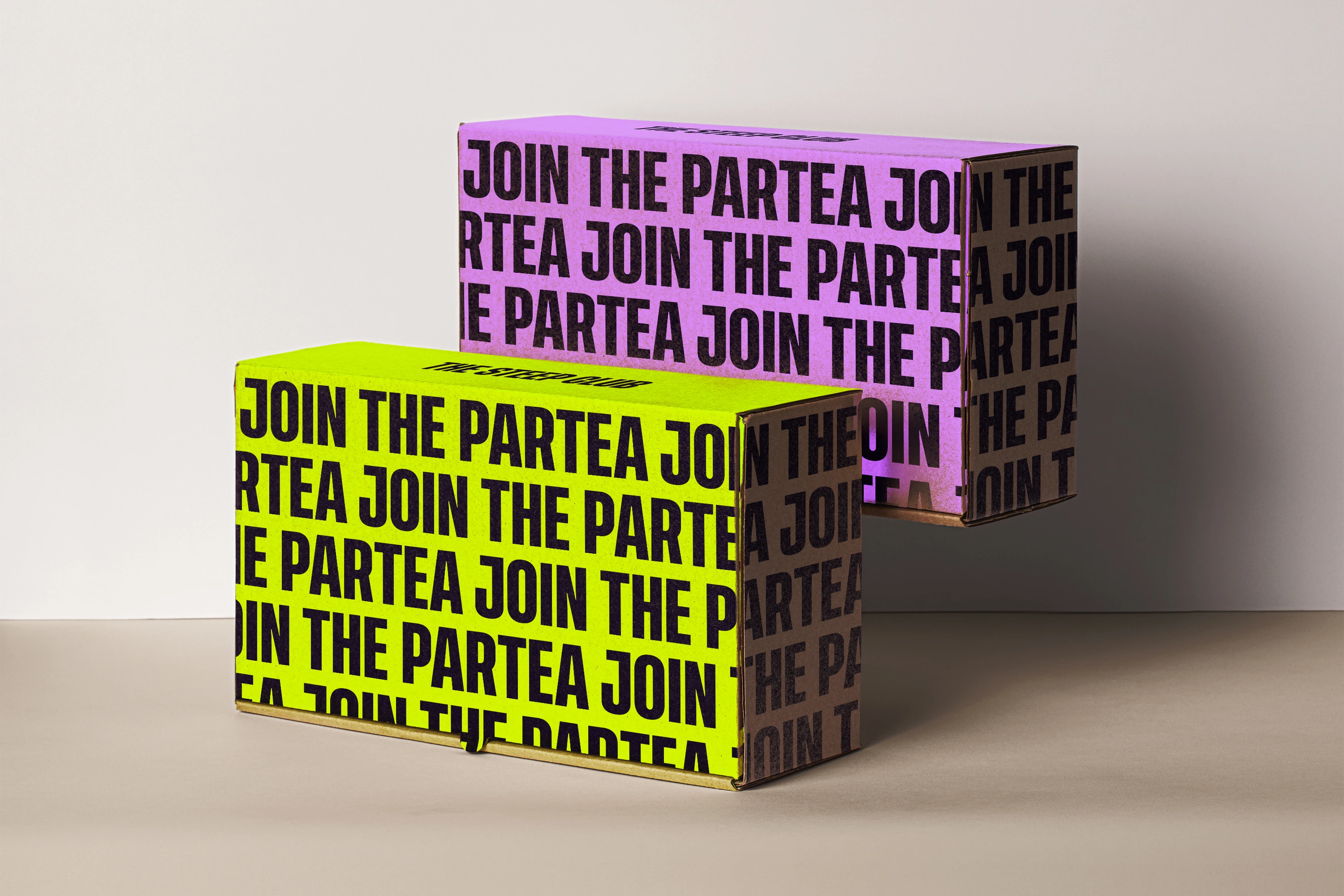
Two Steep Club shipping boxes stacked on a table, one acid yellow and one purple, each covered edge to edge in “Join the Partea” in heavy black capitals

Steeped, Not Brewed

It turns out tea isn’t brewed, as I’d always thought. It’s steeped. Brewing keeps the water on the heat. Steeping takes it off and lets the leaves soak until their flavour comes out.

So the brand draws out what’s inside too. You know what’s in the box before you’ve read a word, and whether you’re reaching for morning or night.
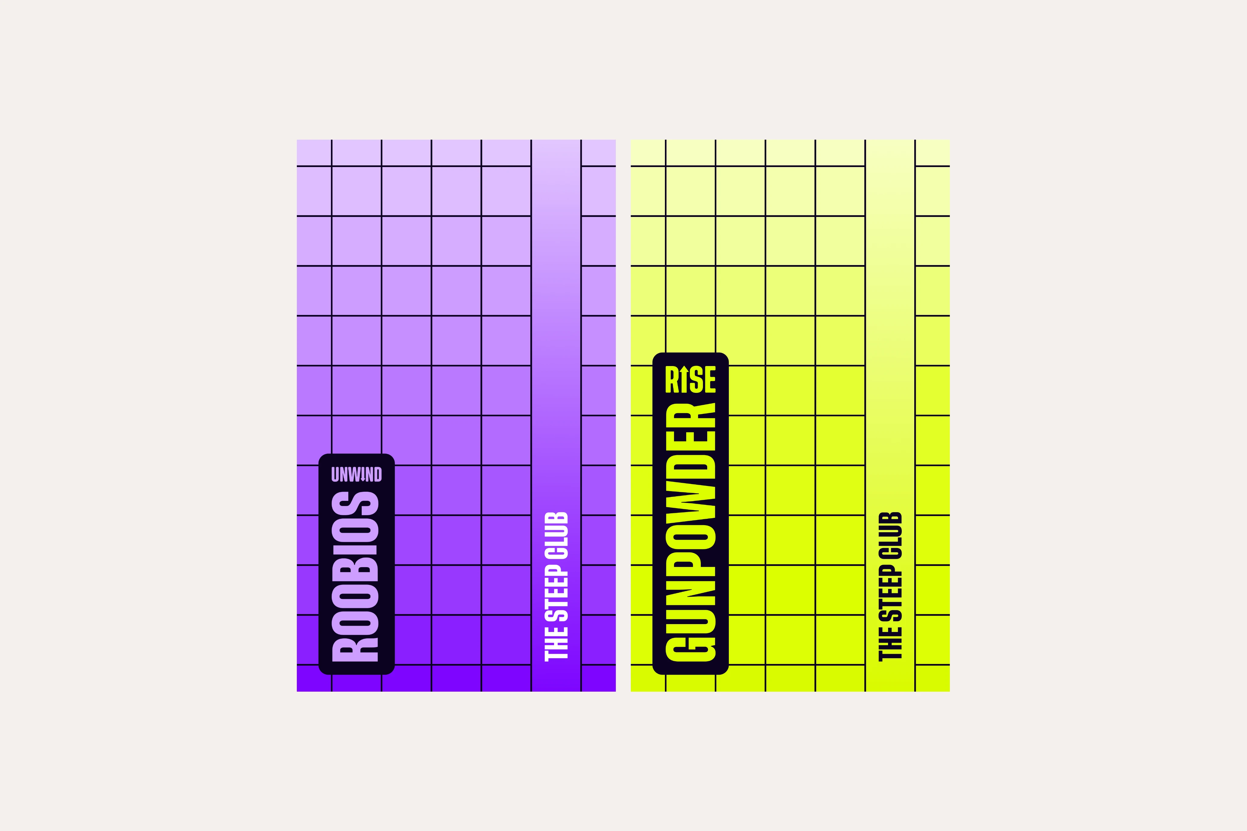
The Unwind and Rise packs laid flat on cream: a black grid over a gradient, pale lilac deepening to violet for Unwind, pale yellow deepening to acid yellow for Rise, each with the range and the tea’s name in a black tab up the side

Playing Around

Before any of that, I played. The name stacked three ways, the letters of TEA turned into a pattern, and that pattern tried in three colourways to see which held up.

For a while the ranges were Midnight and Energise, in plum and orange. Most of it never made the packs. The heavy capitals did.

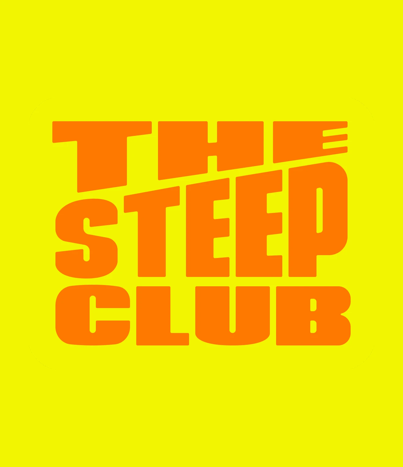
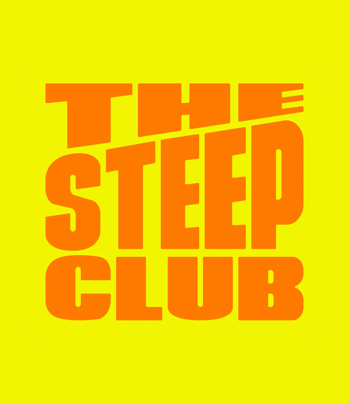
An early Steep Club logo: “THE STEEP CLUB” stacked in heavy orange capitals on yellow, the top line slanting up to the right
Another version of the stacked logo, orange on yellow
A third version, with the letters set taller so the three lines fill more of the square
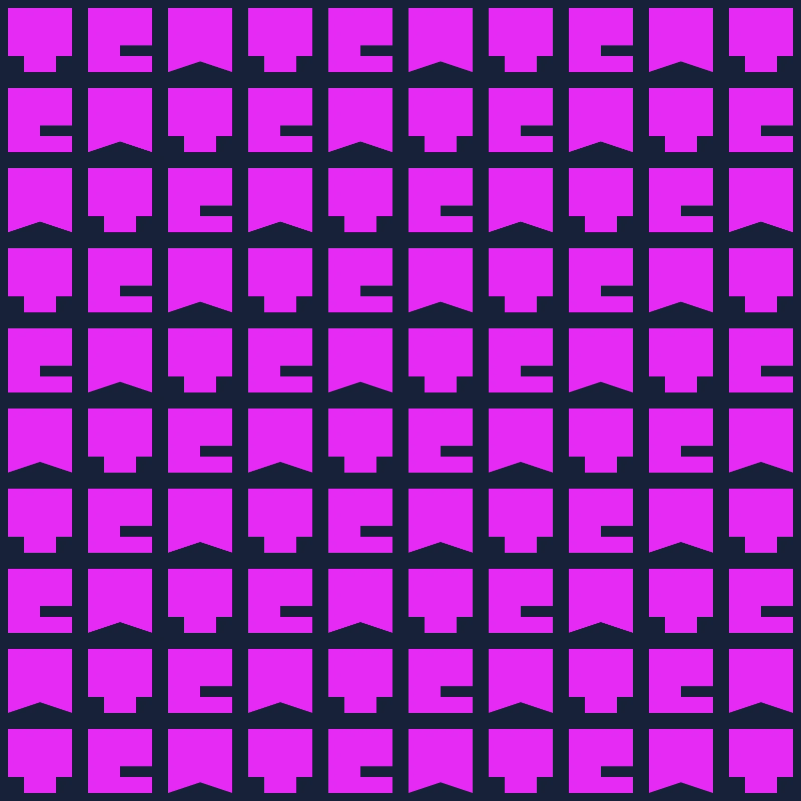
A pattern built from the letters T, E and A, interlocking in rows, magenta on dark navy
The same TEA pattern in navy on near-black, the letters only just visible
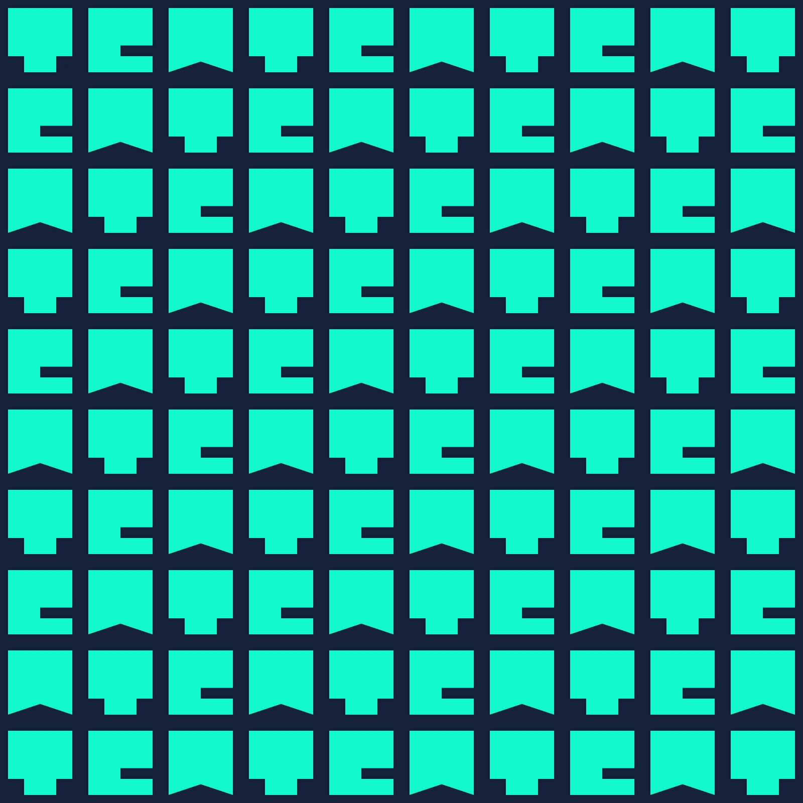
The TEA pattern in bright teal on dark navy
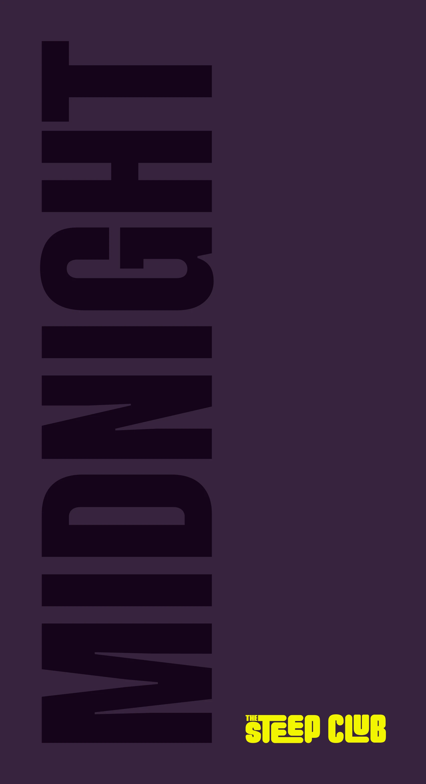
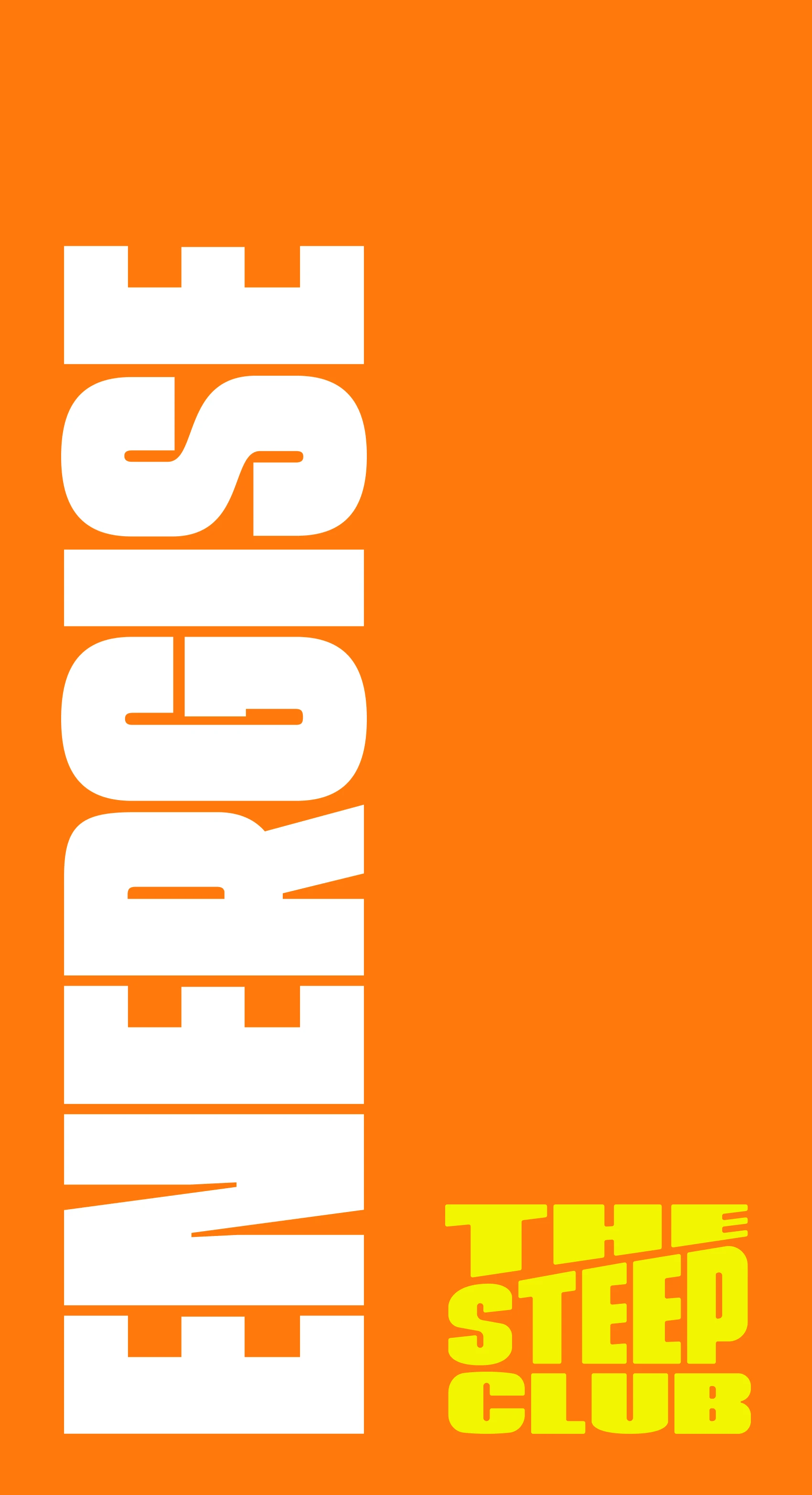
The foot of the Midnight pack from the earlier naming: “MIDNIGHT” running up a dark plum pack in heavy black capitals, a small yellow Steep Club wordmark beside it
The foot of the Energise pack: “ENERGISE” running up a bright orange pack in heavy white capitals, the Steep Club logo stacked in yellow beside it

Rise and Unwind

The two ranges do opposite jobs. They had to be different enough to tell apart, and close enough to read as one club. So I gave both the same pack: a grid with a gradient running down it. Together they stand for time passing, which is the one thing that separates a morning tea from a night-time one.

The colour is the difference. Rise’s gradient runs to acid yellow, a nod to the morning sun, and Unwind’s to purple, for the night drawing in. Everything else stays the same, down to the black tab the tea’s name sits in.
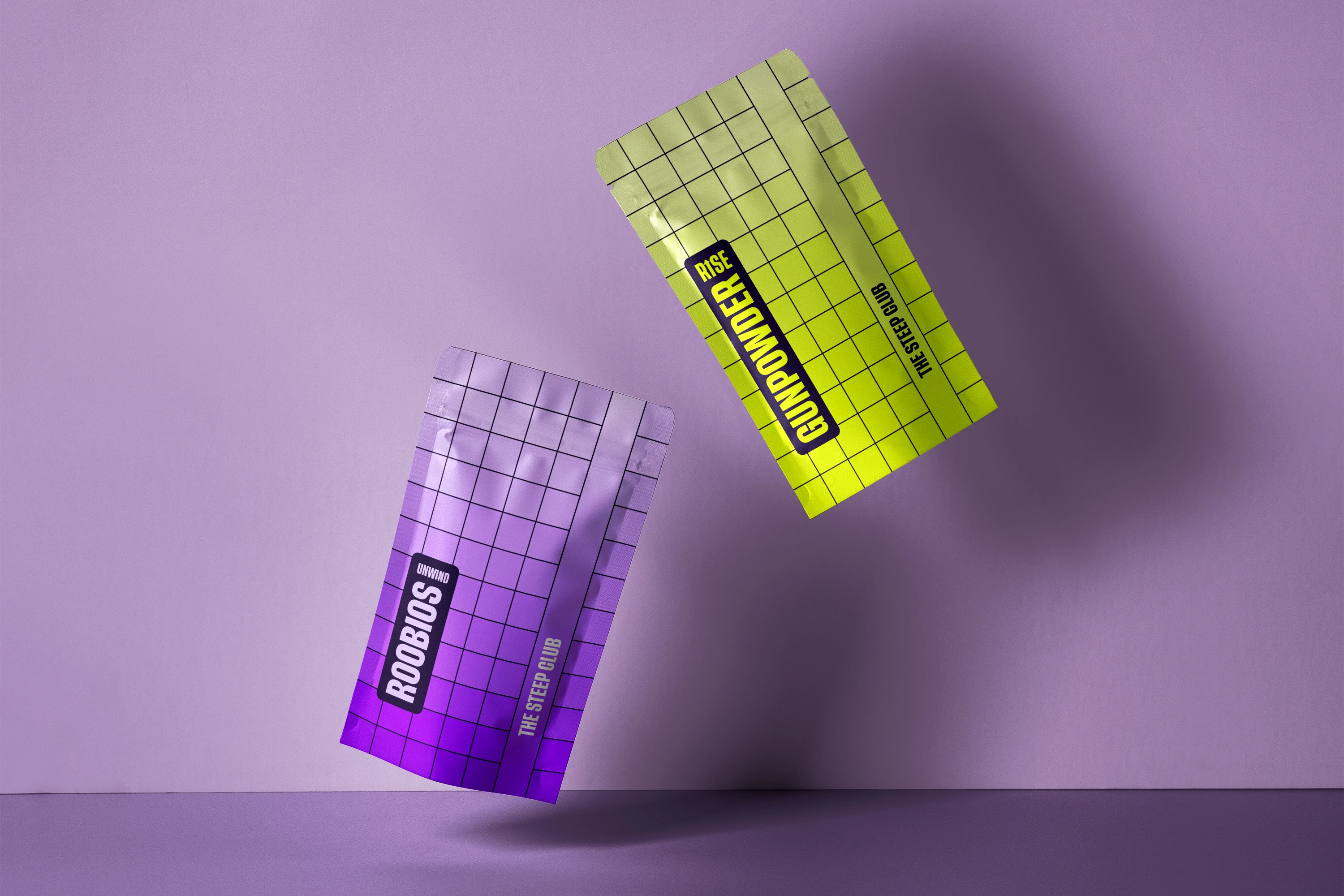

A purple Unwind pouch and an acid yellow Rise pouch falling against a lilac wall, both printed with the same black grid
A purple Unwind tea tin on a purple background, the gridded gradient running round it and the Unwind name in a black tab
A purple “Time to Unwind” sticker seen half through a sheet of reeded glass, the letters breaking up behind the ridges

Join the Partea

The type is Thunder, a heavy condensed sans set in capitals, big enough to fill the side of a box. On the shipping boxes, “Join the Partea” repeats until it runs off every edge. On the packs the type turns on its side.

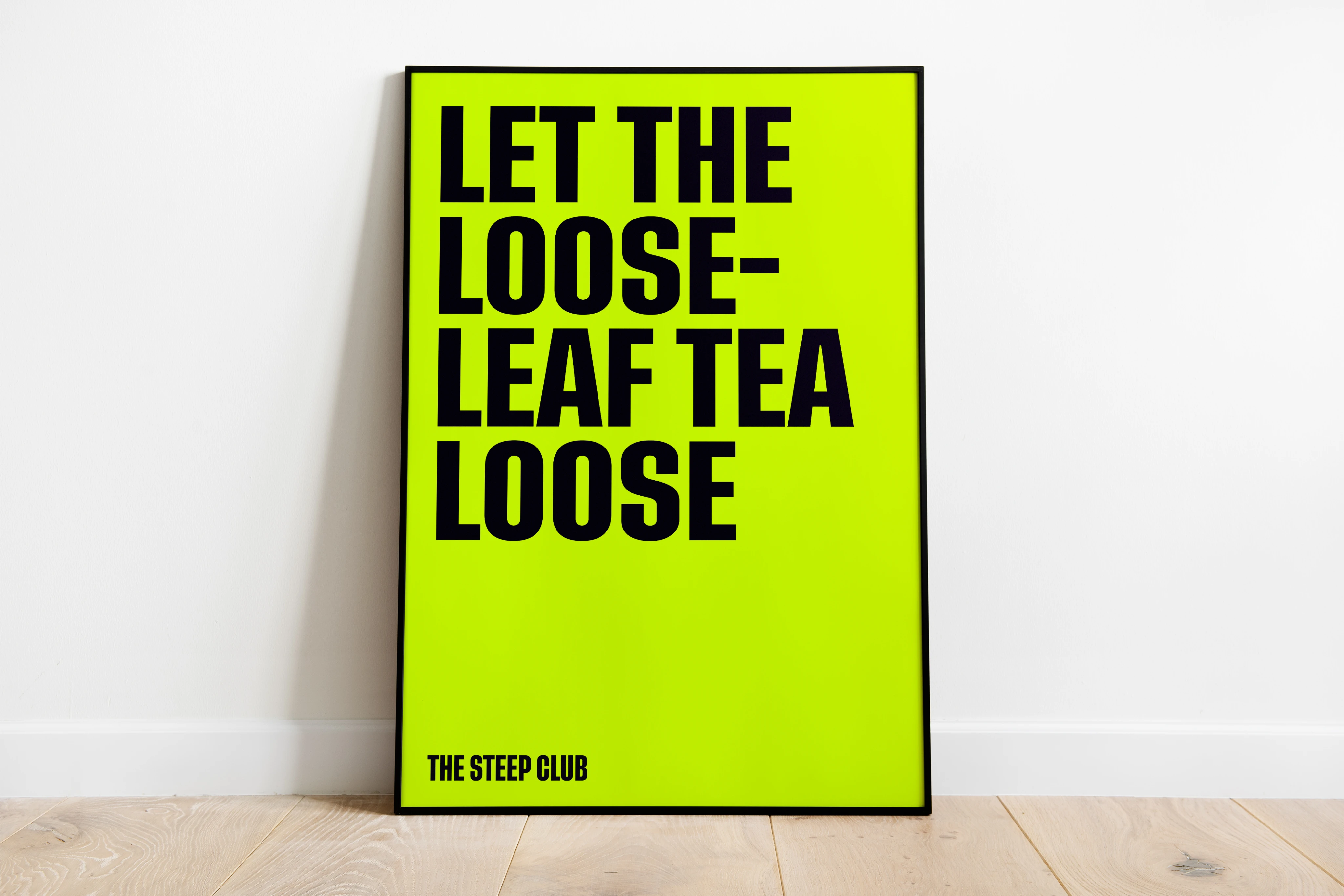
I wrote the rest of the copy as the same kind of joke: “Smells like tea spirit” on one poster, “Let the loose-leaf tea loose” on another, and “Brew can do it” along the packing tape.
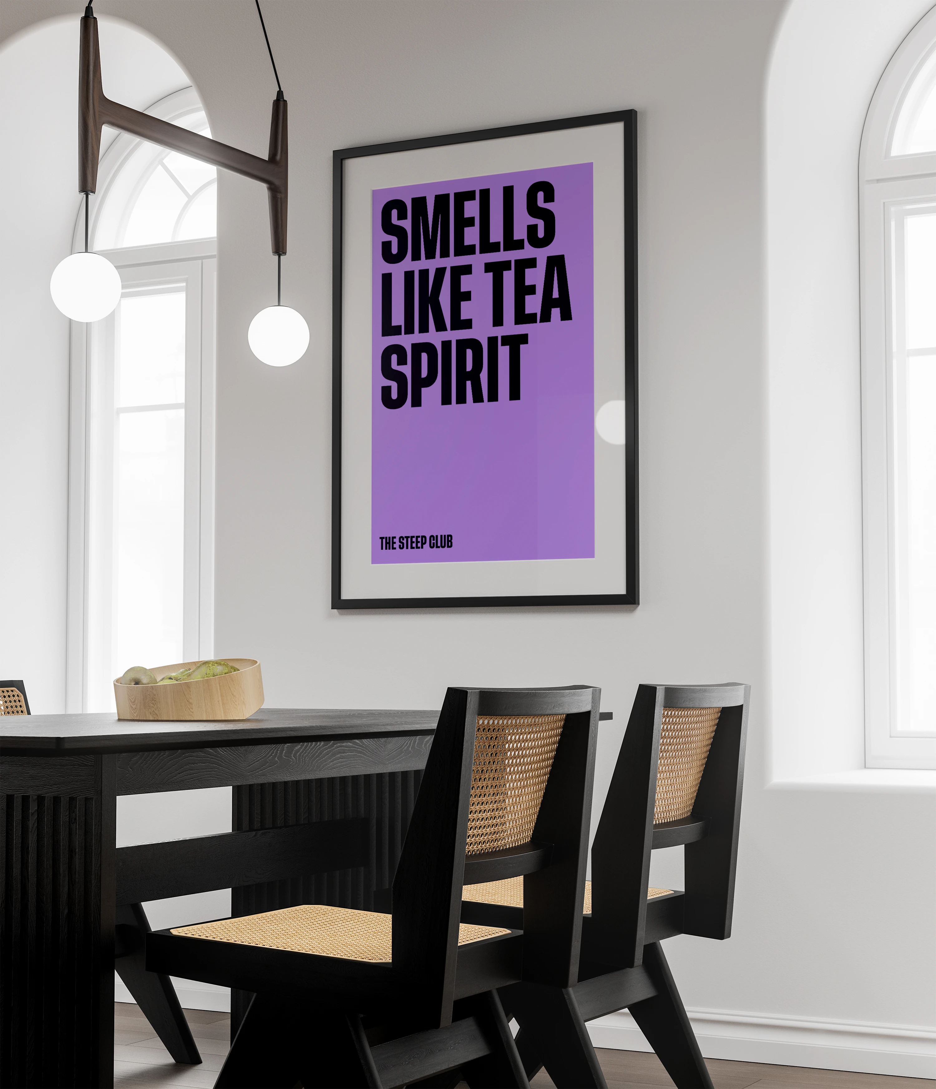
A framed purple poster, “Smells like tea spirit”, above a dark dining table with cane-backed chairs
A framed acid yellow poster, “Let the loose-leaf tea loose”, leaning against a white wall on a wooden floor

Brew Can Do It

The monthly box belongs to neither range: plain kraft card, “Your monthly tea subscription” in black, and the “Brew can do it” tape across the top in green, the one colour that isn’t Rise’s or Unwind’s.

As far as I know, The Steep Club never launched, so the packs only ever lived in mockups like these.
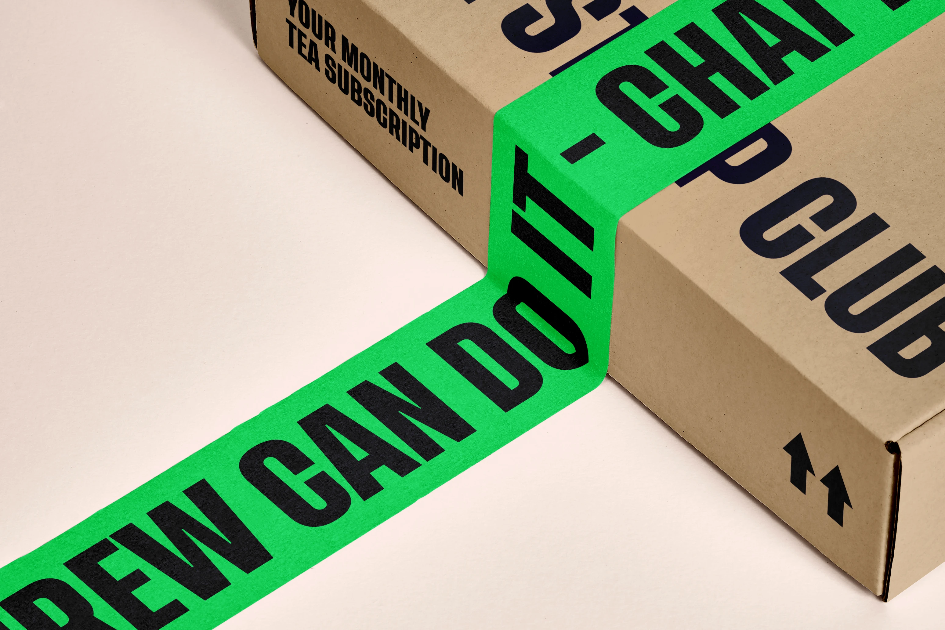
A kraft Steep Club box, “Your monthly tea subscription” printed on its side, sealed with bright green tape reading “Brew can do it”