

Next project


Highlights & Outcomes
250,000+patients supported since the relaunch
3 pillarsbehind every decision
42 pagesof brand guidelines
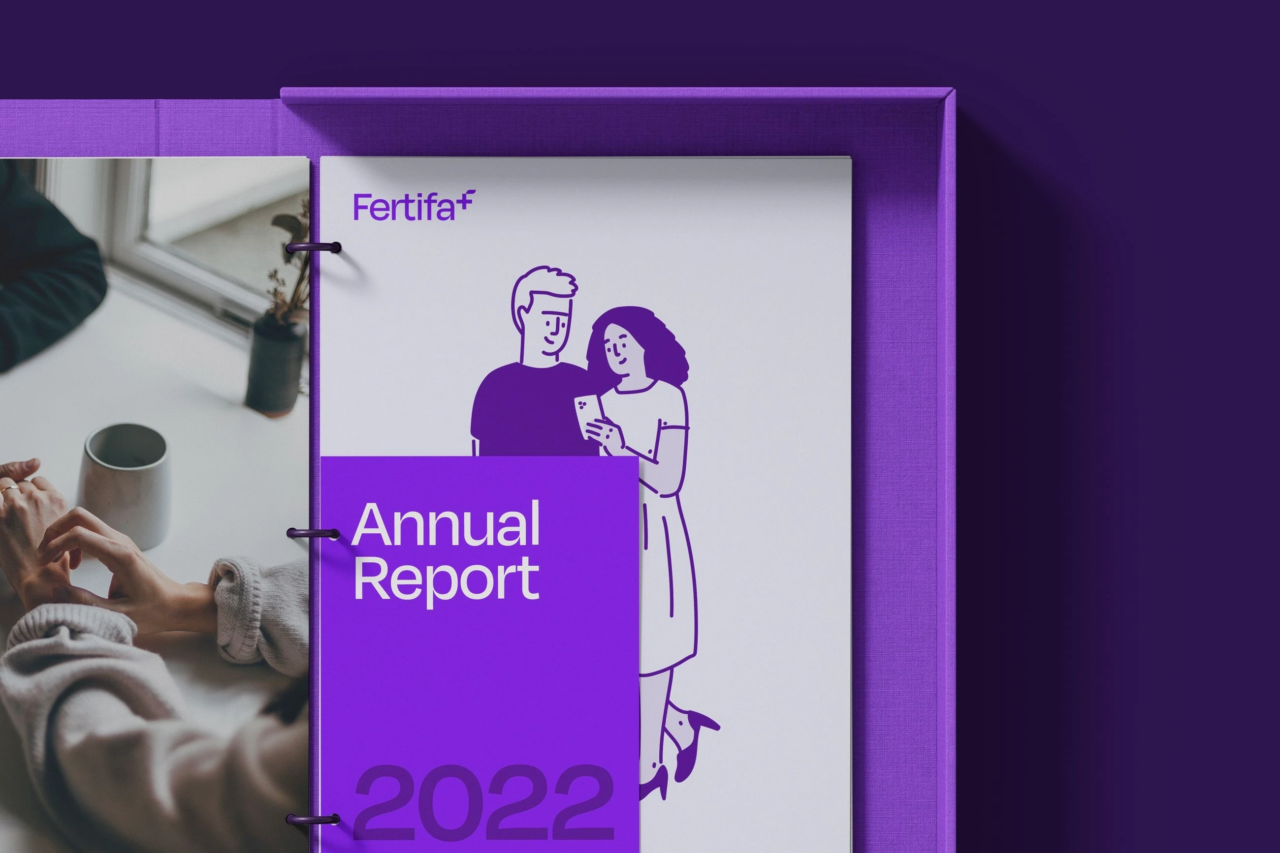
Fertifa came to me with a name and room to shape everything else. I led a design team of two, me and Sam, working alongside Fertifa’s own team. Their customers were founders, People teams and benefits leads at startups, tech companies and every kind of employer in between. The people using it were their teams.
That meant designing for two very different moments. Whatever I made had to be professional enough for a benefits review, and gentle enough for someone reading it alone, late at night.
Over four or five rounds of workshops and feedback with Eileen, Fertifa’s CEO, and Roxy, their Head of Marketing, we worked out what Fertifa stood for. It came down to the three pillars above.
Outcome:
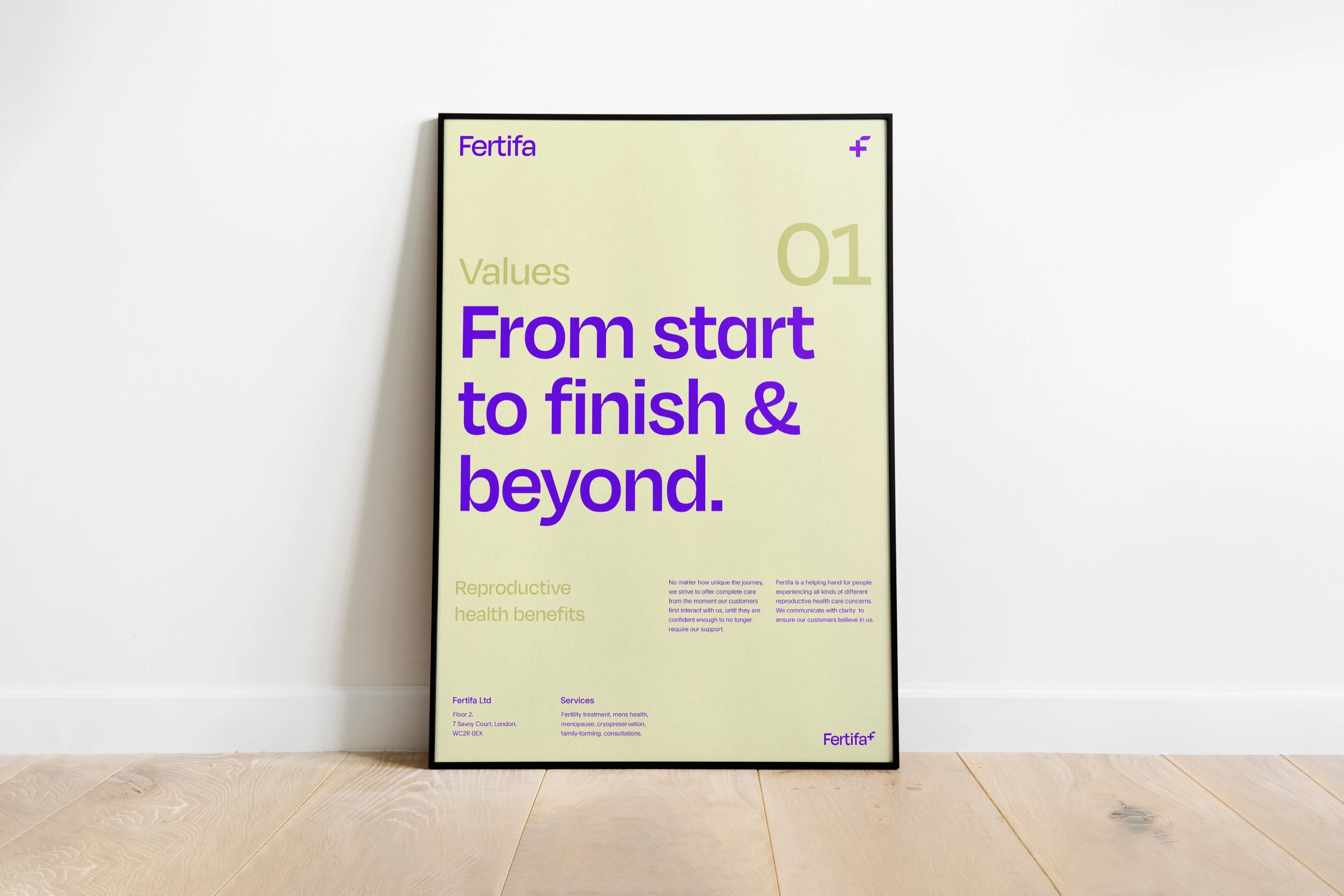
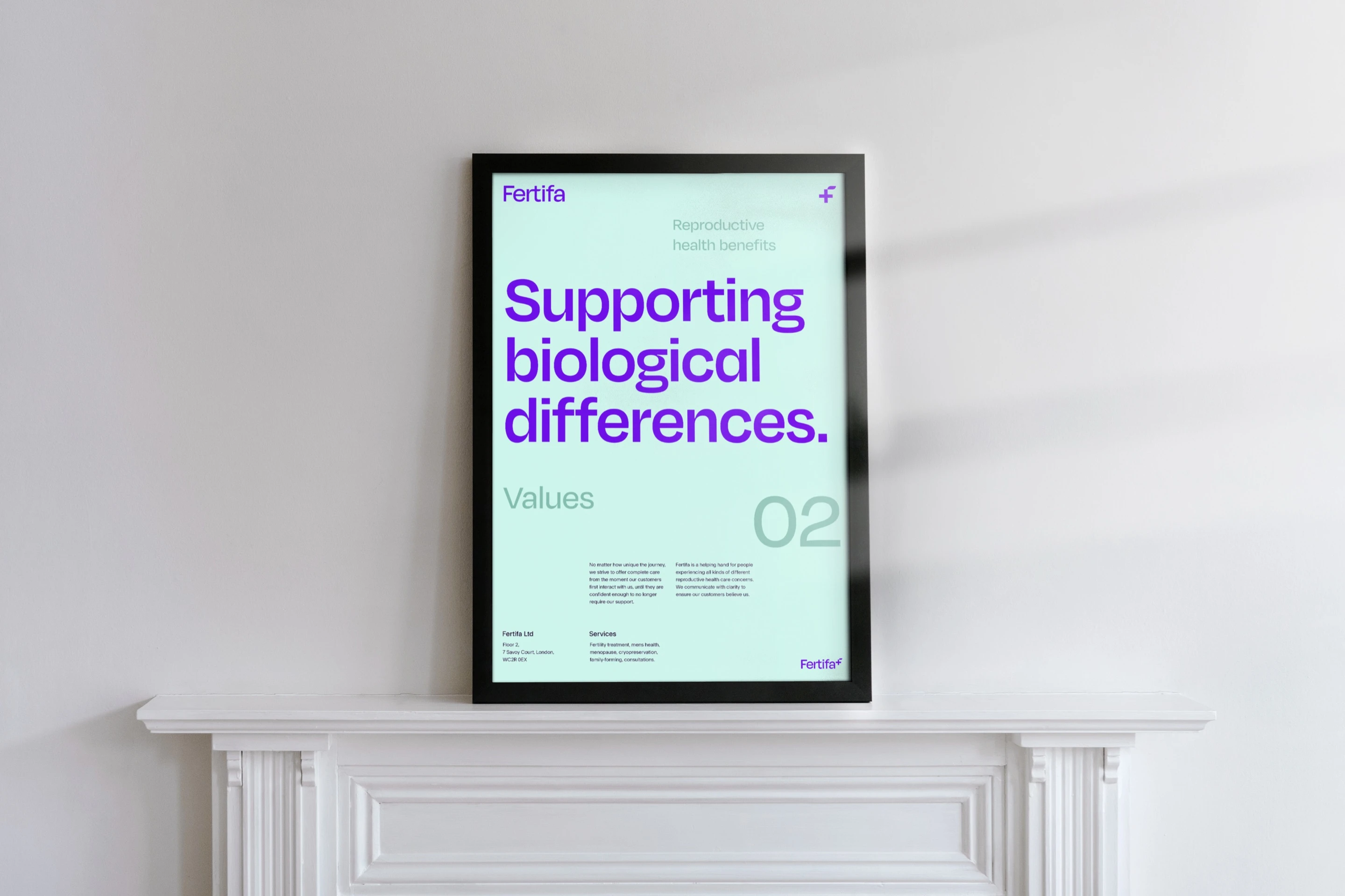
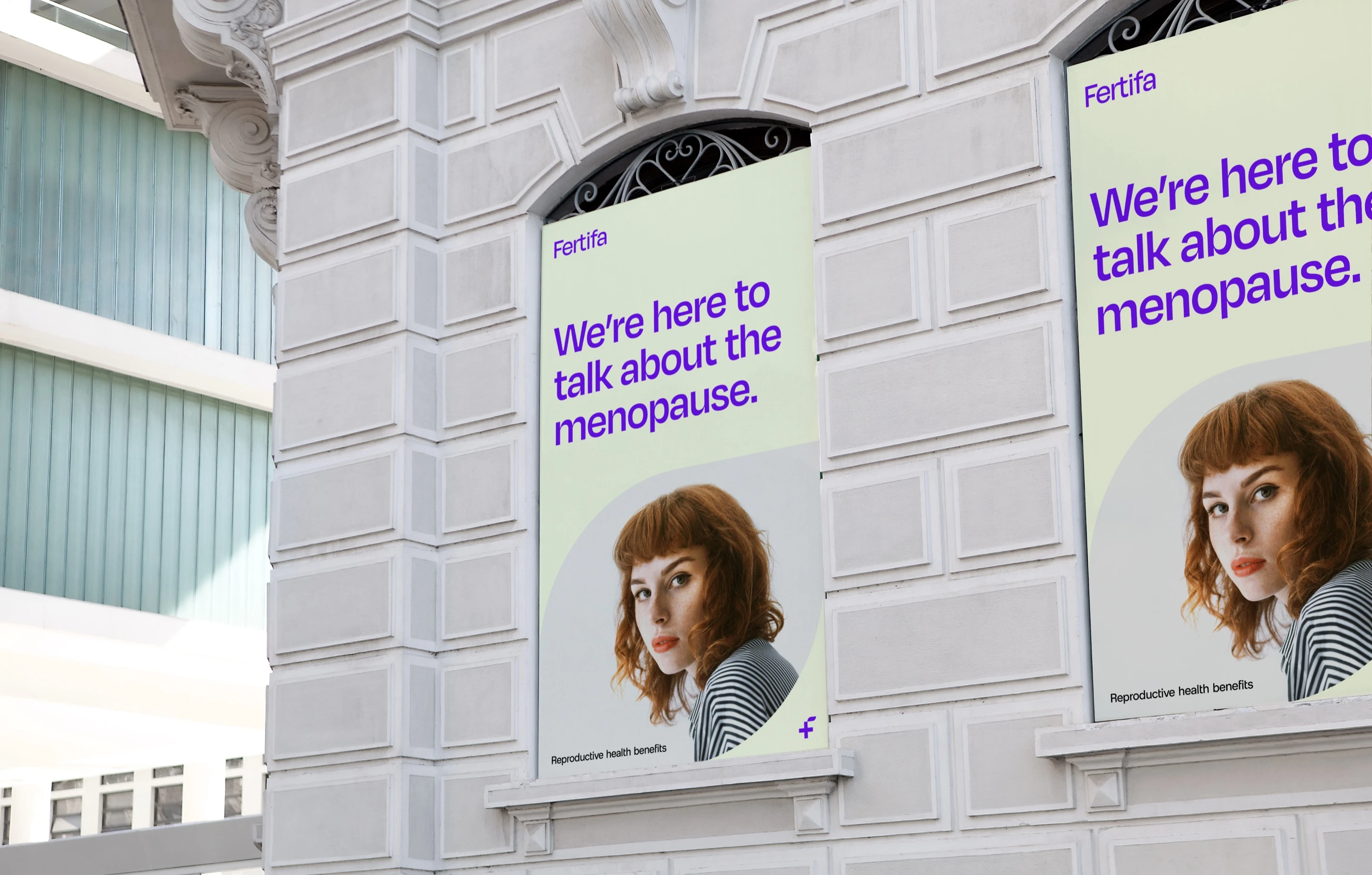
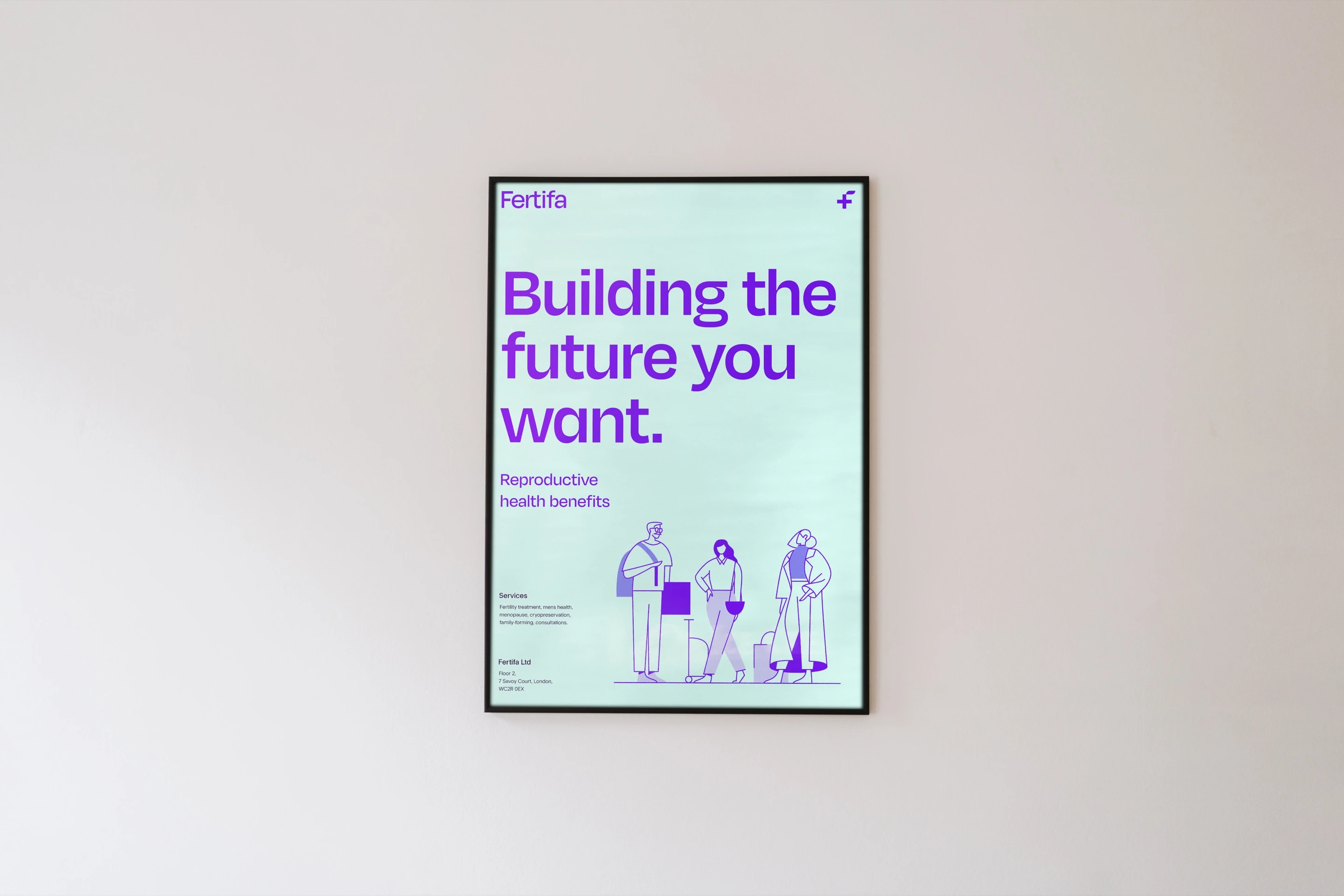
The pillars didn’t stay in a deck. “From start to finish & beyond” and “Supporting biological differences” went straight onto the posters.
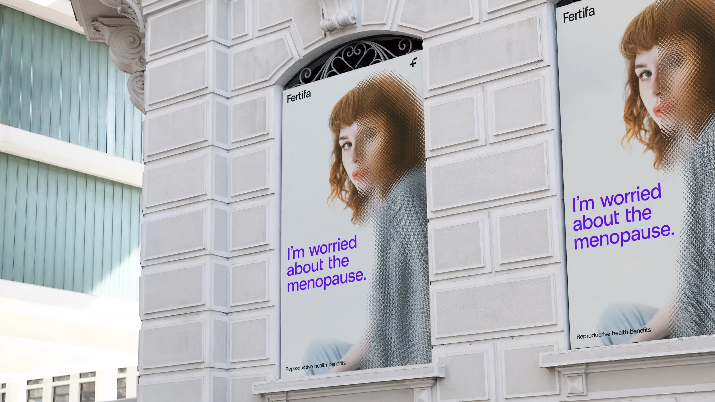
I presented two directions. The first, Facing reproductive health issues together, put people’s own worries in the headline and set faces behind reeded glass. The second, Supporting people through their reproductive healthcare challenges, was softer: a leaf mark, lemon and sloe, and portraits in arches.
Outcome:
Fertifa chose the first, and I brought the warmth of the second along with it. The glass went after their feedback. It hinted there was something to hide, the opposite of what we wanted to say, so the faces came out from behind it.
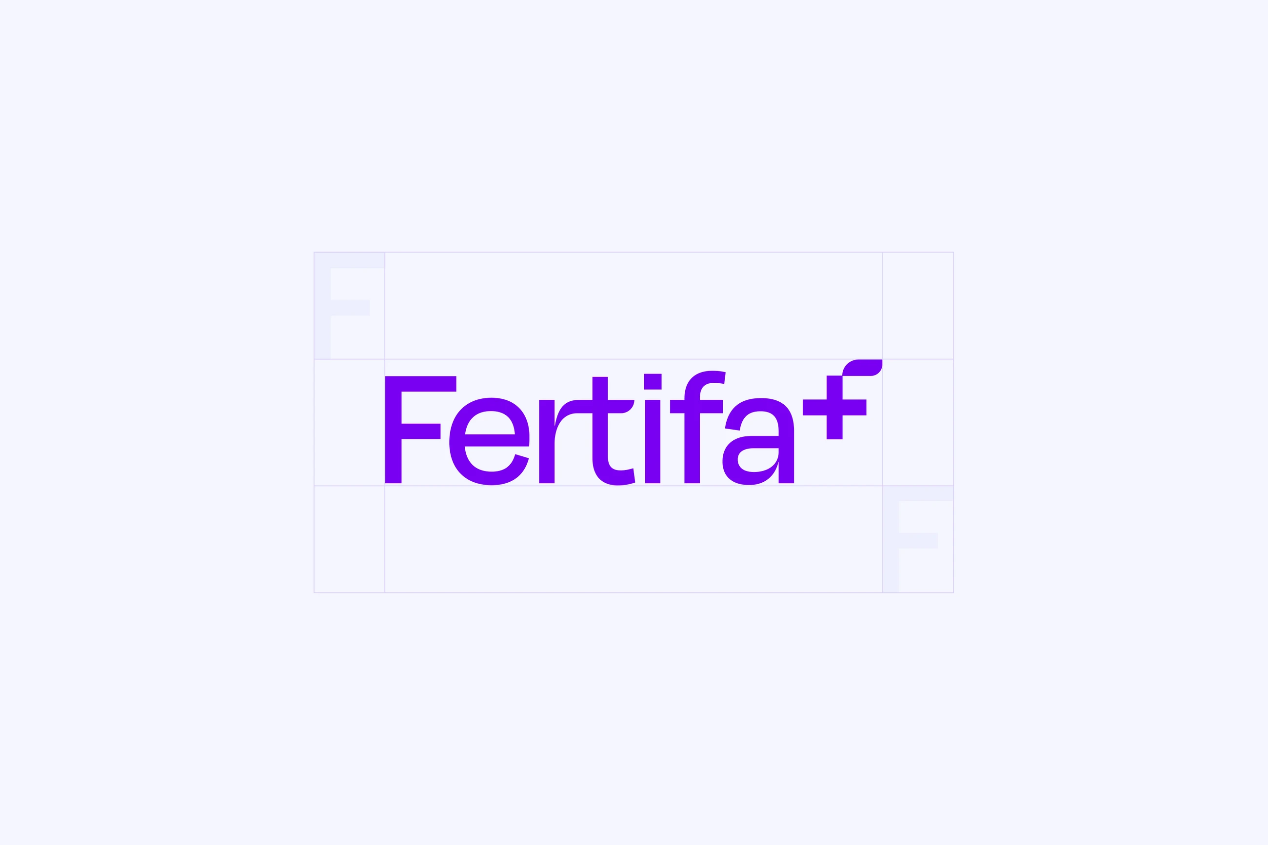
The logomark is three ideas in one shape: the F of Fertifa, a + for health and a new shoot for life.
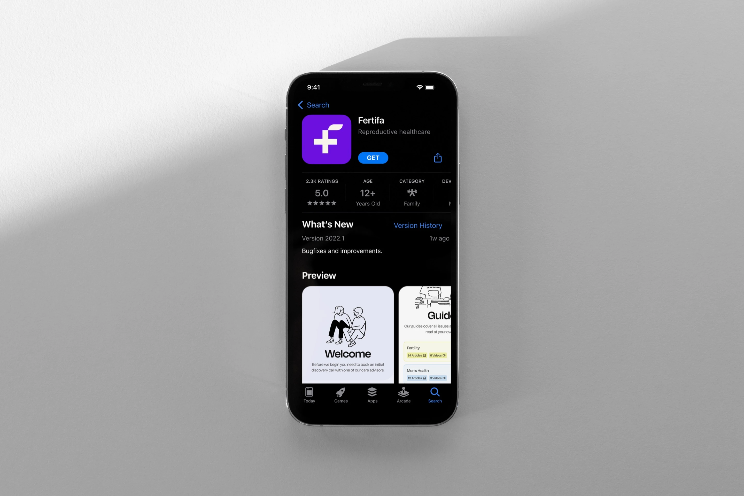
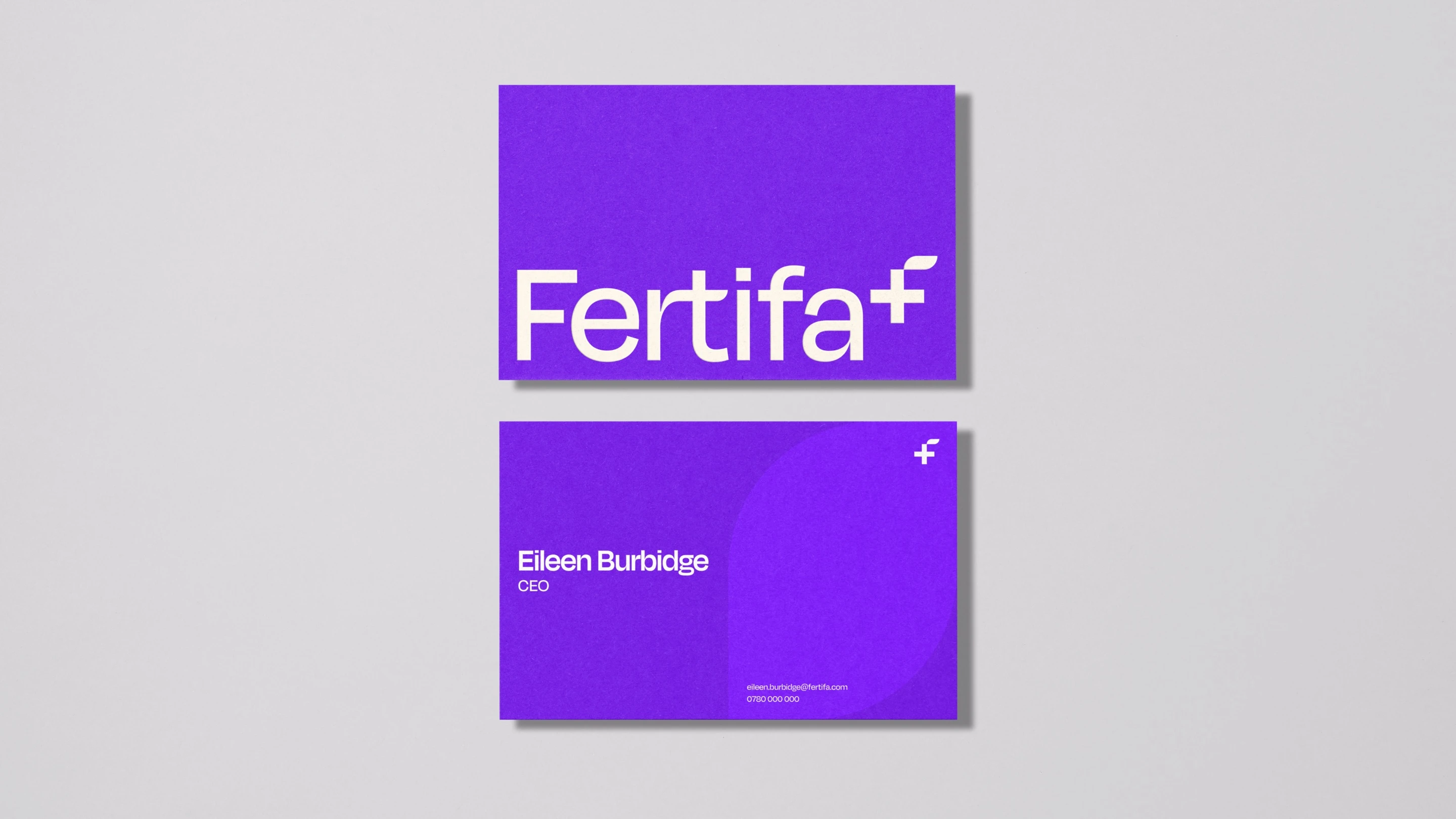
On its own it’s a stamp for app icons, letters and the corner of a poster. On the end of the wordmark it reads as a quiet plus.
In 2022 every startup was reaching for bright, loud colour (think Deliveroo and Monzo). A brand about something this personal needed to stay calm.
So one colour does the heavy lifting: a bold violet the team nicknamed “Blurple”. Around it sits a softer extended palette of greys, greens, yellows, blues and reds for backgrounds, illustration and the product, never all at once.
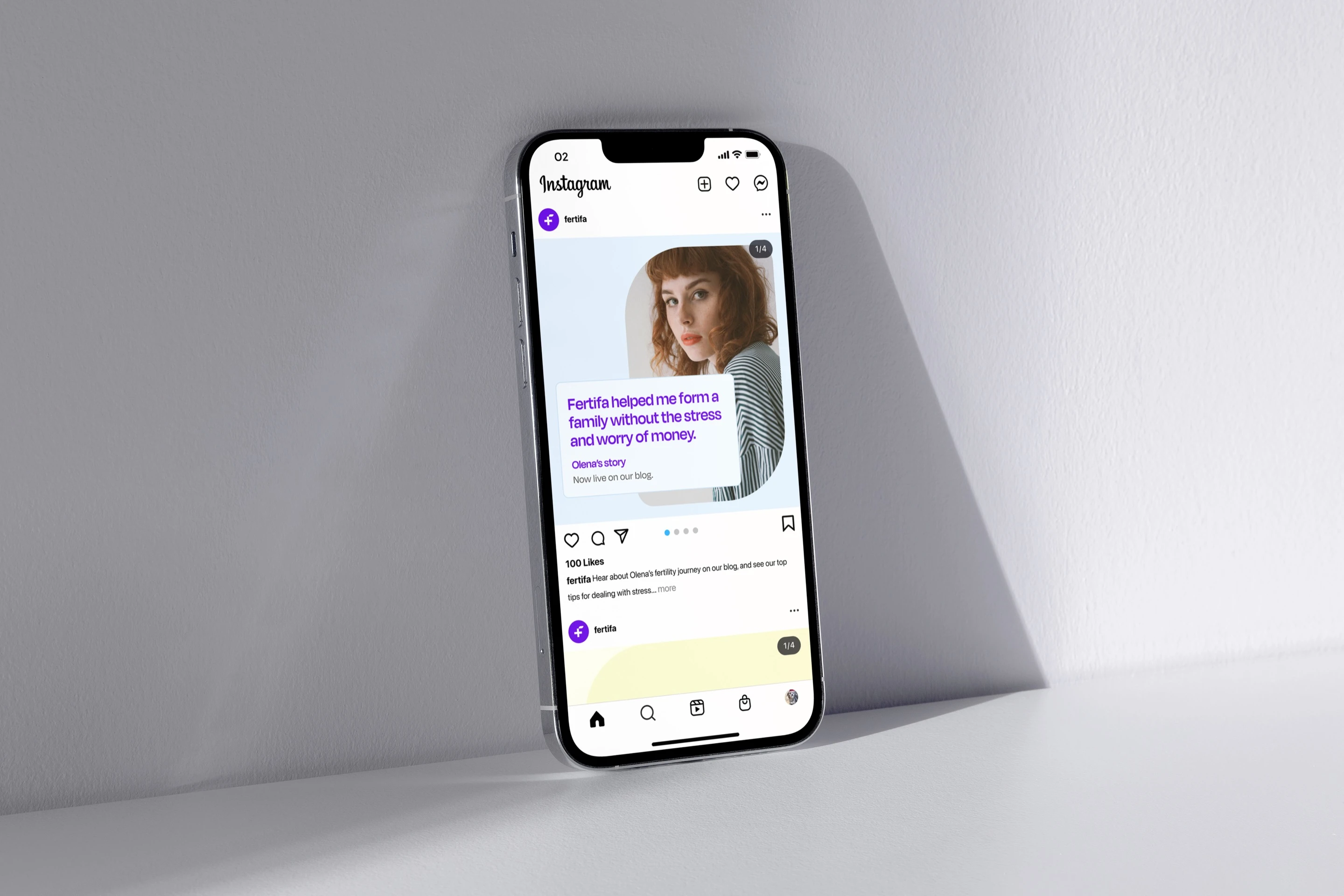
The tone of voice says what people are thinking, in their own words rather than the brand’s: “I want to know more about IVF options.” “Fertifa helped me form a family without the stress and worry of money.”
The illustrations do the rest. People drawn in a single purple line rather than stock photos of clinics, so the subject feels human without getting too close.
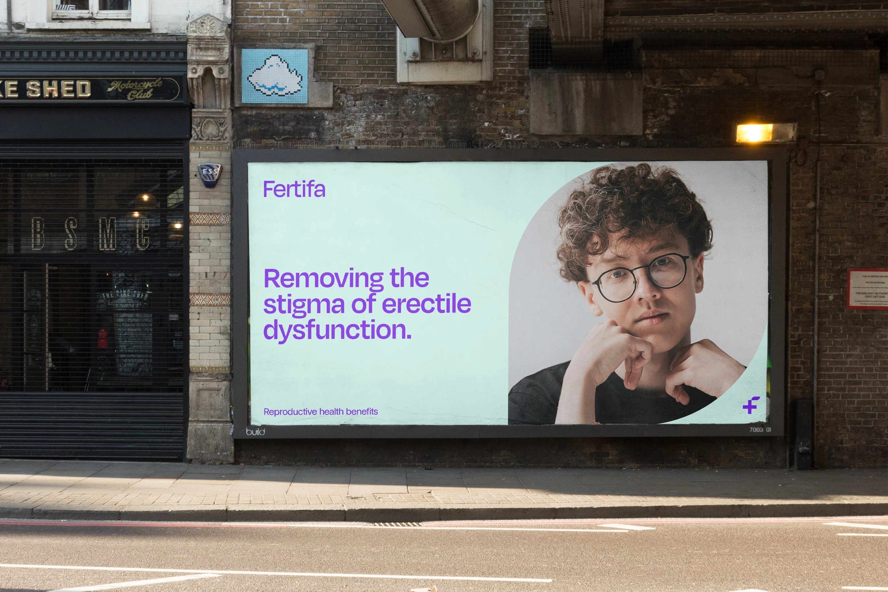
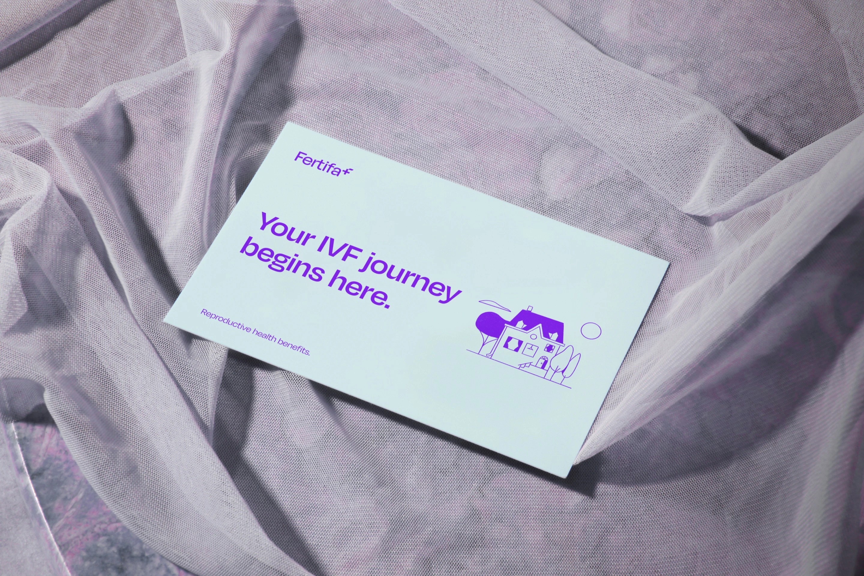
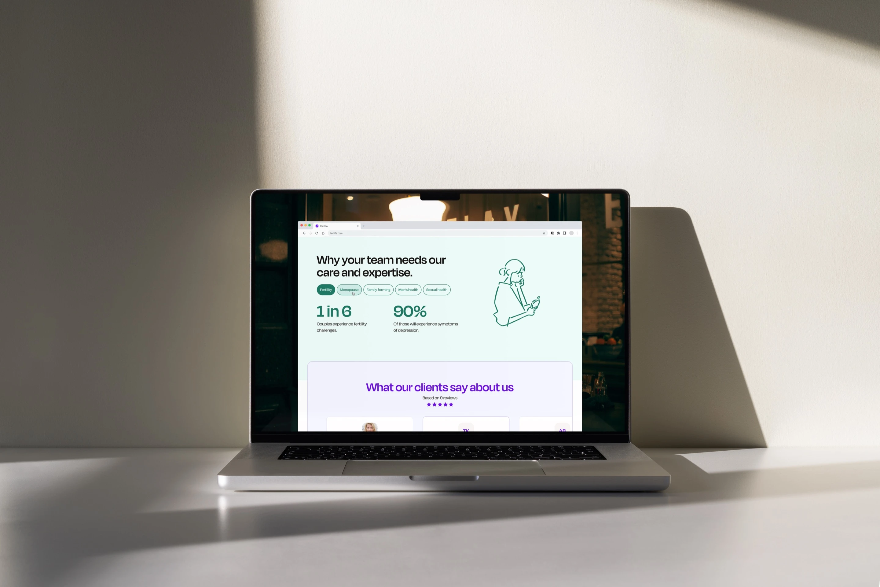
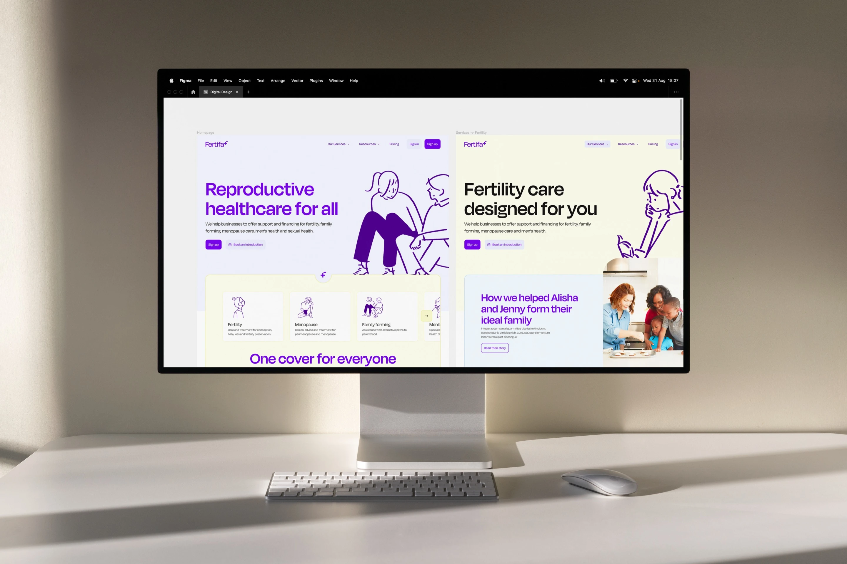
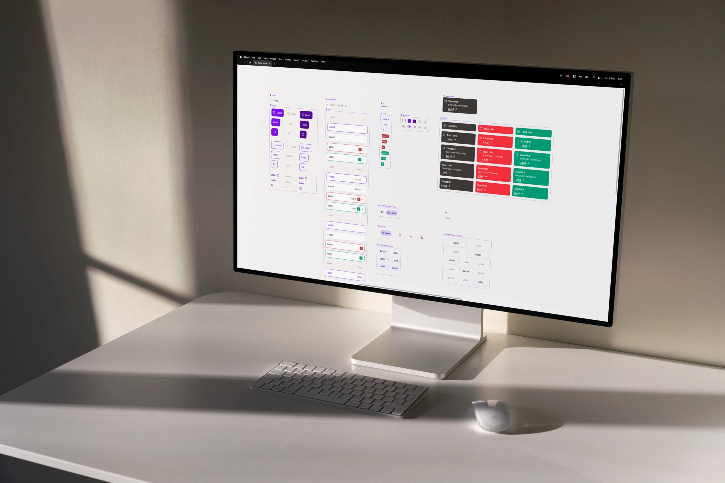
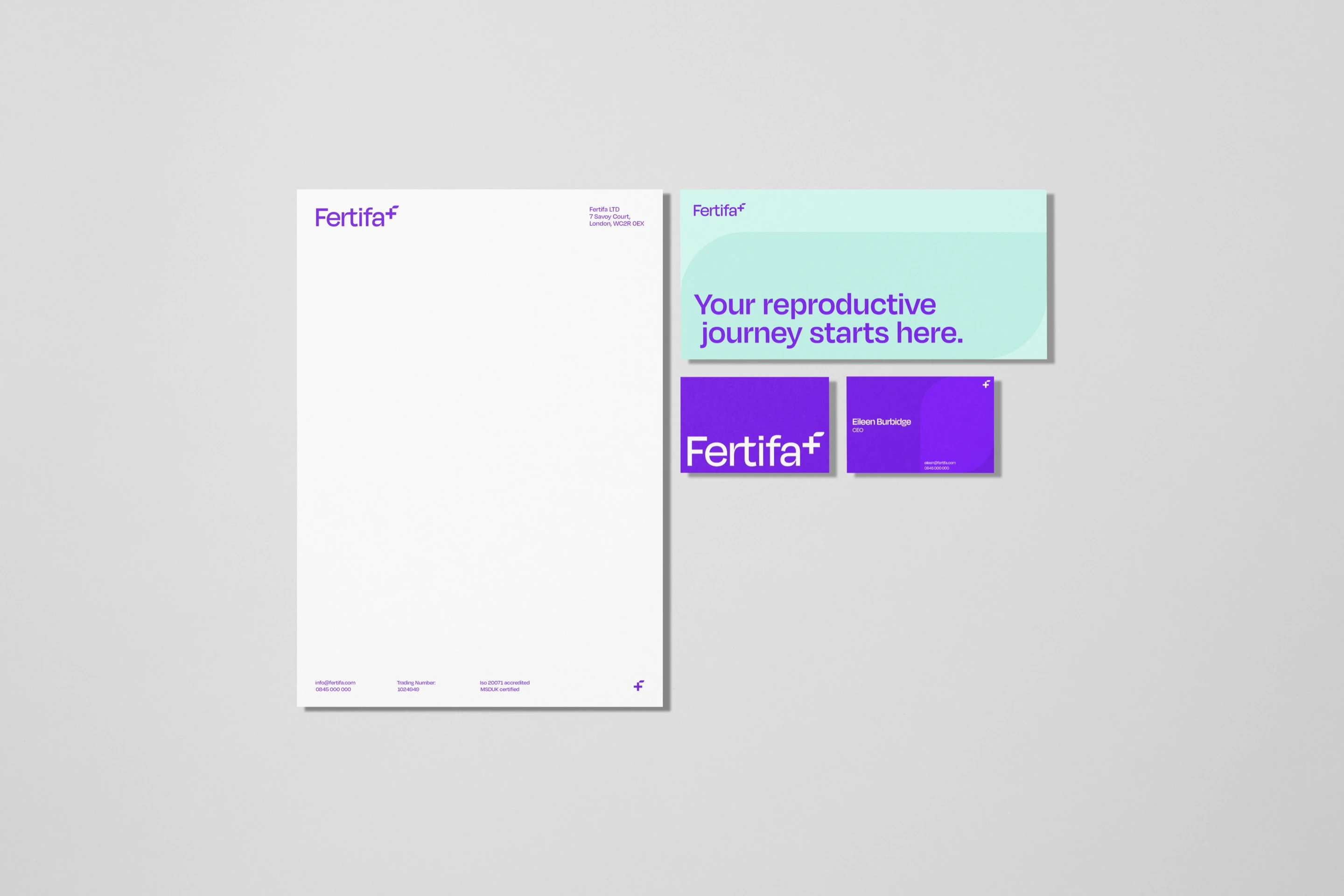
All of it went into a 42-page brand guide covering logo, type, colour, photography, illustration, advertising, social, stationery and the website’s design system.
Outcome:
The whole brand, guide and all, landed in time for Fertifa’s relaunch.
2026
Since the relaunch, Fertifa has supported more than 250,000 patients across 150 areas of healthcare, with active clinical or reimbursement cover in over 100 countries. Sam later joined Fertifa full time.
What’s next:
In 2026 Fertifa came back to me, personally this time, to take the brand on to where the company is now. More on that once it’s public.
250,000+patients supported
100+countries with active cover
£10m+of reimbursements covered

“Sean really gets into what users are actually trying to do, and asks the tough questions that make you rethink things you thought you’d figured out.”

Martin DreymannCo-founder & CTO
