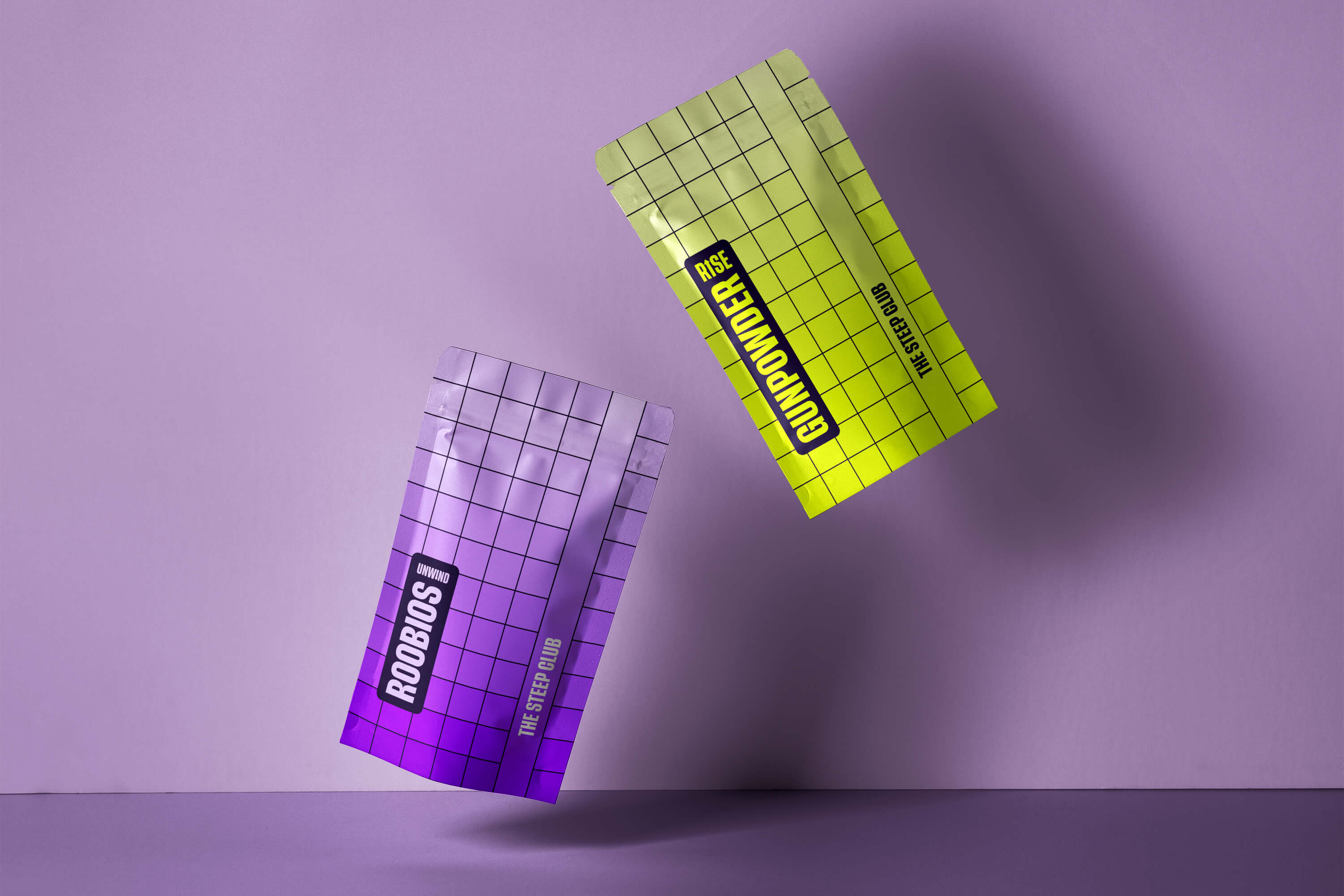
The Steep Club is a D2C tea subscription service. Their partnership with some of the world’s best tea farms, bring high quality, specially selected blends of tea in two varieties, “Rise” to wake you up or “Unwind” to settle you and your mind, all achieved with 100% natural tea.

Heather, the founder of The Steep Club originally approached an idea, she wanted to take her existing D2C knowledge and apply it to a gap that she had spotted in the blossoming tea market. She wanted something that felt different from the existing brands out there allowing a connection to be formed between the brand and her desired Millenial → Gen-Z audience.


So, as it turns out, tea is steeped — not brewed (as I thought), the difference being in the direct application of heat. Steeping is the process of soaking an item in a liquid in order to extract it’s essence/flavour (here it’s tea leaves in water), whereas brewing requires a heat source to be in direct contact with the water. As the steeping process is an extraction of flavour we wanted our identity to hint towards this, leading with bold (but themed) colours to indicate what lay inside the boxes.

So, as it turns out, tea is steeped — not brewed (as I thought), the difference being in the direct application of heat. Steeping is the process of soaking an item in a liquid in order to extract it’s essence/flavour (here it’s tea leaves in water), whereas brewing requires a heat source to be in direct contact with the water. As the steeping process is an extraction of flavour we wanted our identity to hint towards this, leading with bold (but themed) colours to indicate what lay inside the boxes.

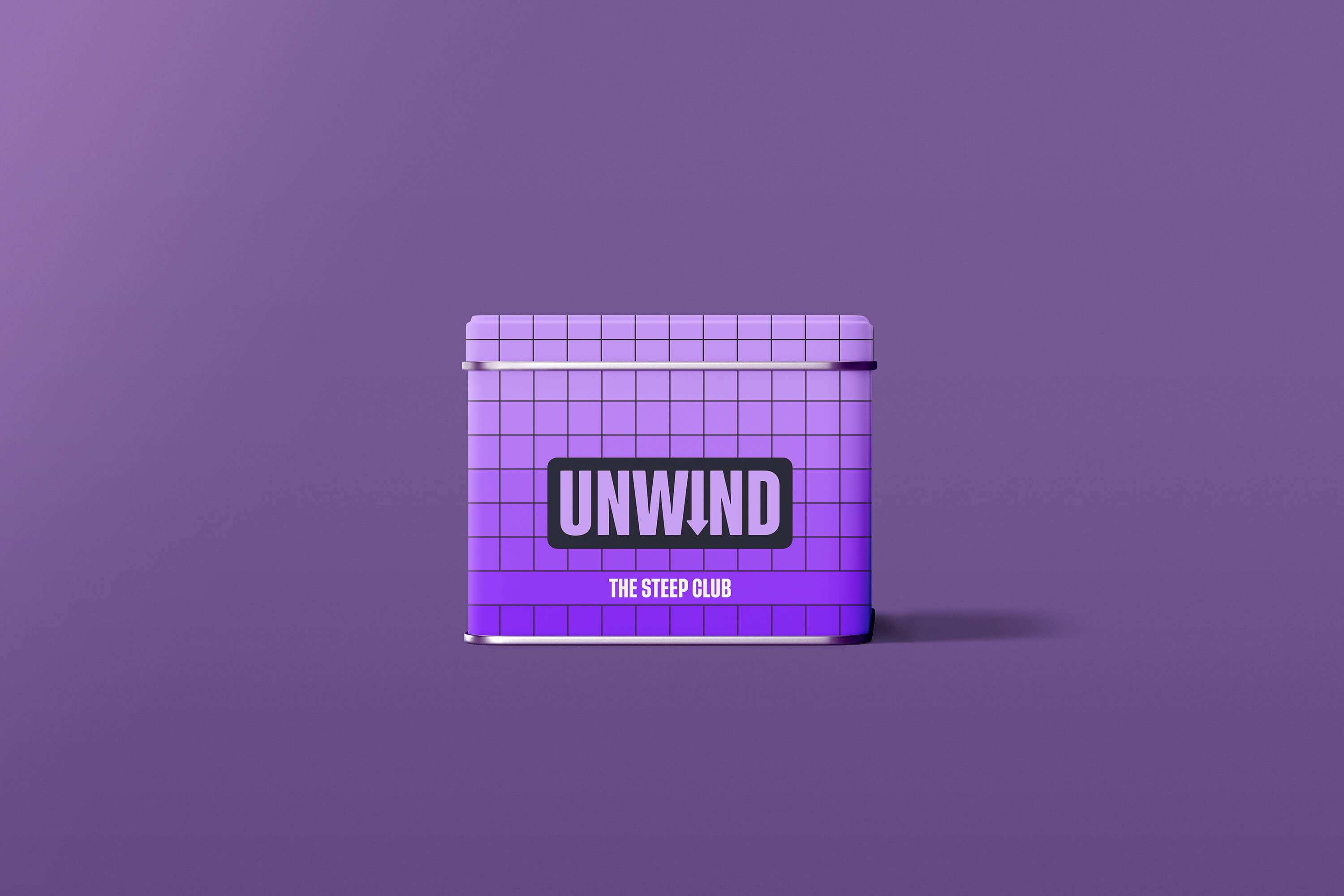
The Steep Club’s two product ranges are connected, but serve a very distinct purpose. We wanted to ensure that they were different enough to distinguish, but similar enough to link. Both sets of packaging feature a gradient pattern across a grid to reference the passing of time, a key component to both the varieties of tea. For Rise we used an acid yellow gradient as this gave us a nod towards the morning sun, and with Unwind, we opted for a purple, hinting towards the upcoming night.
