Lead Product Designer
Introduction
When I joined the Shuffle team in 2023, the company was just a couple of months old and I was the first product and design recruit into the team. That left me with an audaciously large goal, to help steer the business to not only launch it’s first product, but find a foothold in the hugely competitive market it had placed itself in.
The Problem
Shuffle approached me with their vision, to revolutionise the UK rewards landscape dominated by giants like Airtime Rewards, Quidco, and TopCashback in a similar way to what Monzo have done to the banking world.
Founded by Ollie and Enzo, the two met whilst building Loot and later Bo (Ollie was a founder of Loot).and had convened to build Shuffle around a year earlier. Their consensus was to build a new rewards card, one with a randomised reward, that secured customers by utilising a variety of gaming dynamics, with the rewards themselves being funded by loans to restaurants and coffee shops.
v0 - The Investor Edition
My first task at Shuffle was to build out a quick brand and a “V0” of the product that we could present to investors, giving them a better vision of what the team had envisaged and allow the company to secure their first “proper” round of funding.
A clickable prototype and an initial brand later and we were ready for that round, raising £2.5m!
Launch Targeting
To refine our launch approach, we conducted extensive research, segmenting the UK hospitality market city by city. We identified Manchester as the optimal launch location due to its compact city centre, ideal for achieving market saturation and its youthful demographic (over 40% aged between 20-40). Combining these factors with its burgeoning and vibrant restaurant scene it felt like a match made in heaven.
User Research
Combining our initial designs with a comprehensive list of questions, we gathered users across our target demographic into online sessions, to dig into their eating habits, how often they were heading out, where to and who with. From this, we were able to further refine our initial target audience to Double Income No Kids Couples (DINKs), who eat out at least twice a week, living within 30 minutes of the Manchester City Centre.
The Re-Shuffle
As with every startup, the team were on a tight deadline. We wanted to go live by the end of the year (it was now February) and Shuffle still had gather a number of approvals from the FCA and Mastercard.
This, was where I had an idea.
What if we were to offer customers a rewards product, that had the same app experience, one with random rewards (as we wanted), with a curated list of spots (as we wanted), but instead of issuing our own card, we link to your existing bank account.
As a result of this idea - Shuffle were able to launch their product five months early in August 2024

Branding
Core to structuring Shuffle’s brand was understand why the company exists. By mixing up Simon Sinek’s Why Framework and utilising some of the tropes from Five Why’s I worked with the whole team to help us define why we existed as a business and how we wanted our users to perceive us.
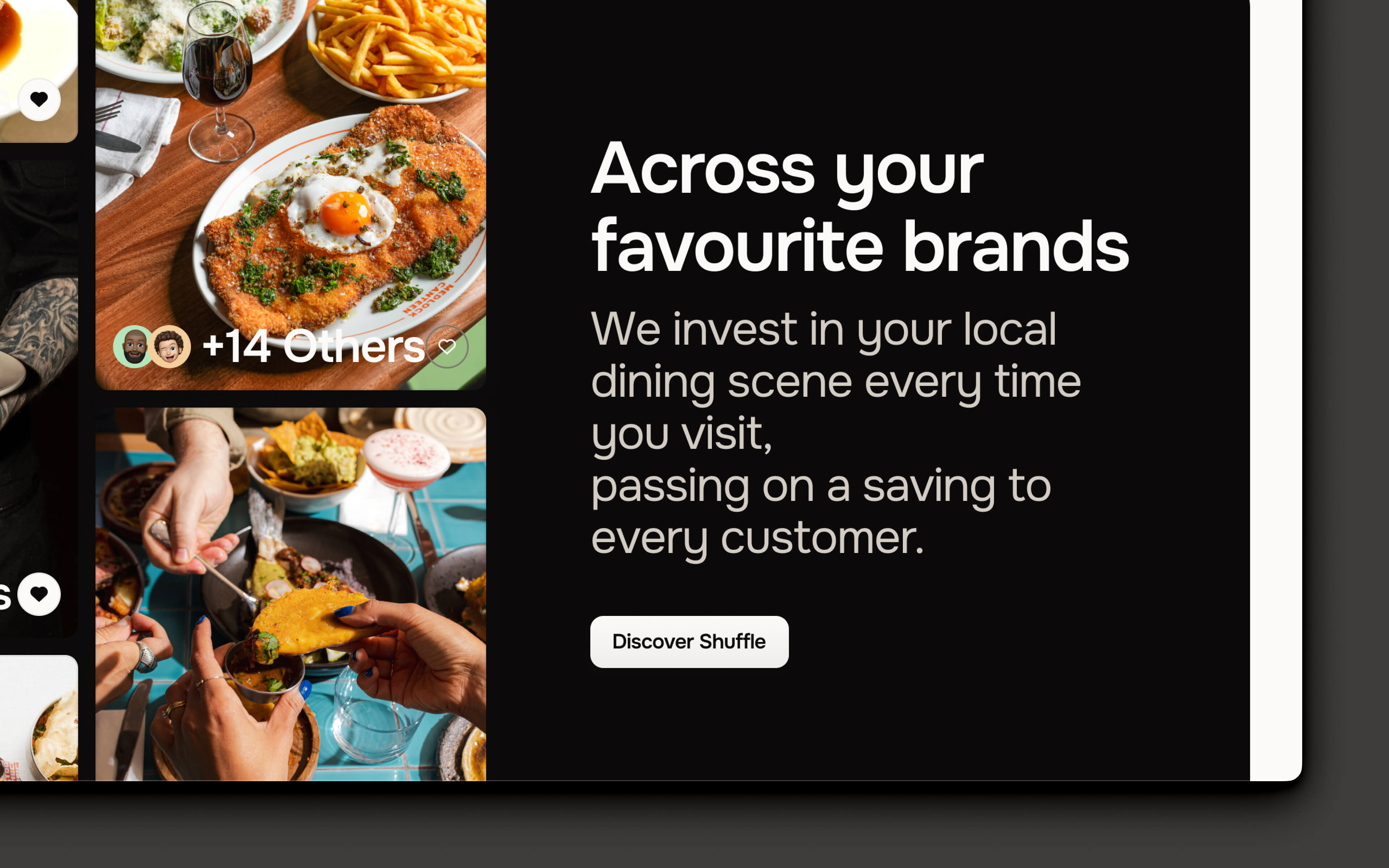
Shuffle’s mission is to bring joy to your everyday. Helping to highlight the best in your local area and grow a better community together as a result. Our brand therefore had to reflect just that.
By utilising a scaled back colour palette, choosing a humanist/geometric sans hybrid typeface in Onest, and really focussing on the brands Shuffle would play host to I helped Shuffle bring the visual identity of the company in-line with the company goals.
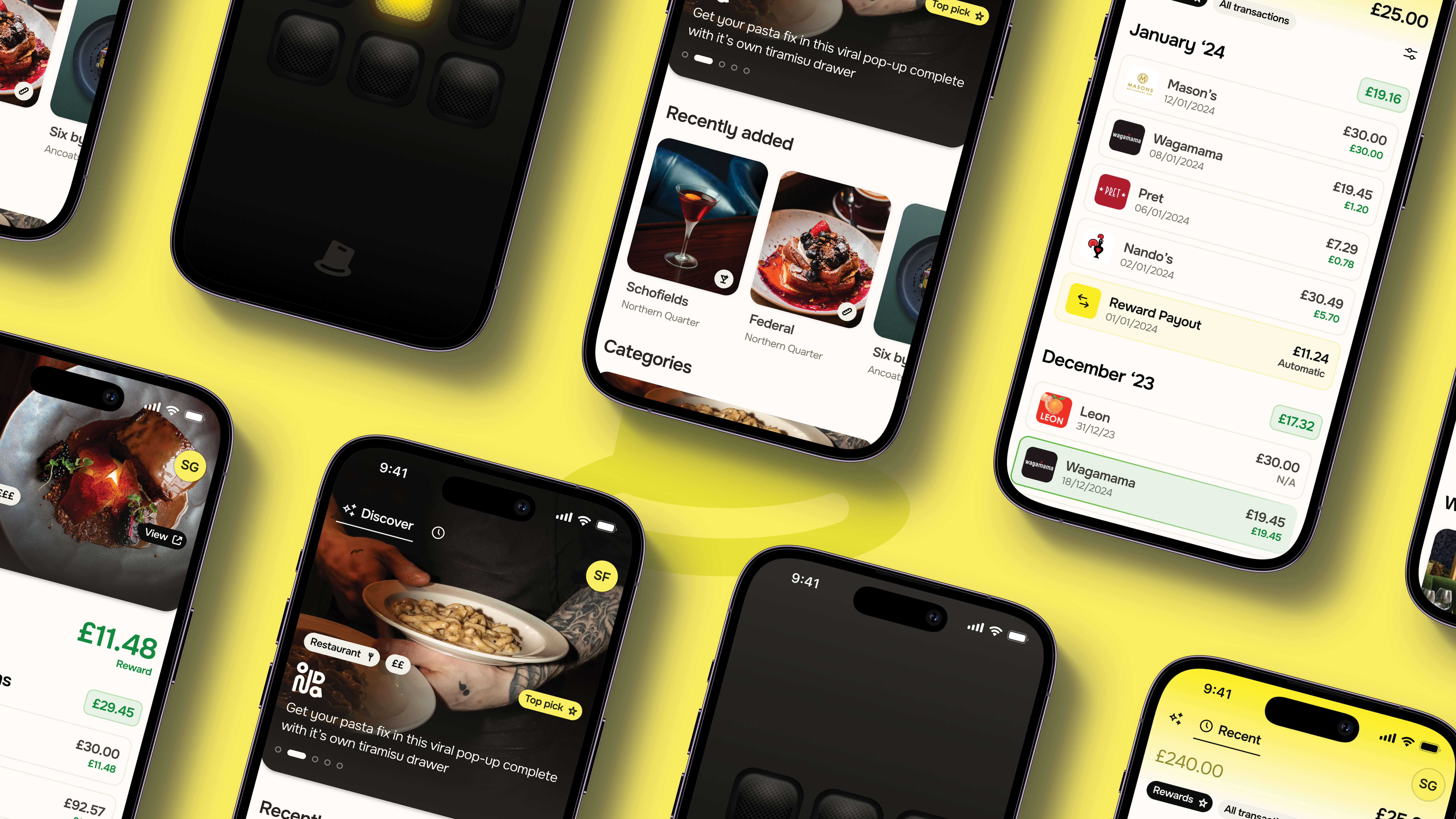
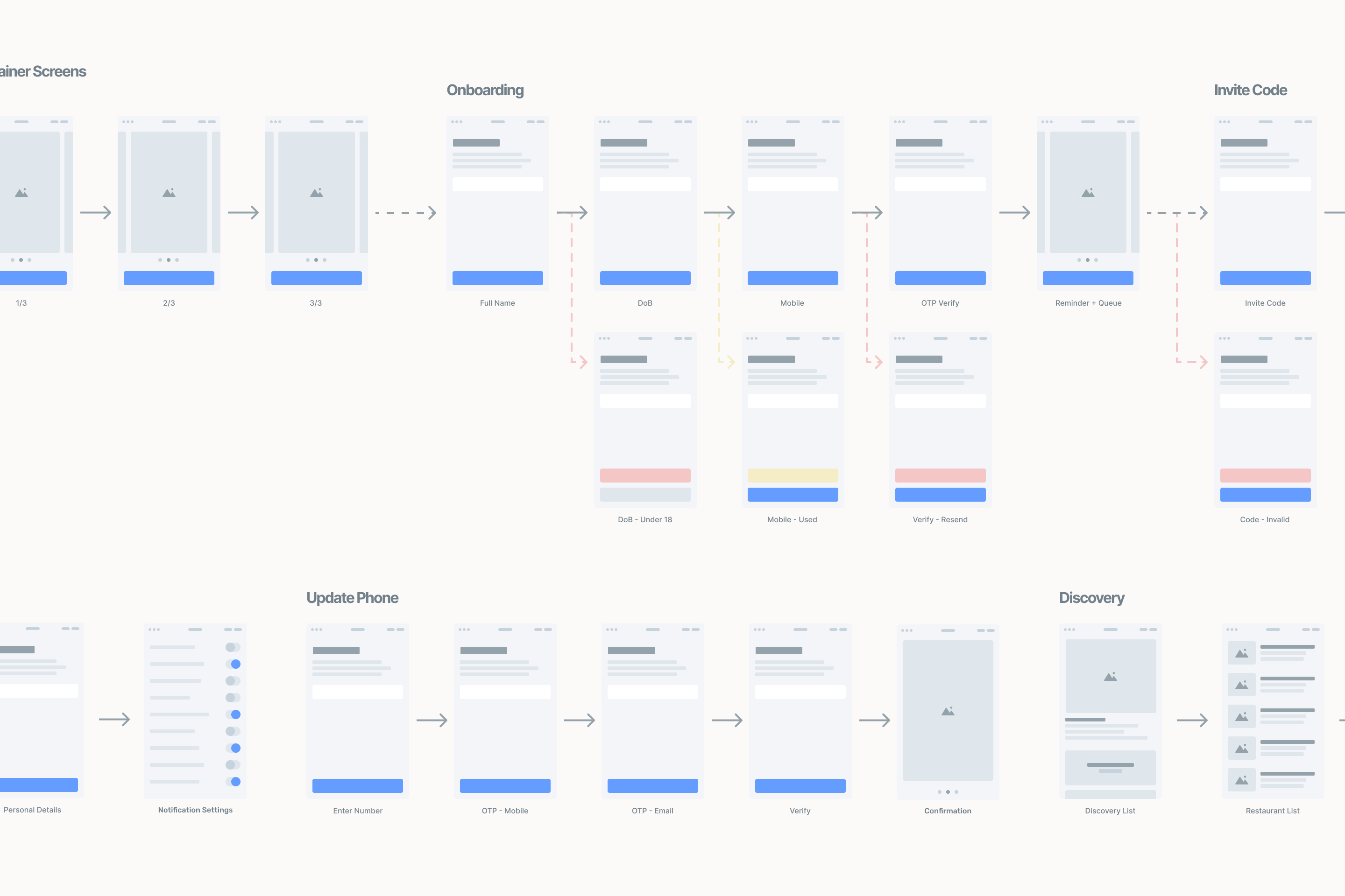
App Design
The app design took place in three parts, discovery, onboarding and rewards. Onboarding was vital for building trust with customers, Discovery was how we’d get users to use the app and Rewards was how we’d get them to stay.
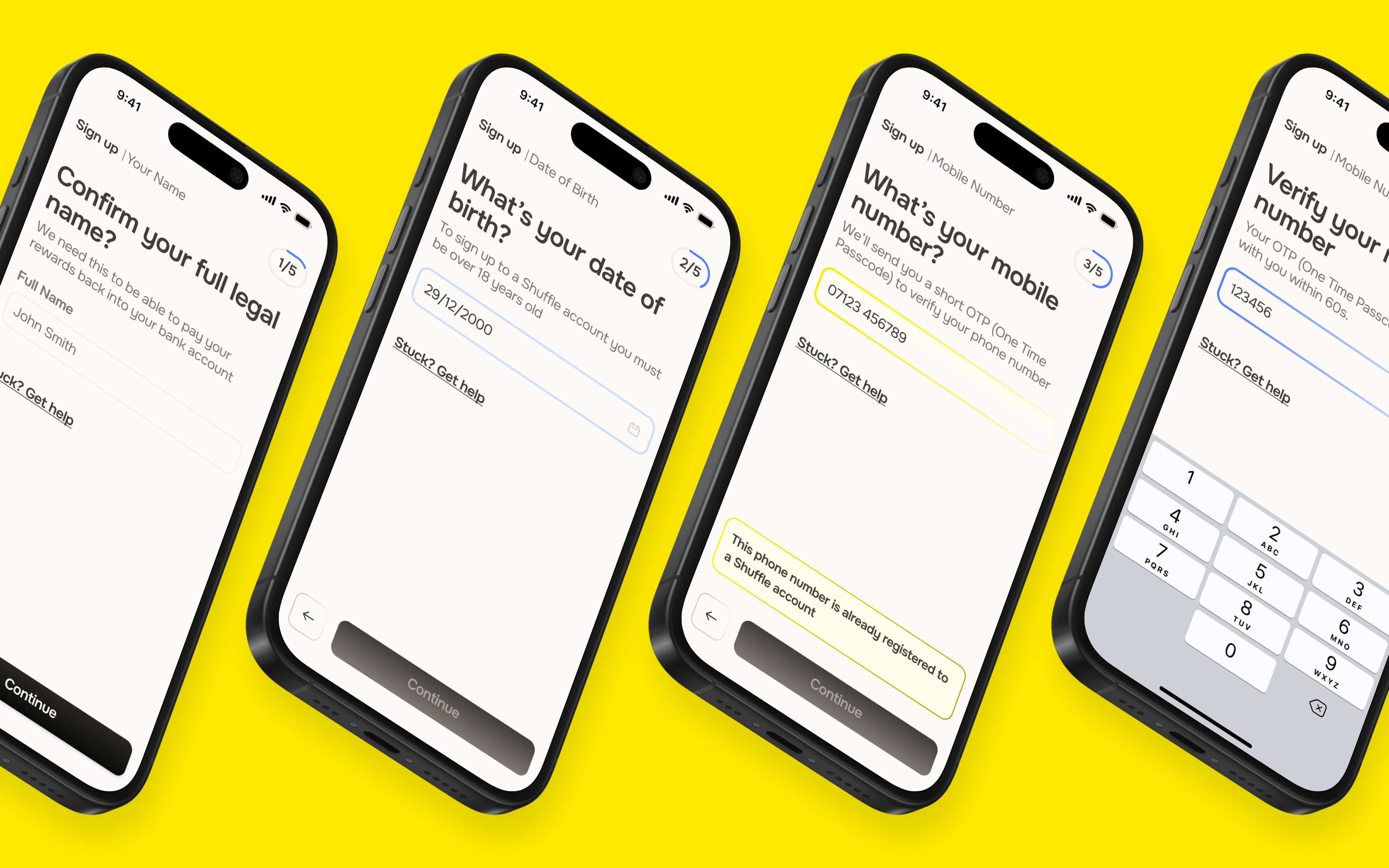
Onboarding
Alongside collecting basic information, we had to instill trust in our users through this journey so they would go on to connect their bank account to Shuffle. To do this, we minimised the information we were collecting upfront, and reiterated the benefits to signing up throughout the onboarding flow.
Re-highlighting features & rewards to users boosted our conversion rate by around 15%.
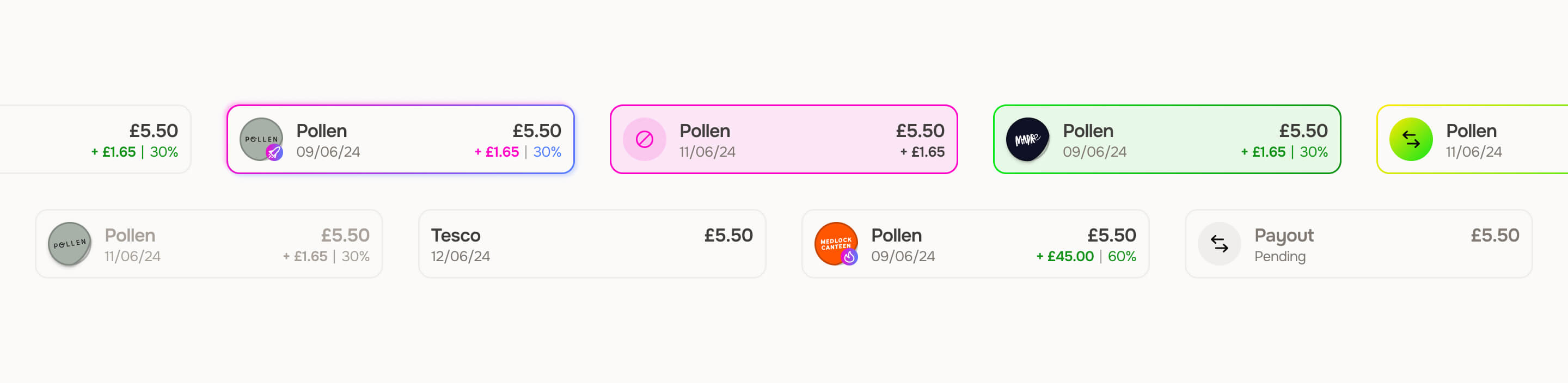
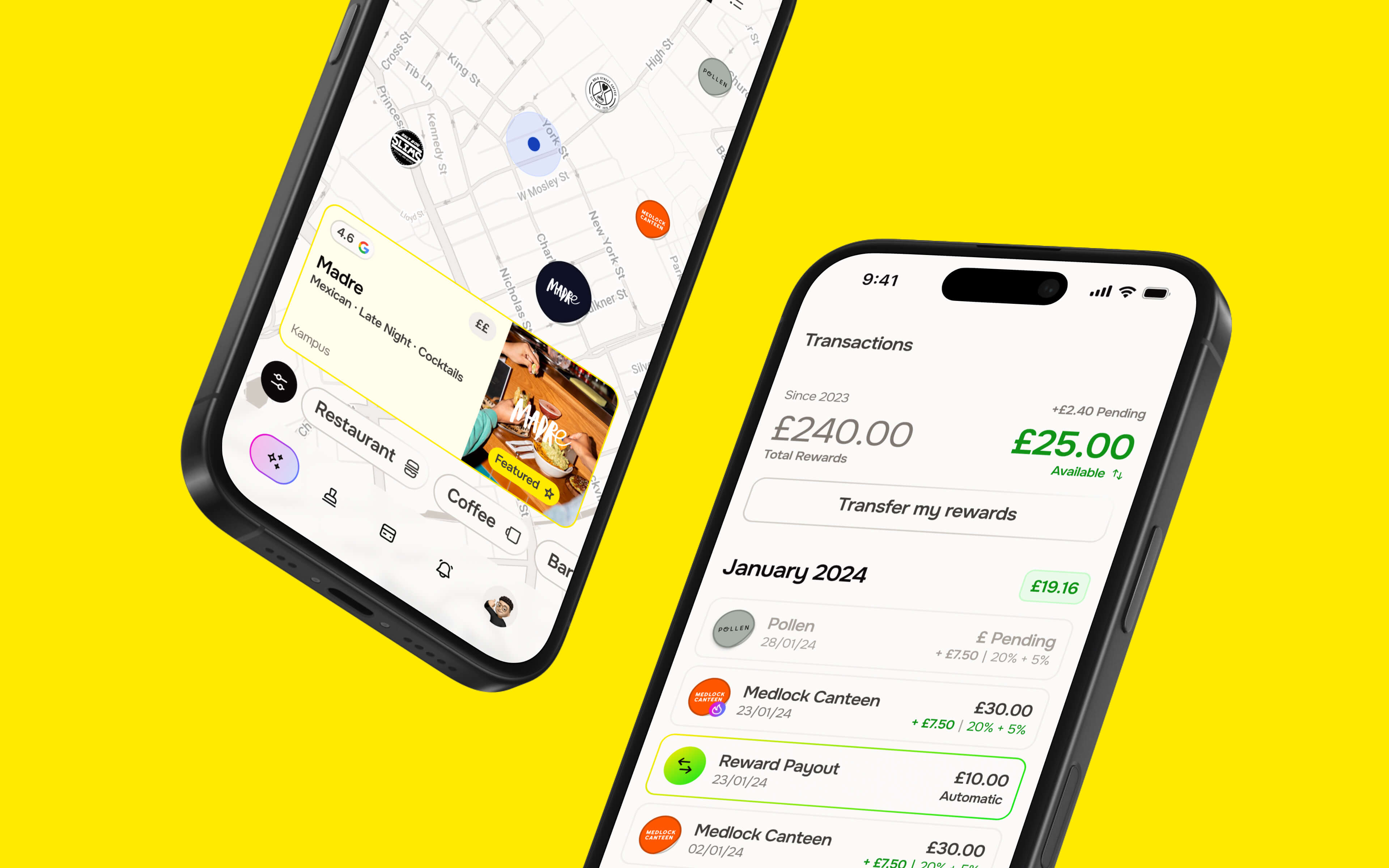
Rewards
The main core of the Shuffle app are obviously the rewards. These are given to customers in the form of a random discount at any of their qualifying retailers, and returned to the customers as cash back into their connected bank account.
To show these rewards to the customers we kept a reasonably familiar interface, utilising similar elements to your everyday banking app, we injected some personality from our retailers (their logos becoming stickers) we showcased the cashback the users had earned per transaction plus their monthly and total reward balances.
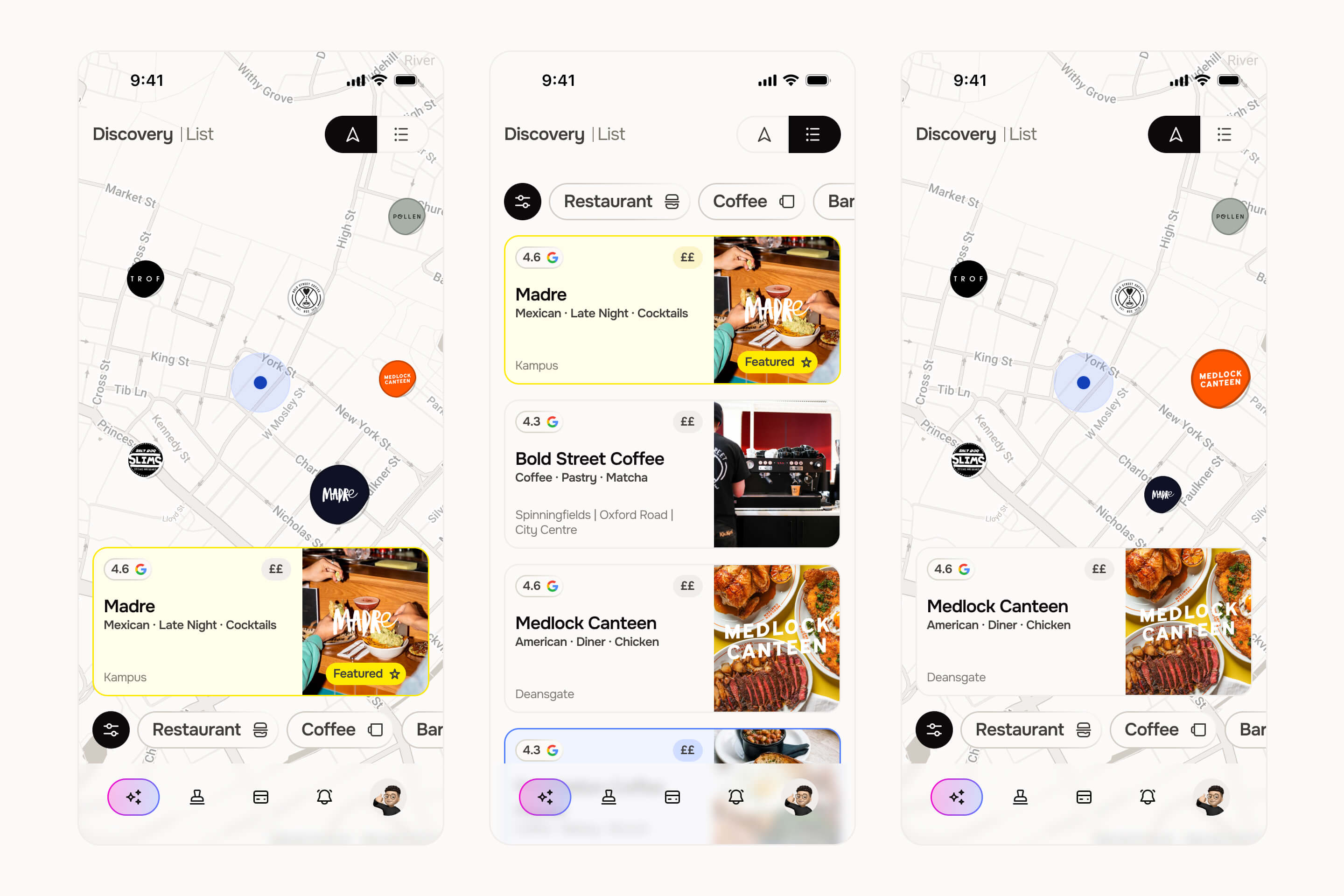
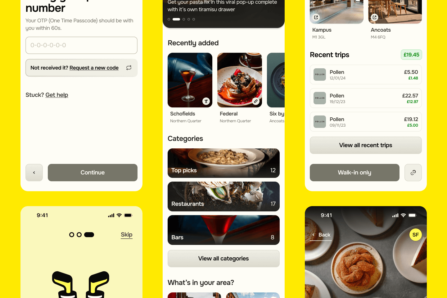
Discovery - Updated
Discovery was the first feature we redesigned after launch. From testing with our initial users in Manchester, we found that they didn’t know the list as well as our initial research suggested, and as such regularly dipped out to Google Maps to try to find the correct location for each Shuffle Merchant. To solve this, we built maps directly into our app, showing the user where they were in direct relation to the Shuffle partners and allowing them to quickly see where was best for them to head to for a bite to eat, quick coffee or post-work drink.
Maps are more valuable to users even when lists are small
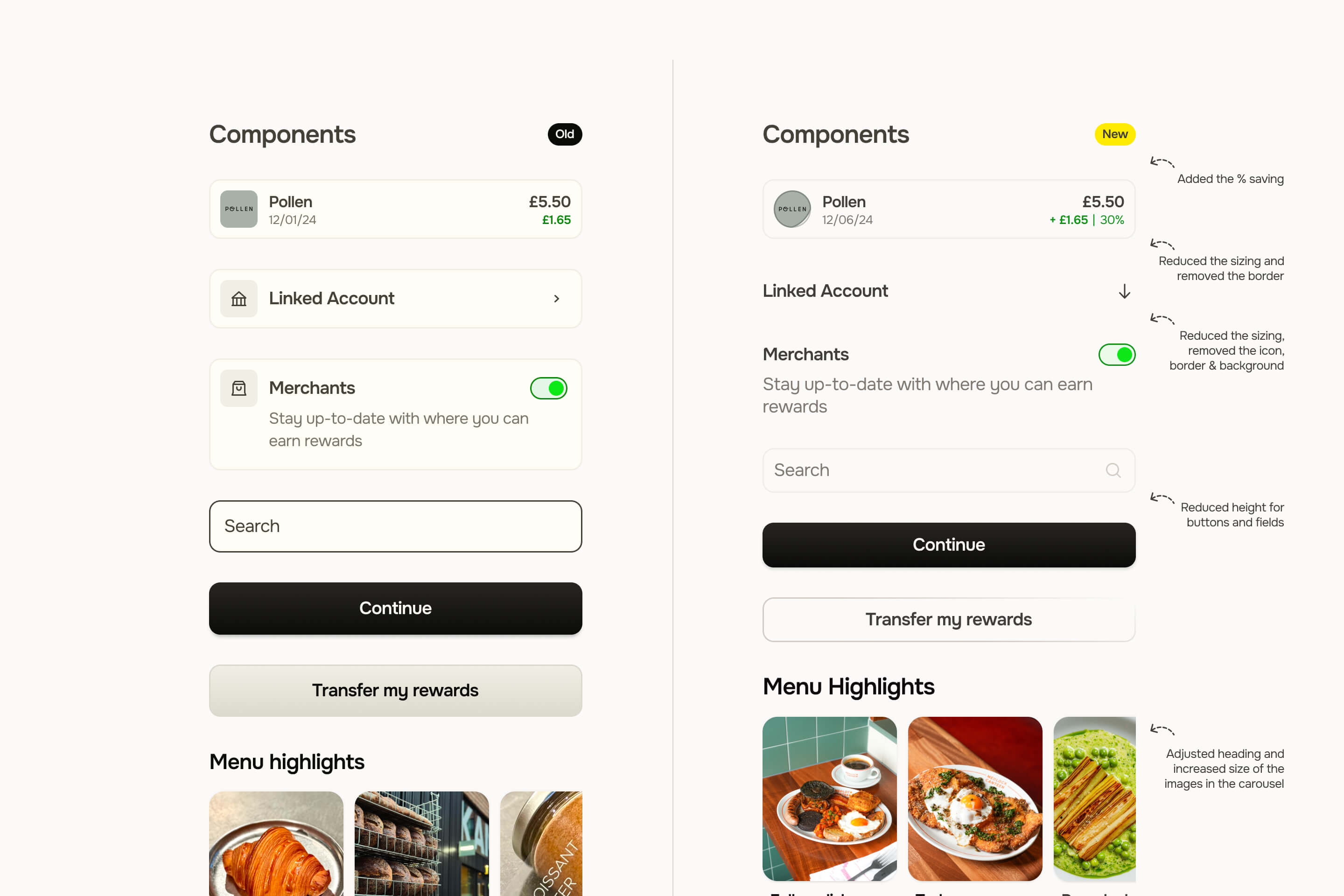
Design System
As all good designers know, a solid design system not only makes our work easier, but it also allows us to more easily communicate with product and development teams as we build out screen designs. At Shuffle I established a design system almost from the get-go (you can see some of that above) and worked on it iteratively, building out components as and when we needed them.
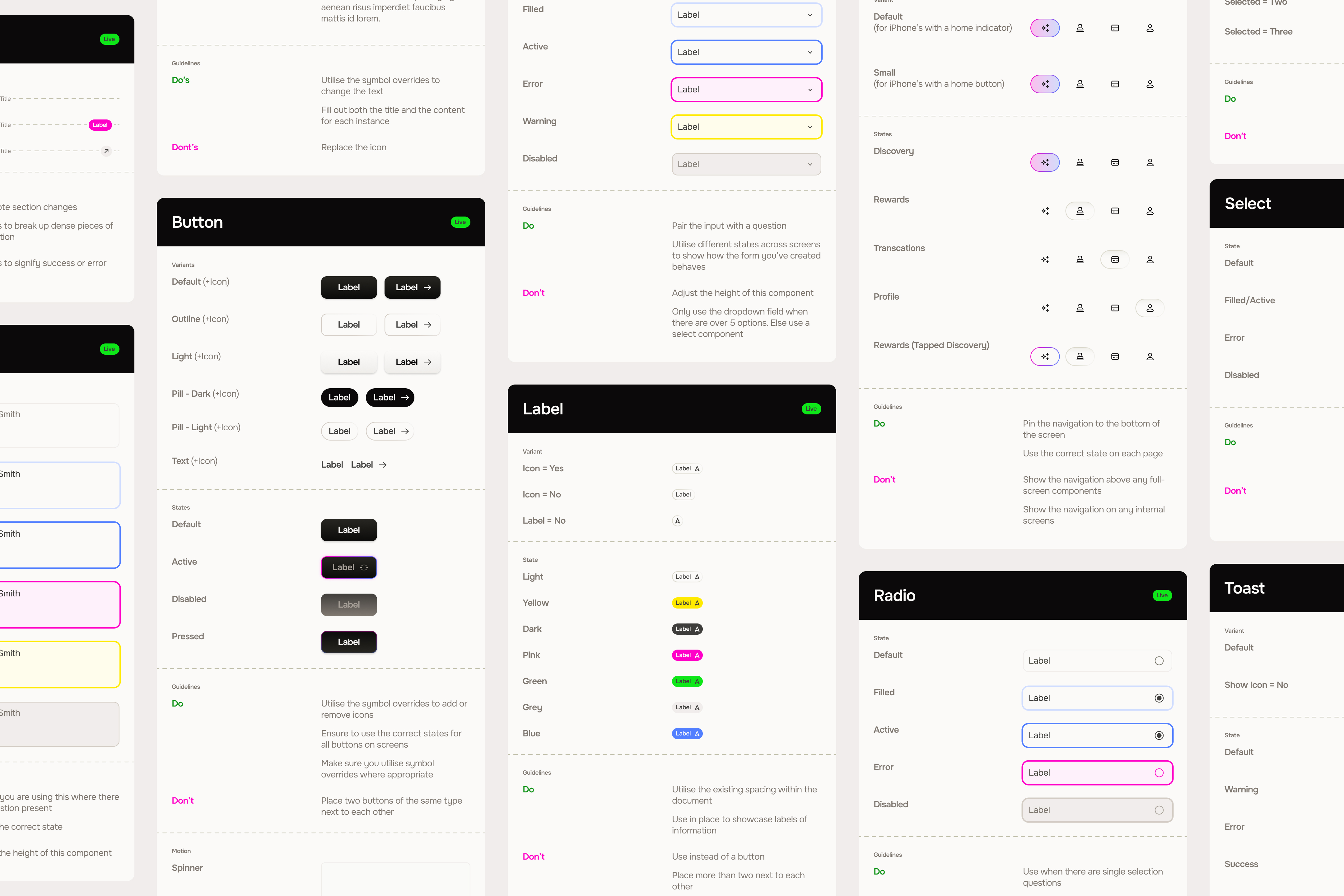
The final piece of the puzzle was to build out and document the final design system. The documentation was designed to build continuity after I left and allow the two new designers to continue to build out screens in the same style and manner that I had set up. I put the guidelines together for both developer and designer use, ensuring that there was a single source of truth for any new component, therefore I included all component instances and states (linked to the design file), rules on the do’s and don’ts of using each component in system and when appropriate, motion guidelines.
Launch and Learn
Shuffle launched to the public on 13th September 2024, nearly two months after we launched with a group of private beta testers.
The app went live with 14 partner venues across Manchester, from the best coffee spots (in Pollen and Fort) to the brightest food upstarts (Bundobust, Medlock Canteen and Madre).
The launch was a huge success seeing over 1000 sign ups in the first week! Not only did Shuffle have a successful launch, the app also had great retention. With features we had experimented and tested thoroughly proving to pull people back into the app. The average user clocked in at ~1.5 visits per month in the first two months after launch, beating the companies own expectations by ~200%!
Shuffle’s launch and subsequent retention beat the companies expectations by 200%
Next Project
